
"As a result...our software was recognized as a technology leader in our field and grew our business over 300% from the previous year."
- JOSH VANDE KROL, NOTIFIED


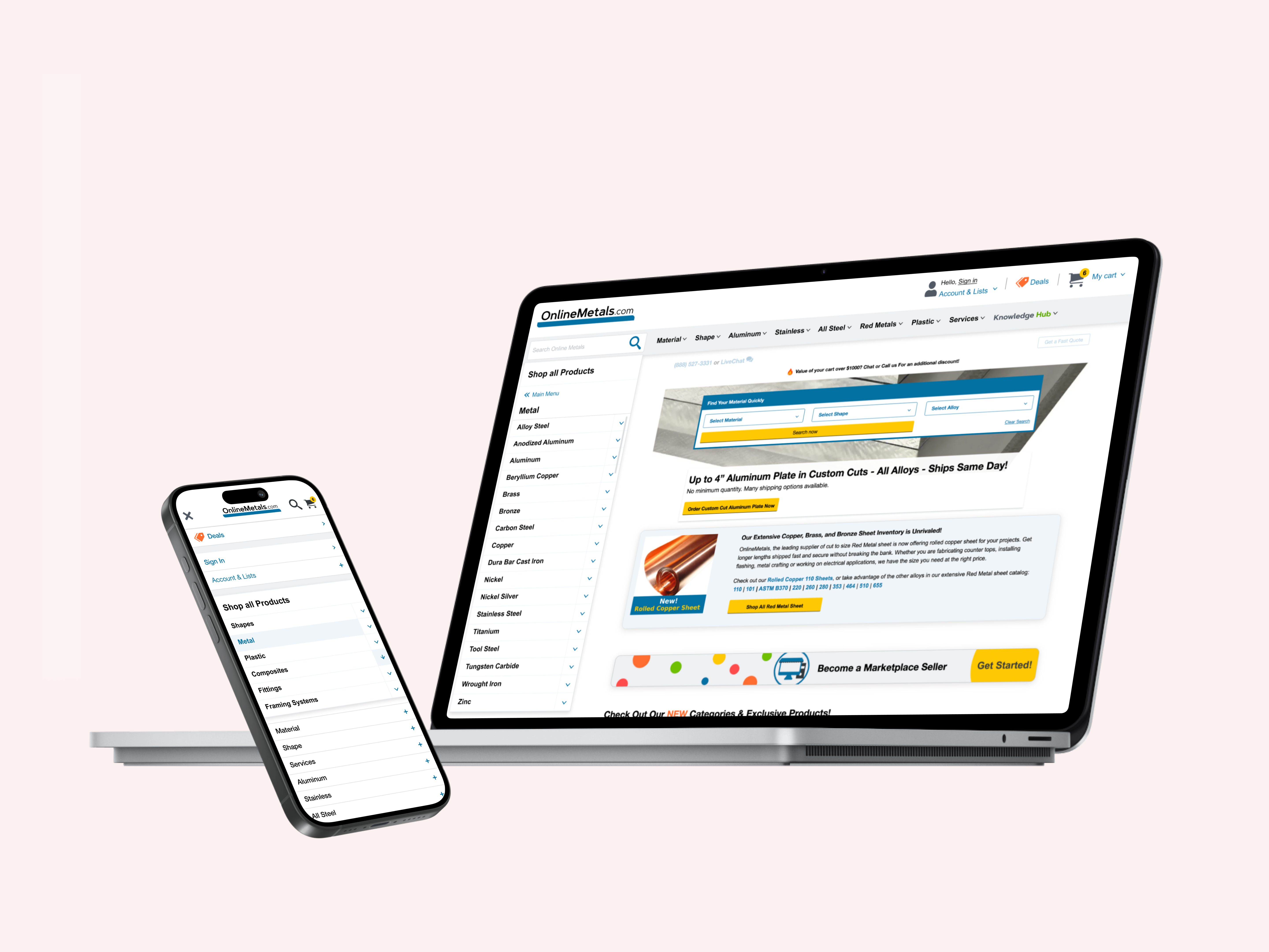
As part of a 3-person design team at Jennergy, I focused on the scalable design system build-out, libraries, components & page layouts for Notified's Experience 365 platform, leveraging Atomic Design & creating the design system in tandem as we designed the features, themes & wireframes for complex B2B & B2C user flows within Notified's SaaS web application experience.

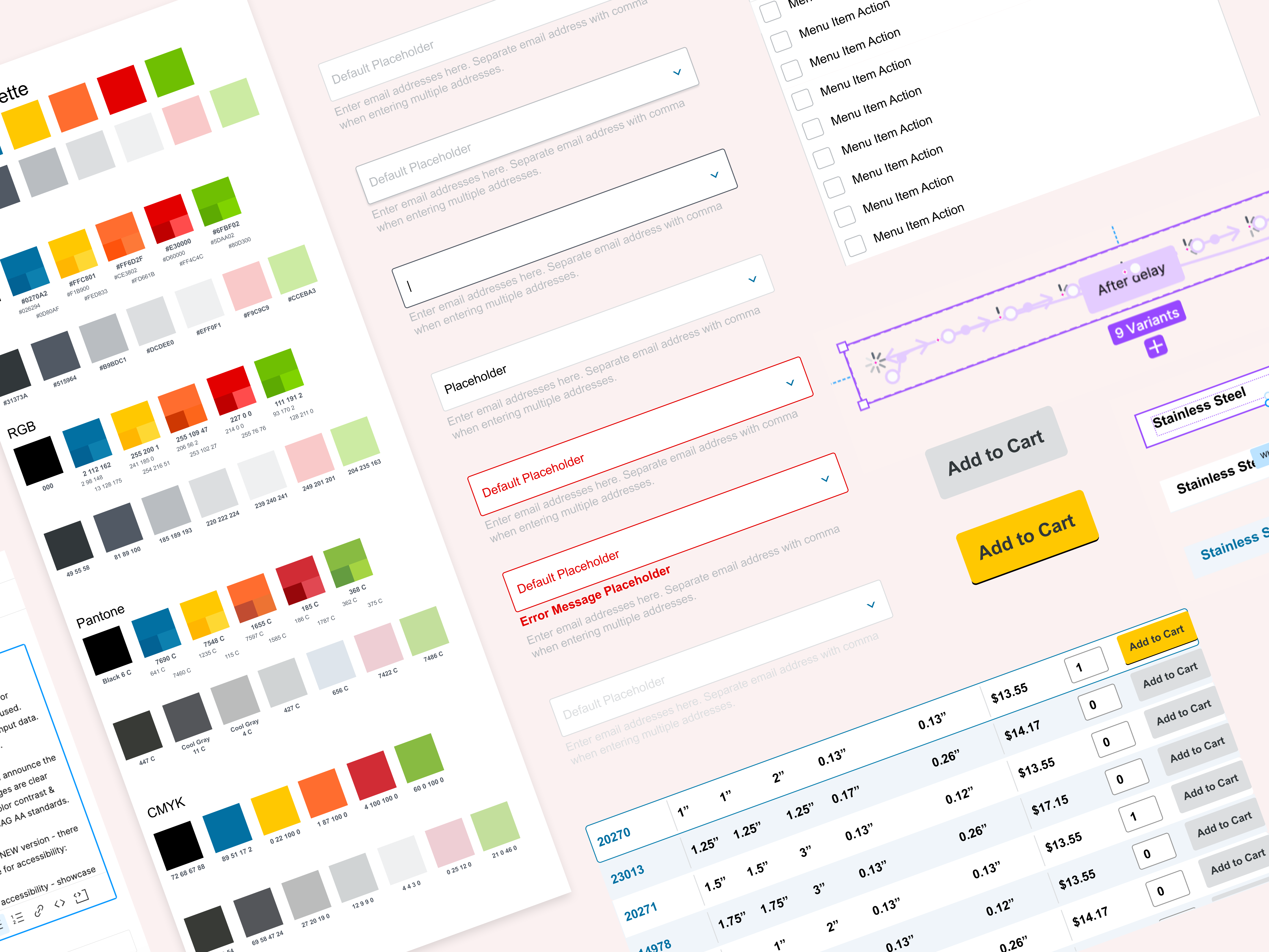
To ensure that everyone would be on the same page & speaking the same design system language, we aligned cross functionally on consistent, clear naming conventions between design & code. We chose to go with a hybrid of functional naming convention + object-role-variant naming convention, naming color token styles (yeah, this was before Figma rolled out our beloved variables! 🥲) according to purpose and application (such as background, primary (user adjustable brand color), text, success, warning, error, etc...) and assigned number values to our color tokens so that, regardless of future changes and updates to the primary design system, its mode or themes, the design system could have the flexibility to scale with the product.

"Design Systems are like homes...and lego projects - always a work in progress."

We initially started the design system as a single file, organizing the pages alphabetically by design element, to make navigating & locating components intuitive. We also included a main component directory which linked to the respective component pages to make elements easily searchable.
🚨 Down the road, as the design system to support Notified's Experience 365 product became more robust, our single file started getting massive, so we decided to shift to a FCP approach, splitting into Foundation, Component & Pattern specific files to make scalability easier.


As an enterprise design system, WCAG 2.0 compliance was essential, and as we developed our color variables and text styles in different modes, we ran careful accessibility checks to ensure that our design system consistently met those accessibility standards.

As we continued to expand our component library, we collaborated as a design team to define component & wireframe naming conventions - for the design system, priorities were for components to be easily found via Asset search in Figma.
For wireframes, we wanted to easily reference:
- Device type (desktop/tablet/mobile)
- User type (global admin/account admin/customer)
- Page name & details
- Version
We also referenced Google's Material Design & Apple's Human Interface Guidelines as well for inspiration on familiar naming conventions and patterns for us to leverage.


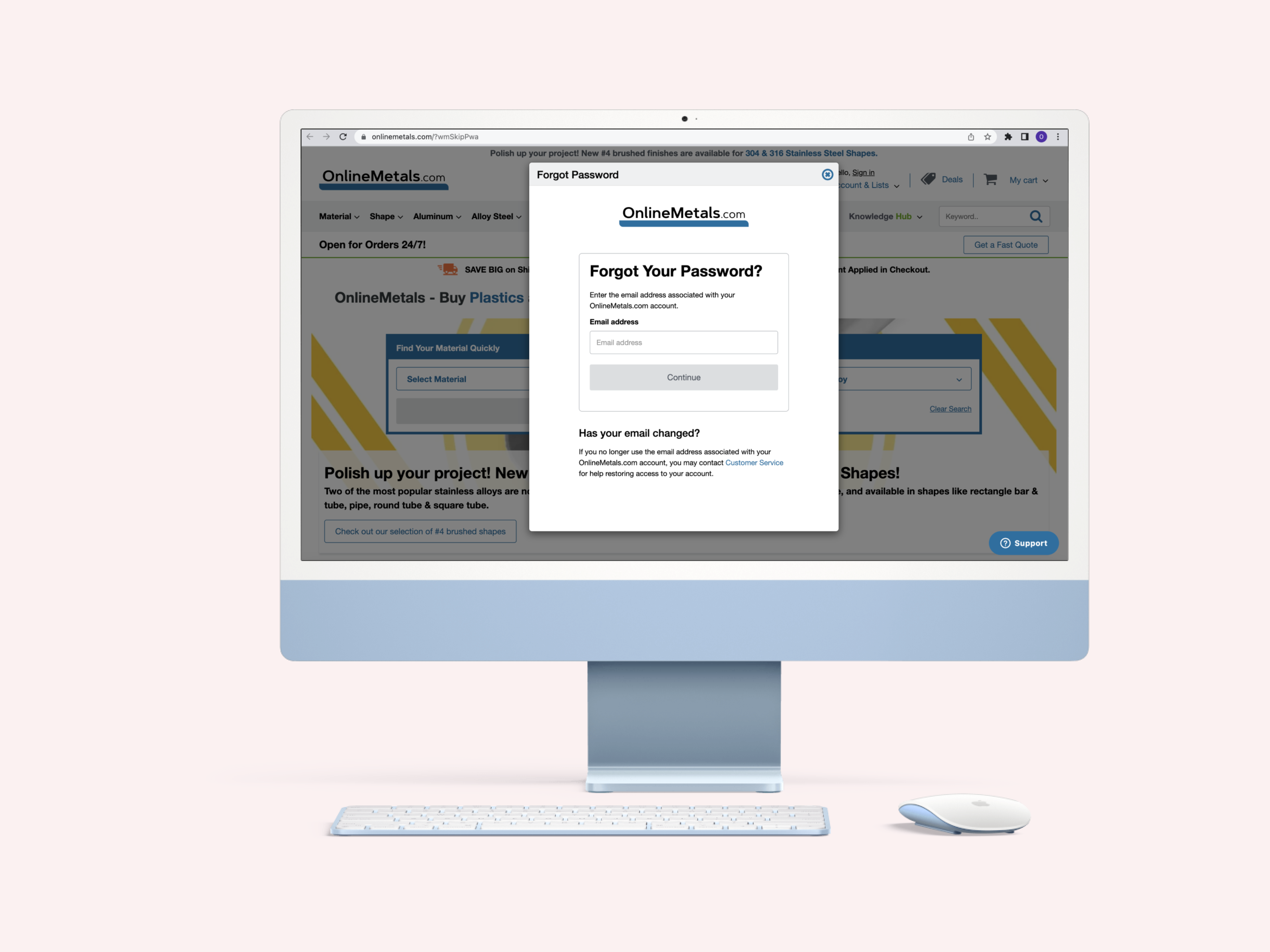
As a team, we defined and created design & dev documentation templates to facilitate consistency with communication and handoff. (Again, long before Dev Mode annotations & component documentation were Figma features - love Figma for making today's job easier here, haha!)


See a demo of examples of my design documentation here:
As we developed this experience, I created custom User Flows & Sitemap in Figma to help visually communicate the product information architecture and desired functionality when users took specific actions along their journey.
We used these flows for communication both within the design team (to help identify necessary wireframes in the user experience) as well as with the execution team to help articulate the design flows & functionality.


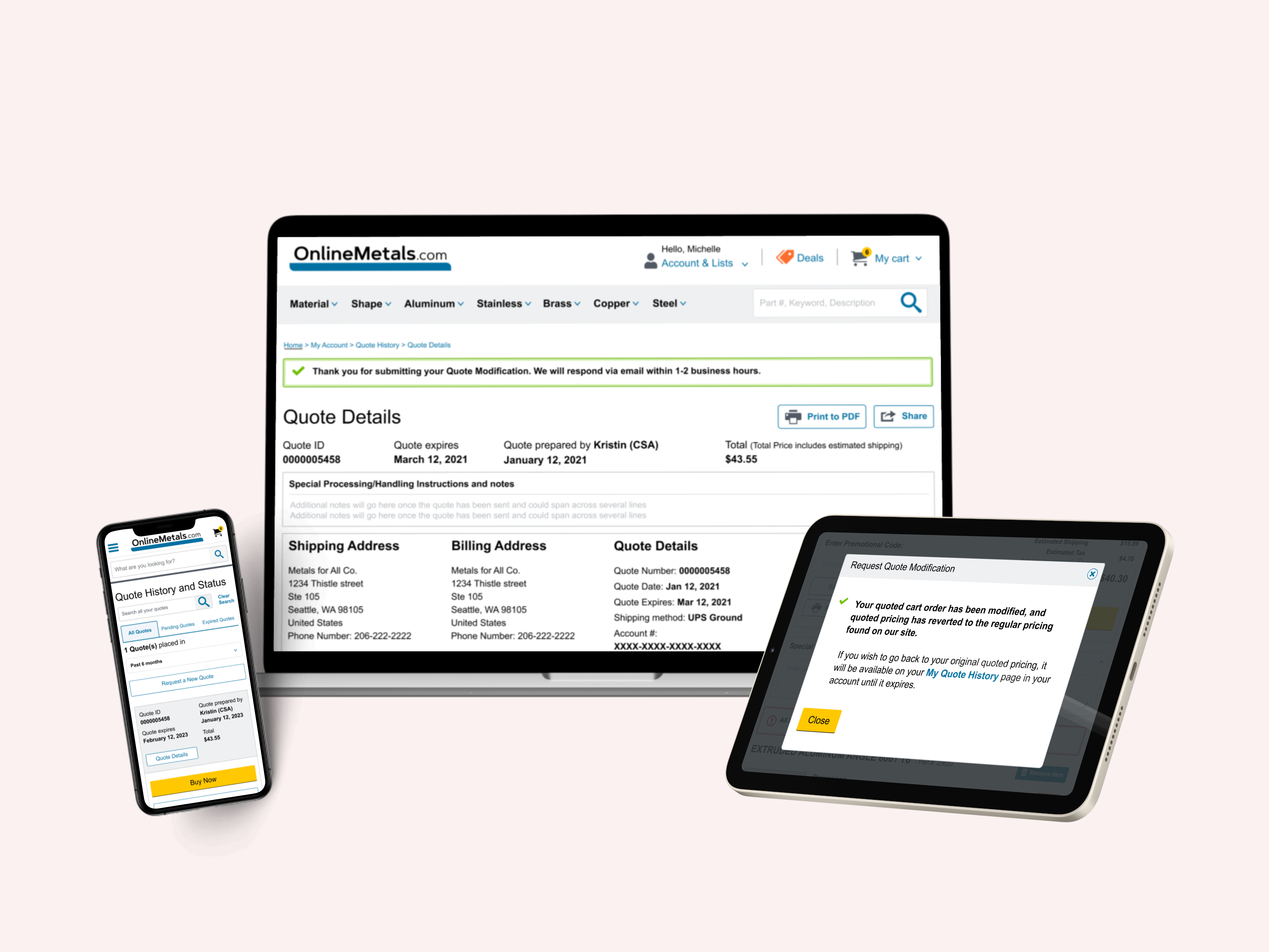
As we created responsive designs for the different Customer, Account Admin & Global Admin flows in this experience, we collaborated closely with the devs, making updates at the component level and updating the design system as needed as functionality became flushed out from the development end. I also created several interactive prototypes to communicate intricate interactions & behavior to the devs.
As this project unfortunately did not have the budget or timeline for in-depth user research, I primarily leveraged secondary research to gather inspiration on familiar design patterns & interactions that Notified's competitors and other event platforms use to help inform my direction on features such as filters, search autocomplete and more.


Because the data, insights & management tools of our B2B experiences were quite detailed, we touched base with our stakeholders from Notified, and together decided the best devices to view and manage the Admin experiences would be Desktop & Tablet.
Since our B2C experience was less complex however, and customers would be likely to interact with events on the go, the Customer experience was decided to be offered across ALL device types, including Mobile.

In addition to creating responsive designs for the different B2B/B2C experiences, I also designed visual layout options for each of these - the most complex being our Global Admin & Account Admin experiences, which offered 3 different views: List, Table & Grid.

Dashboard design & data visualization was a huge focus for Notified Experience 365, given the business goal of providing Account & Global Admins the tools for capturing & comparing important insights such as engagement, sessions, registration & active users.


“Jennergy provided us not only with the strategic user experience designs for our long term product development, but has also assisted in unique and client specific experiences to match their unique needs. Our experience with Jennergy is appreciating and celebrating their culture of “Yes, and…” when asked for crazy, hare-brained ideas to stretch the limits of our developer’s capabilities. They enjoy their work and they are excellent at everything they do! They adjusted to our rhythm of business and adapted our tools for technology and still presented themselves as experts in their field…easily fitting into our established teams. As a result of our partnership over the course of this past year, our software was recognized as a technology leader in our field and grew our business over 300% from the previous year. We appreciate everything Jennergy has done and we look forward to our continued journey!”
- JOSH VANDE KROL, NOTIFIED

Check out the experiences my team designed for Notified here:
"Amy has been a great asset to our UX/UI team - she brings innovative ideas that continues to enhance our projects with her creativity and user-centric approach. Her willingness to help, technical skills and positive outlook greatly facilitate smooth collaboration with our clients and team. Thanks Amy for being so terrific!"
- JENN HILL, JENNERGY