

After analyzing the survey, I put together Desktop & Mobile User Flows of the Chat & Phone experiences to better identify touchpoints, areas of friction along the user journey & opportunities to implement improvements based on customer feedback.


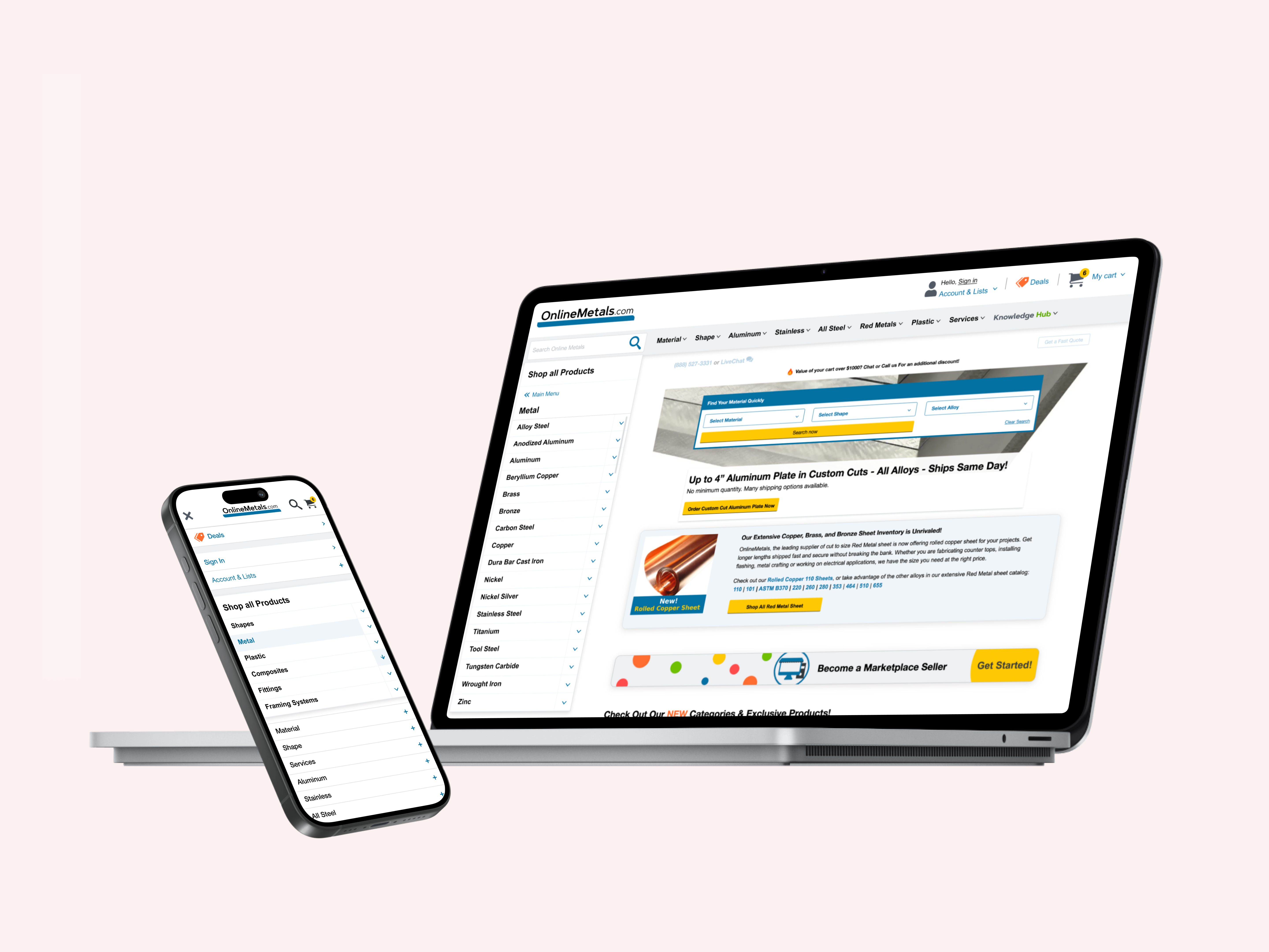
Inconsistencies Between Desktop/Mobile Experiences
- Desktop experience is far more optimized & accessible than Mobile, and has more touchpoints.
- Easy-to-find Desktop touchpoints for both live chat & phone (sticky header, "Contact Us" page, Chatbot icon)
- Inconsistencies with icon usage: Desktop uses "chat bubble" icon for live chat, while Mobile uses "?" icon.
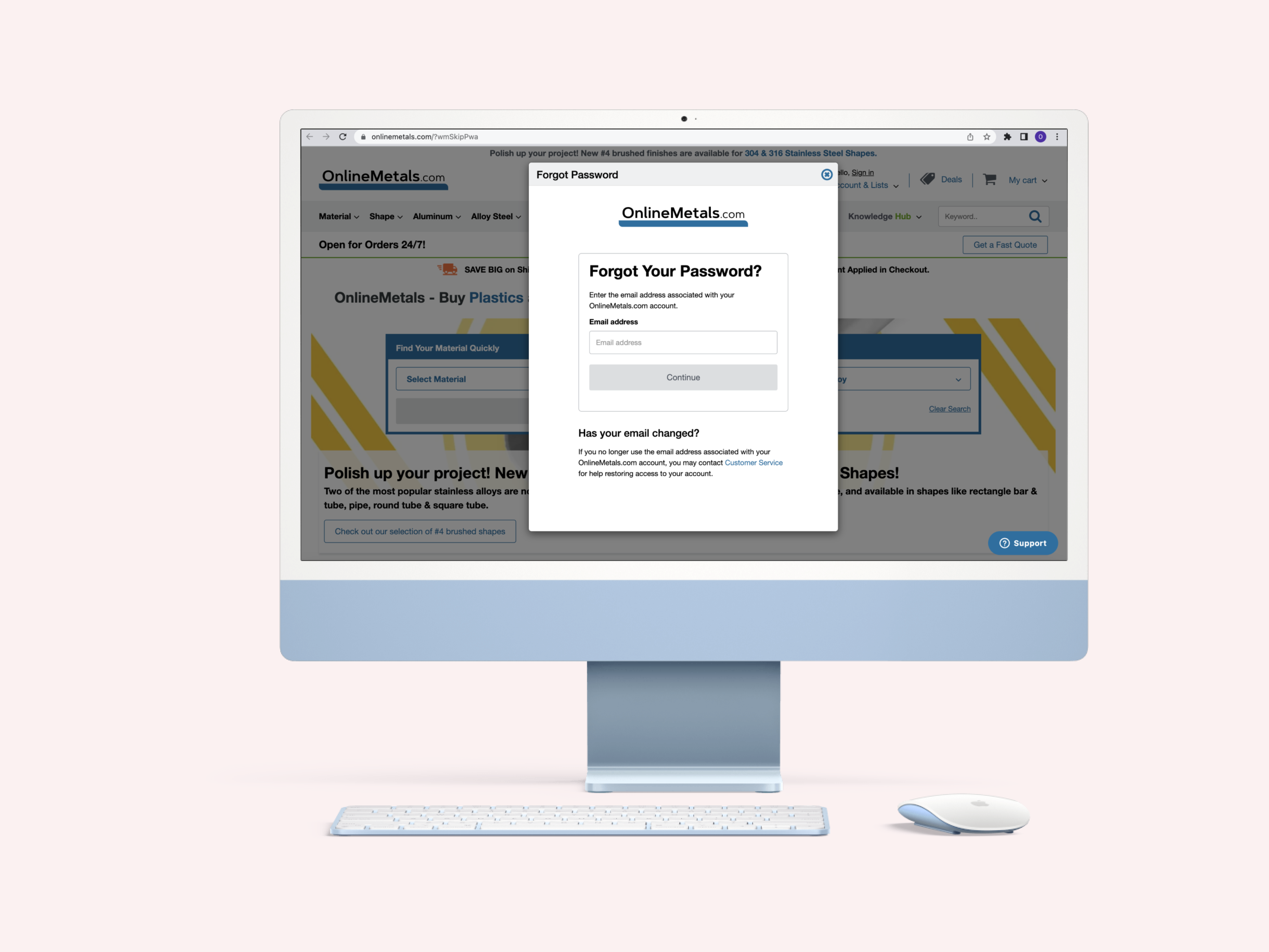
- Phone # is hard to find/hidden on Mobile (only upon tapping search icon, where it appears beneath expanded search, and also discoverable via the 'Contact Us' page (only accessible via opening the hamburger menu, tapping 'Account & Lists' to open). Additionally, the 'Contact Us' page URL via the Mobile Hamburger Menu is broken.)
- Chat is only accessible in Mobile via the "?" icon.