

Context
This project came about through a business desire to make Online Metals' extensive catalogue of materials, products and services more discoverable, and was informed through past customer research, surveys, card sorts and user testing, which revealed that many customers were unaware of many of the services & products offered at Online Metals, and often struggled to easily find what they were looking for with our current navigation.
While in the past we had approached this with incremental improvements to how the top navigation & material quick selector menus were organized, it was clear that we needed a new scalable solution that would support our continuously expanding catalogue and be easy & intuitive for our customers to navigate.
Informed by customer feedback expressing interest and familiarity with side navigation patterns, we had our sights set on challenging/validating this direction.
My Process

Research:
Competitor Benchmarking & Inspiration
To gain inspiration on different side navigation treatments & functionality, I conducted some competitor benchmarking and gathered some navigation ideas from other sites.
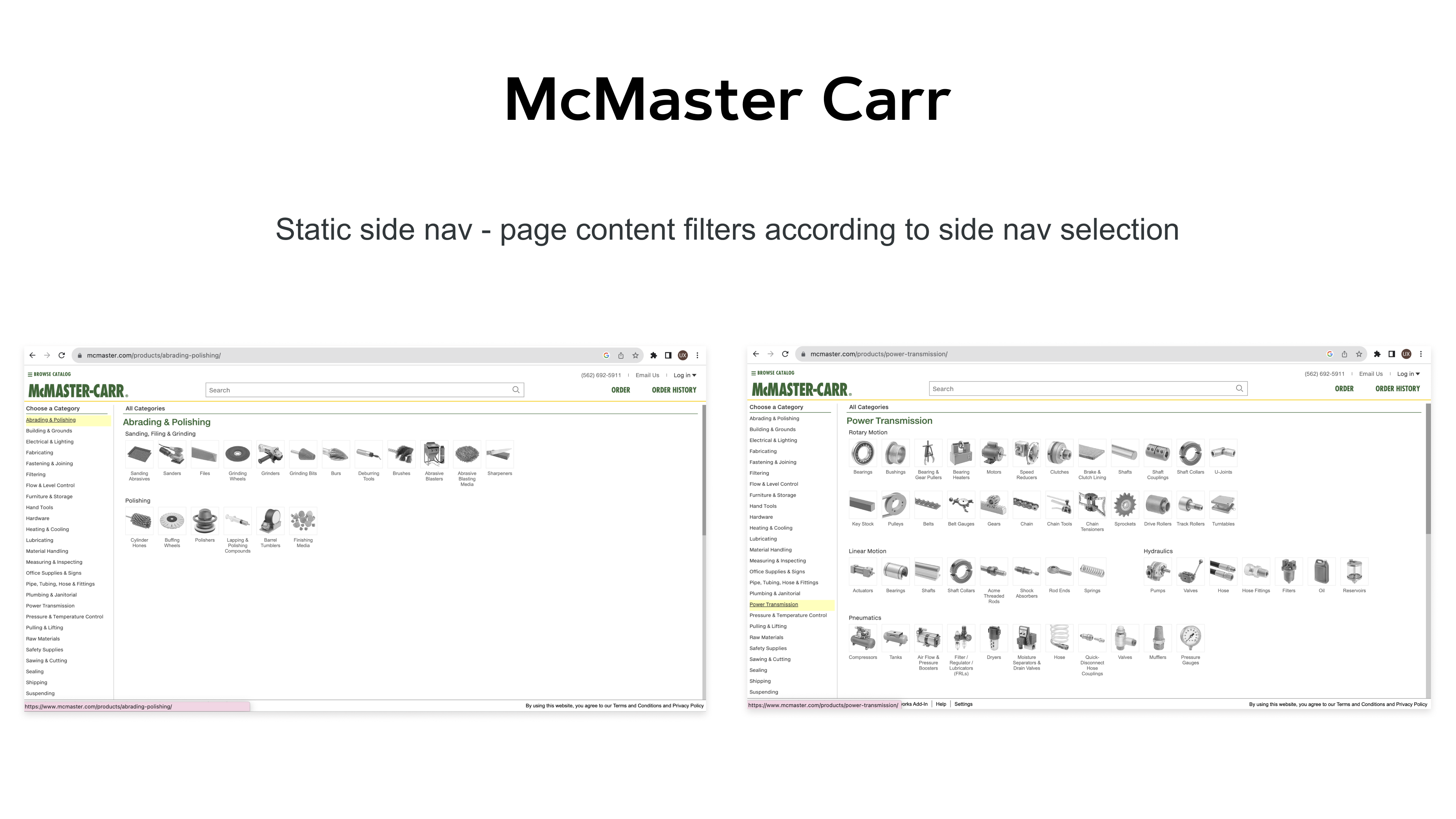
I was particularly inspired by McMaster Carr's & New Egg's side navs, and how Best Buy's clear, expandable nav was presented.
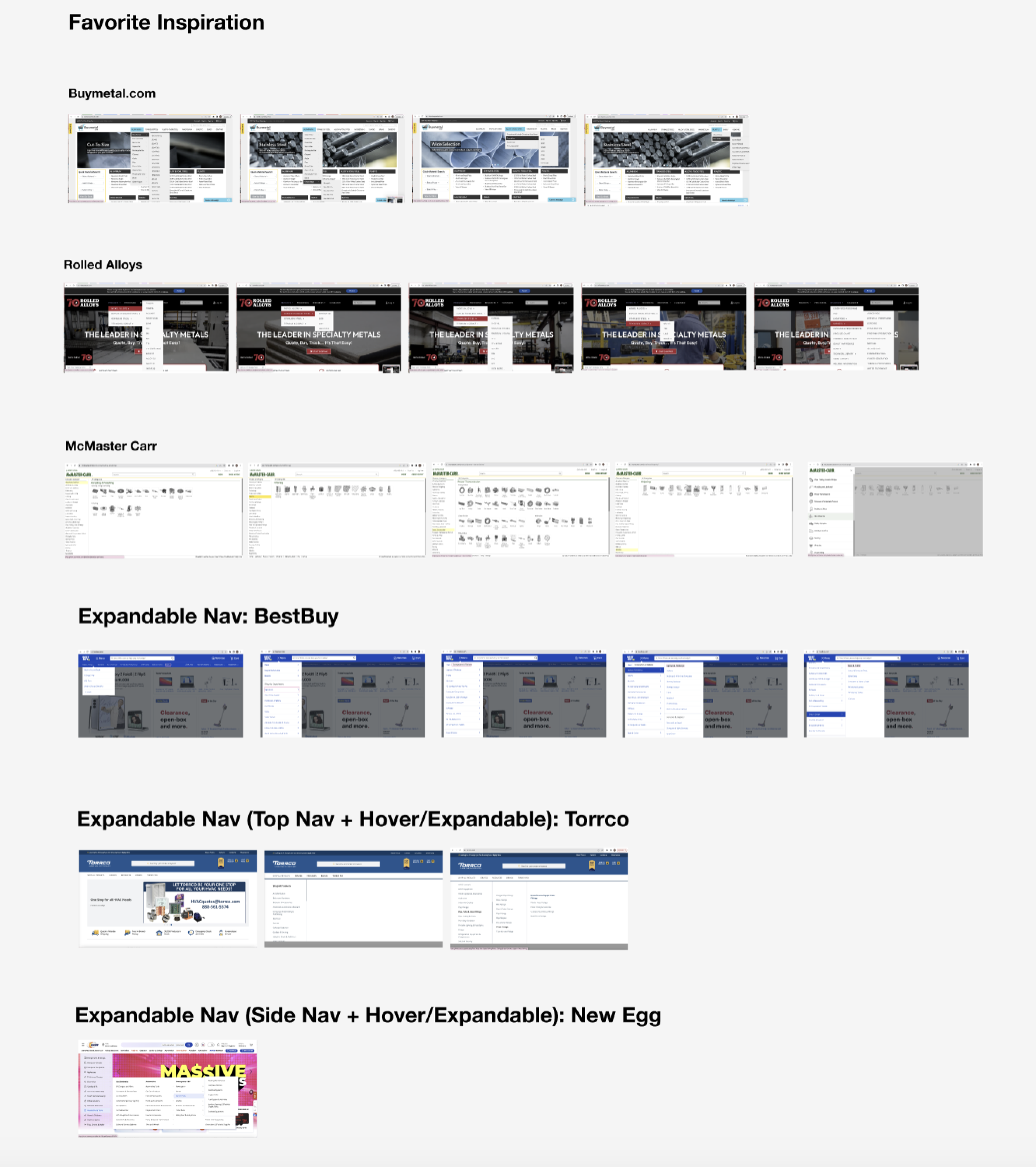
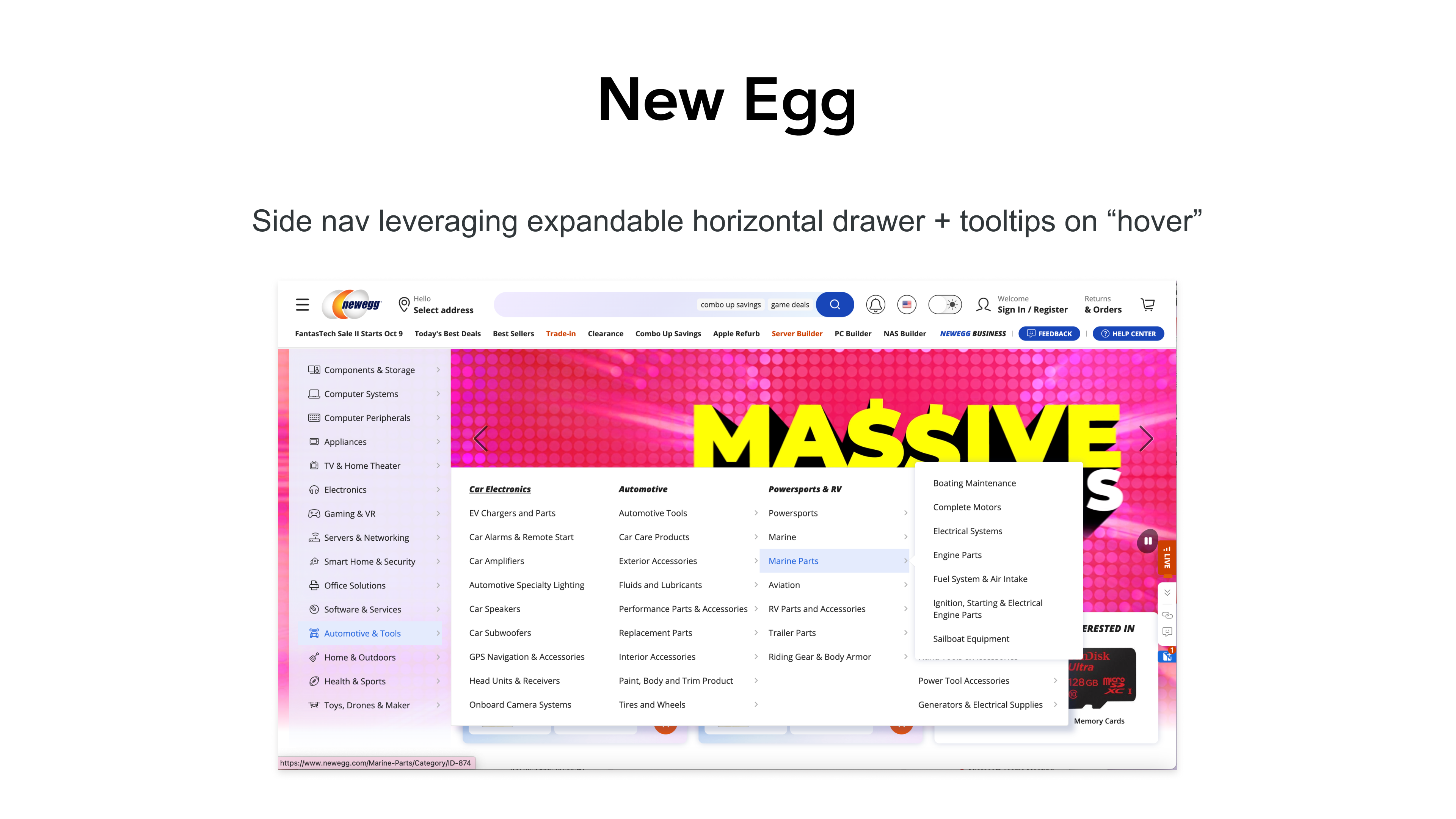
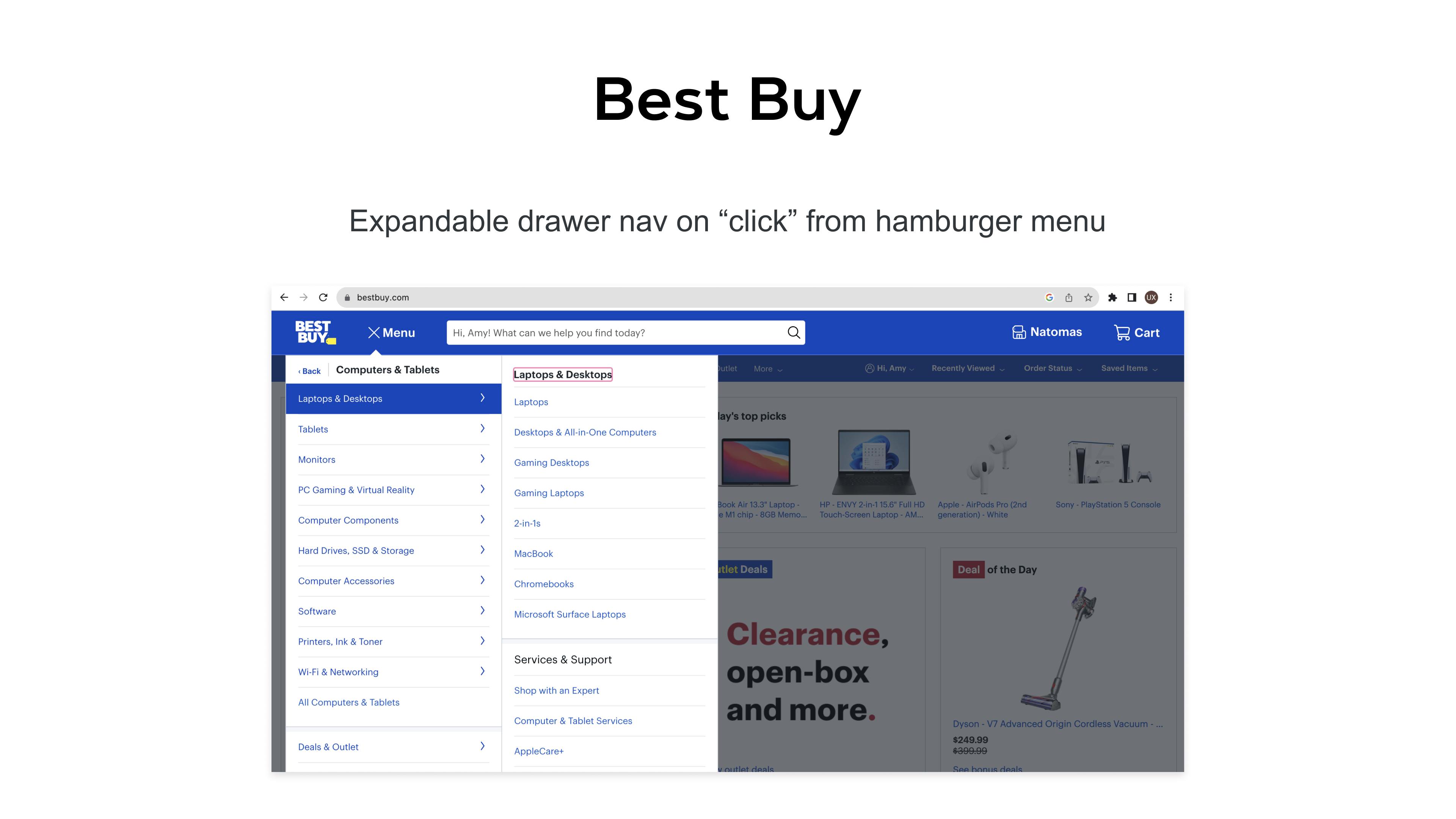
I scheduled a kickoff meeting to share my inspiration with the Merchandizing & Product team leads to get aligned on the design direction I would pursue, get their input on these different ideas, and to understand the desired navigation tier architecture to help inform and inspire the upcoming design work and functionality.
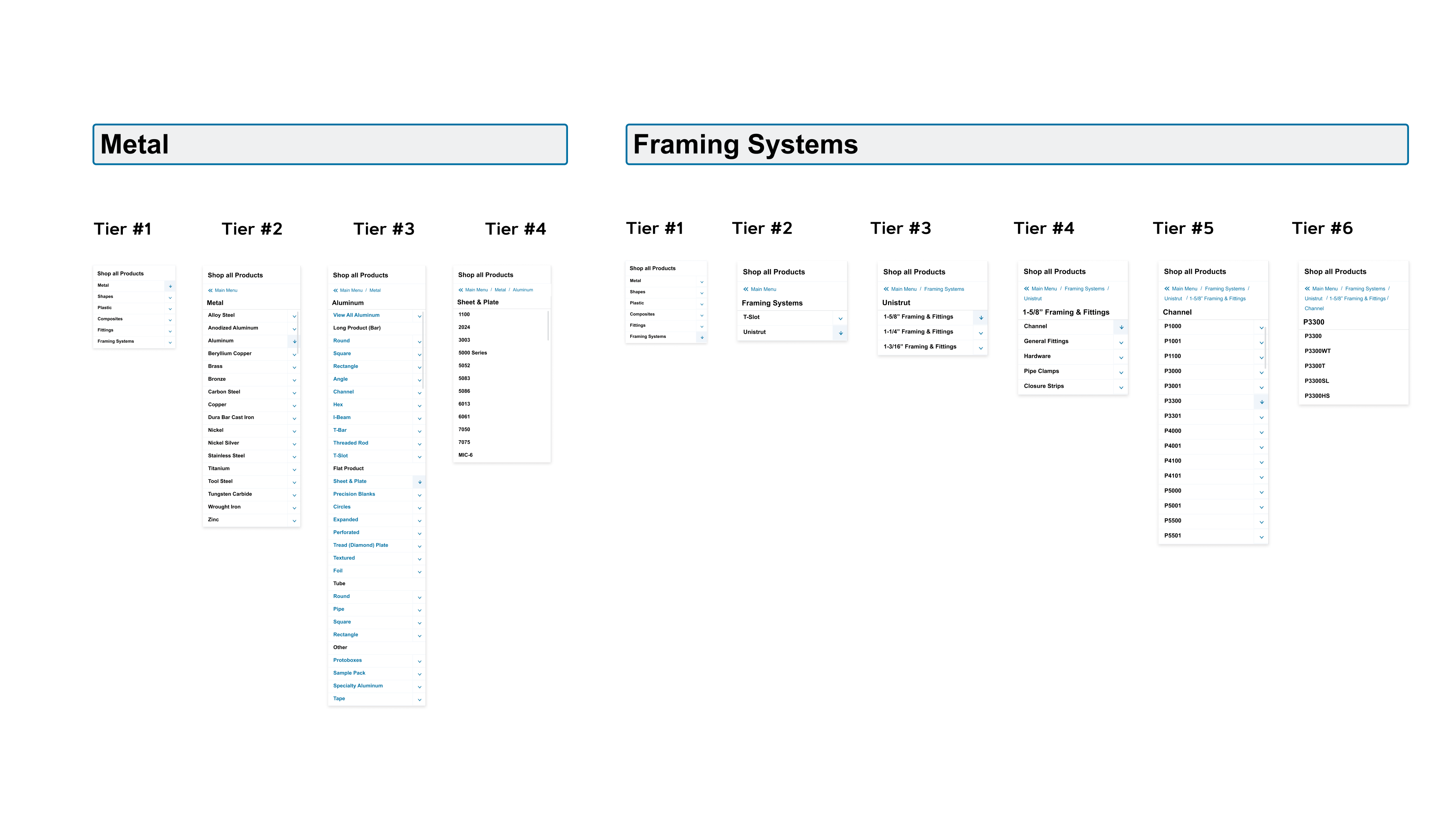
Information Architecture
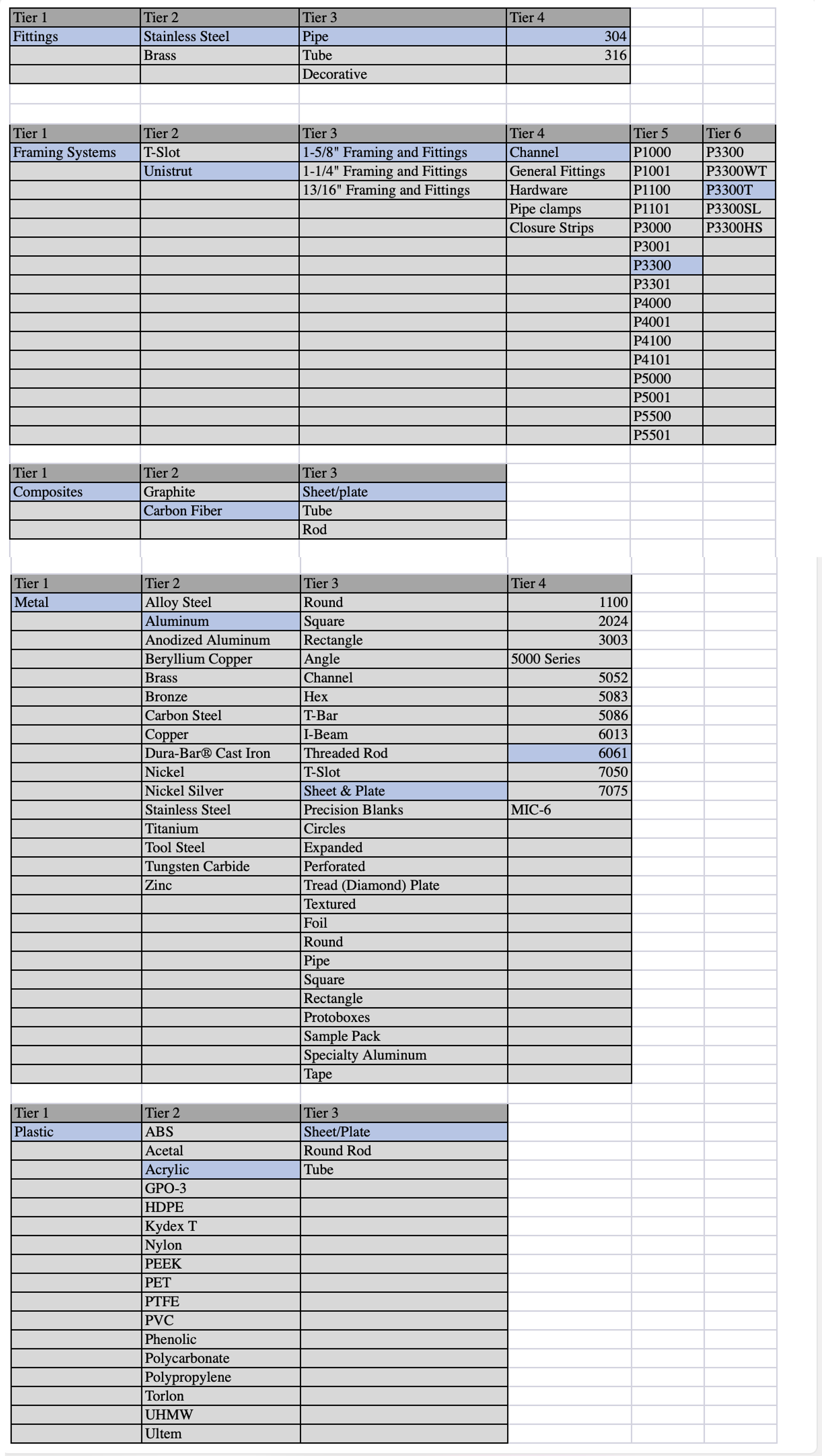
Design Ideation of Tier Architecture
Ideation:
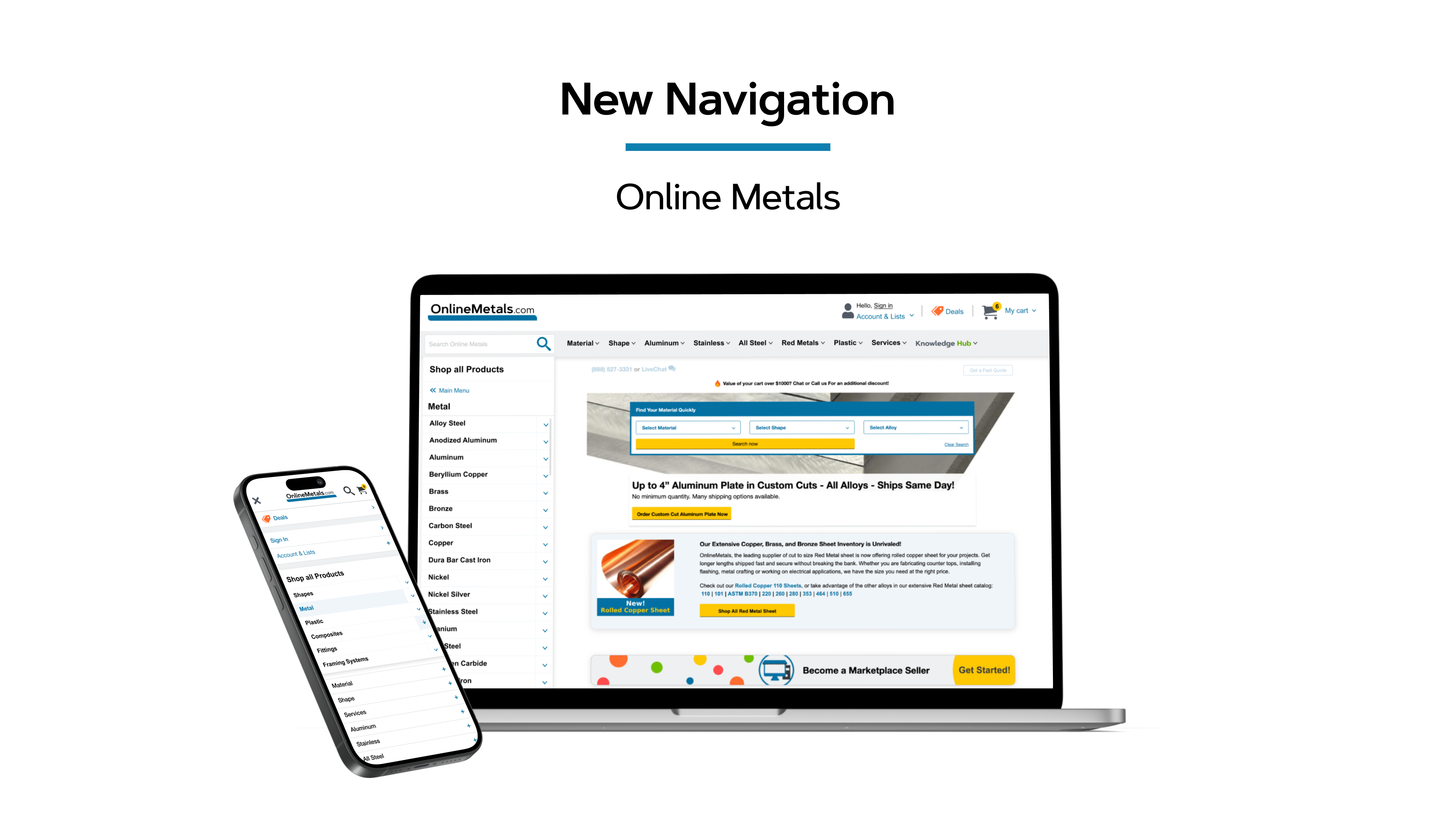
New Side Nav, Top Nav Menu & Search Bar
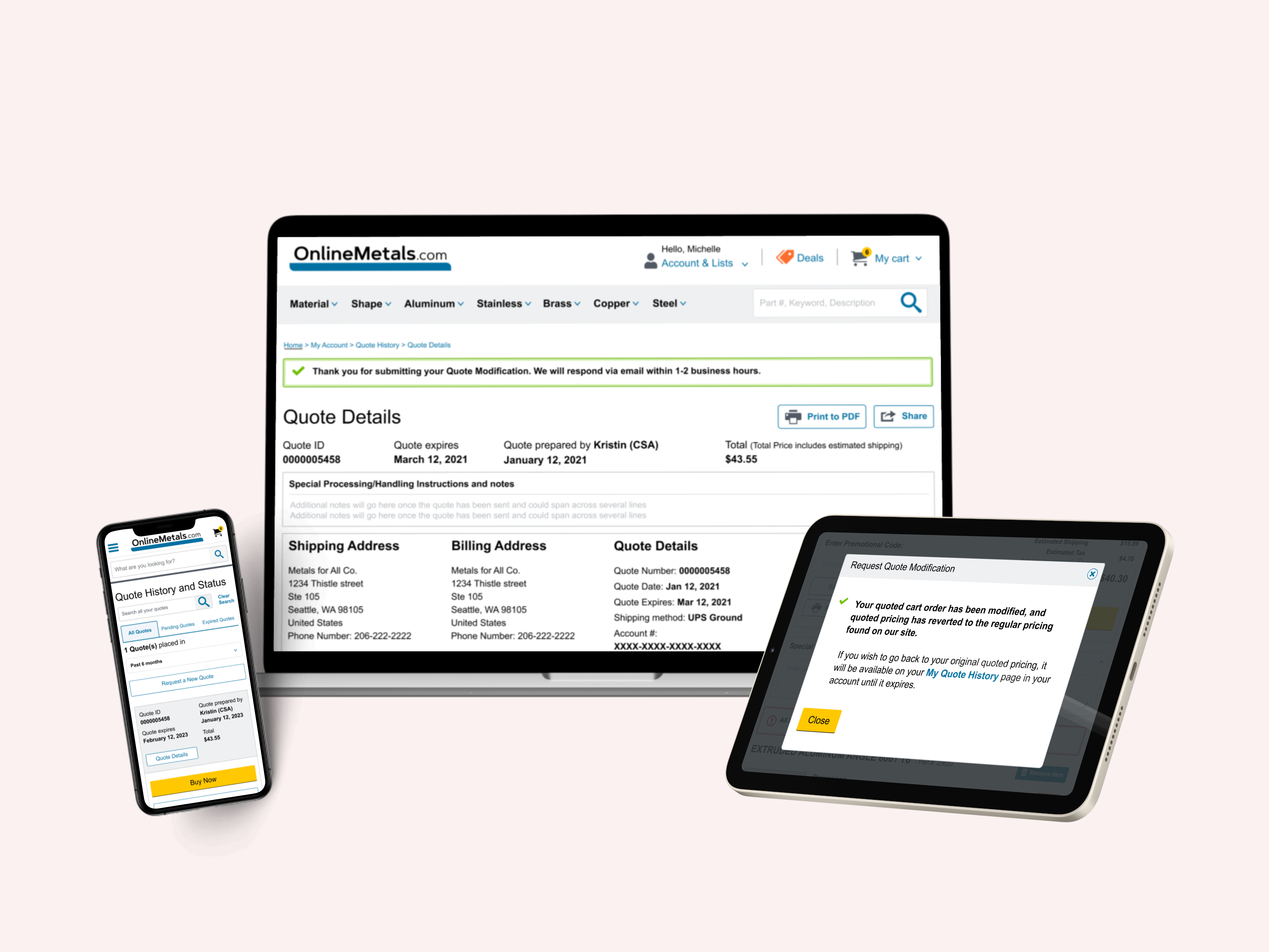
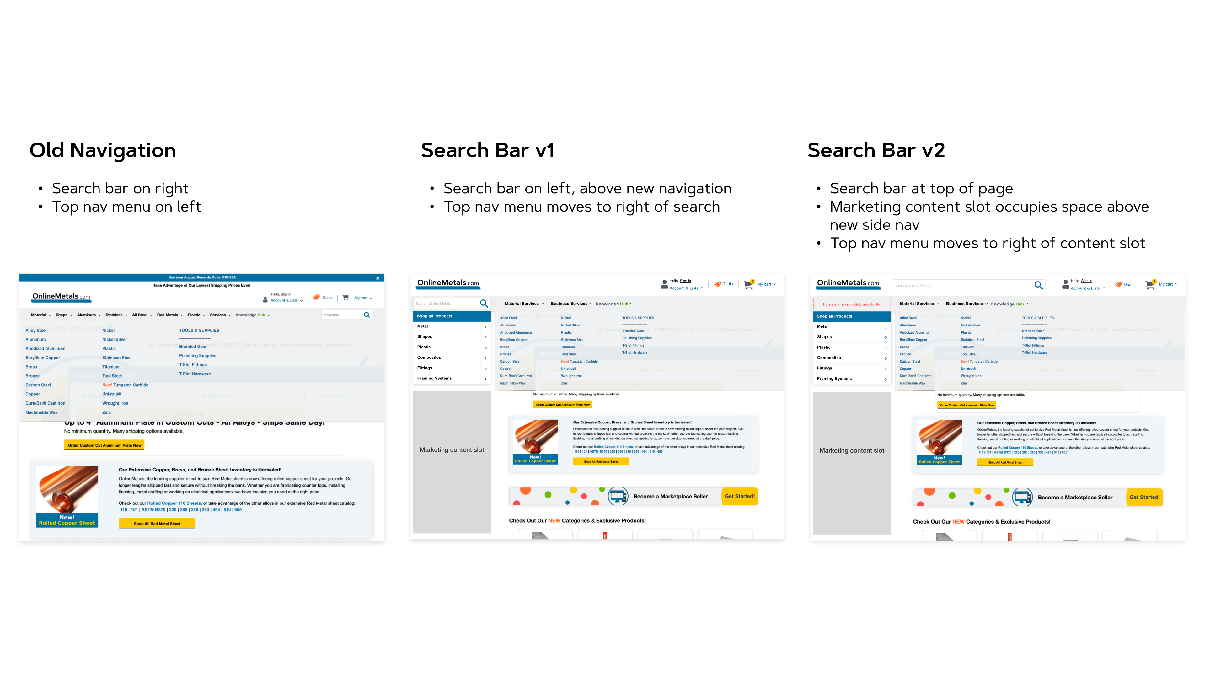
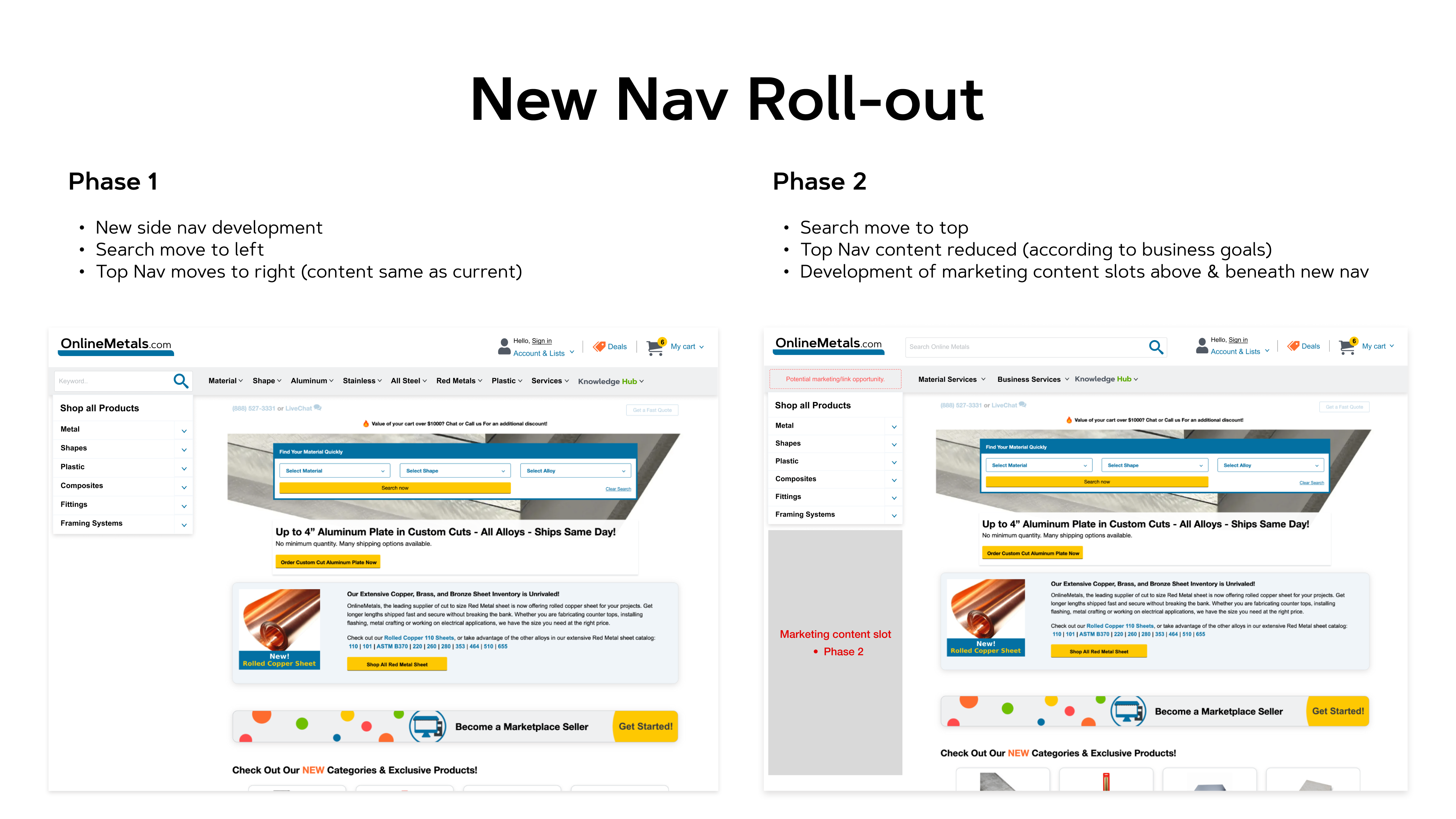
Our current location for the top navigation menu was on the left, with the search bar on the right, and with the new left side navigation design, this presented a problem when the top nav was on hover, as the dropdown content would obscure the left side navigation, so I mocked up some potential solutions to change the top nav & search location and shift the top nav to the right, so that when a user hovered on the top nav menu, it would not interfere with their searching ability from the new side navigation.
I was very intrigued to leverage a combination of the ideas I was inspired with during competitor benchmarking - knowing that our customers regularly express a strong dislike for hover menus, I wanted to explore a static side navigation that would not cover the page, but that would be both clickable (matching our current responsive functionality) & "drill-able", similar to the expandable drawer navs on the Best Buy & New Egg websites. As our users are very trained to navigate via breadcrumbs on our website, I also wanted to incorporate breadcrumbs into the side navigation as a way to navigate back through the experience. Finally, I was very interested in having the page content dynamically reflect the side navigation journey, similar to McMaster Carr's website.
Upon collaborating with our developers in the early stage of the design process to explore the technical feasibility of my ideas, we learned that while the clickable + drill-able side nav functionality/interactions, breadcrumbs, search bar location changes & new marketing content slots would be possible, unfortunately our desire to have the page content & side nav match experiences was not feasible, due to technical constraints & limitations from the backend. This meant that when a user navigated from the side nav to specific pages, the side nav would automatically reset to its default state showcasing the Level 1 menu.
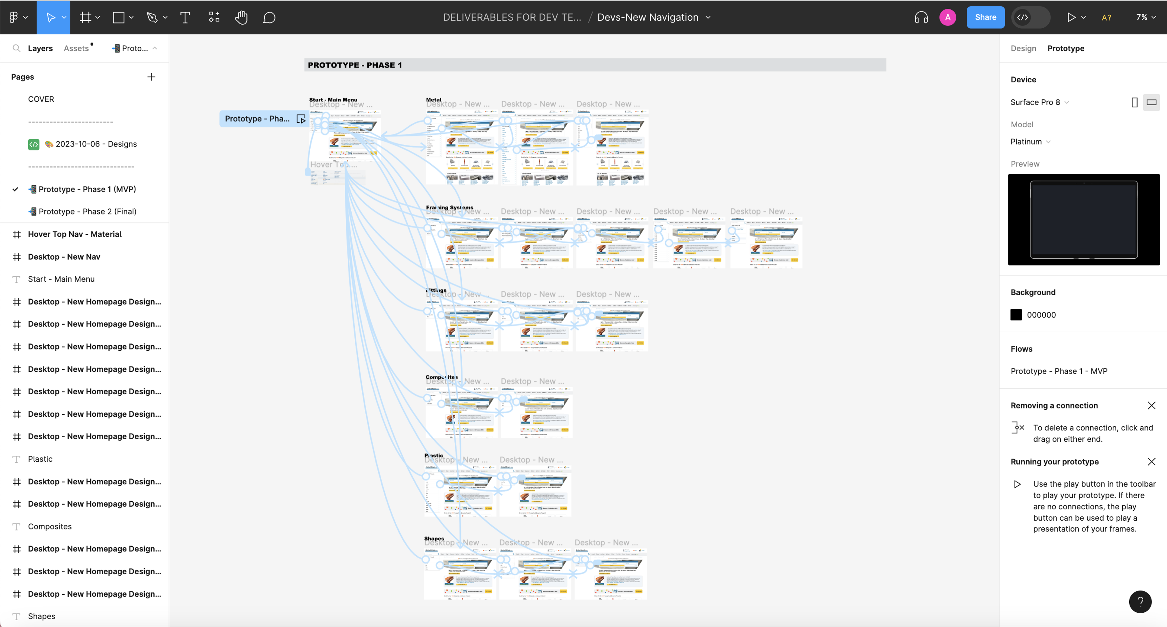
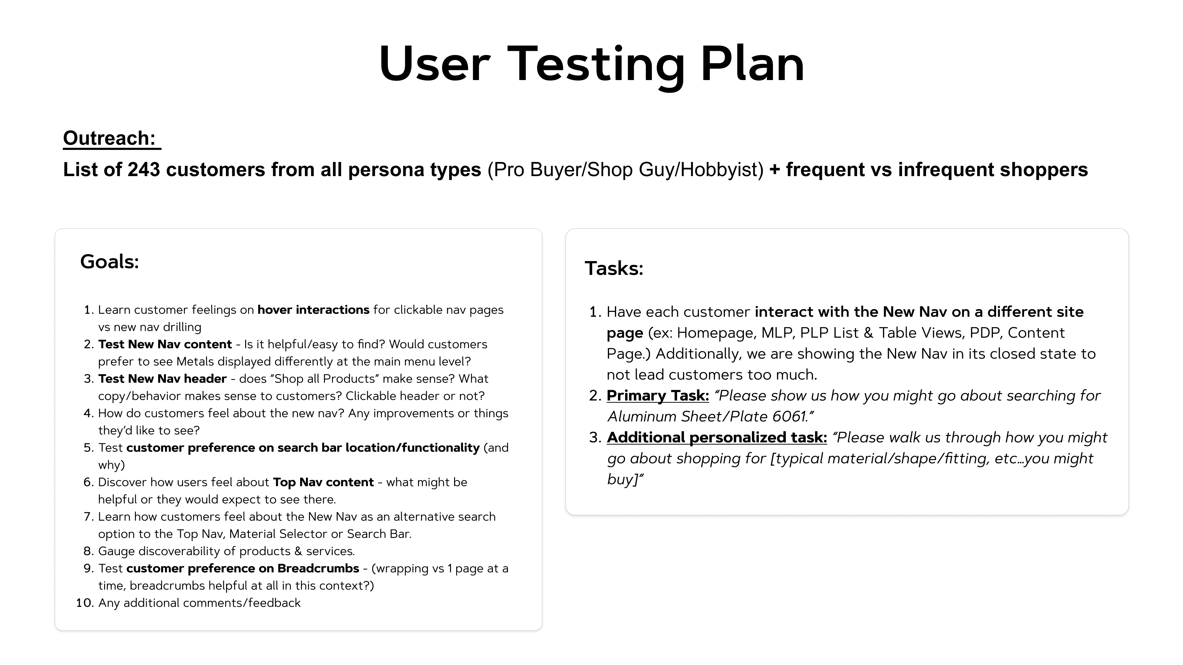
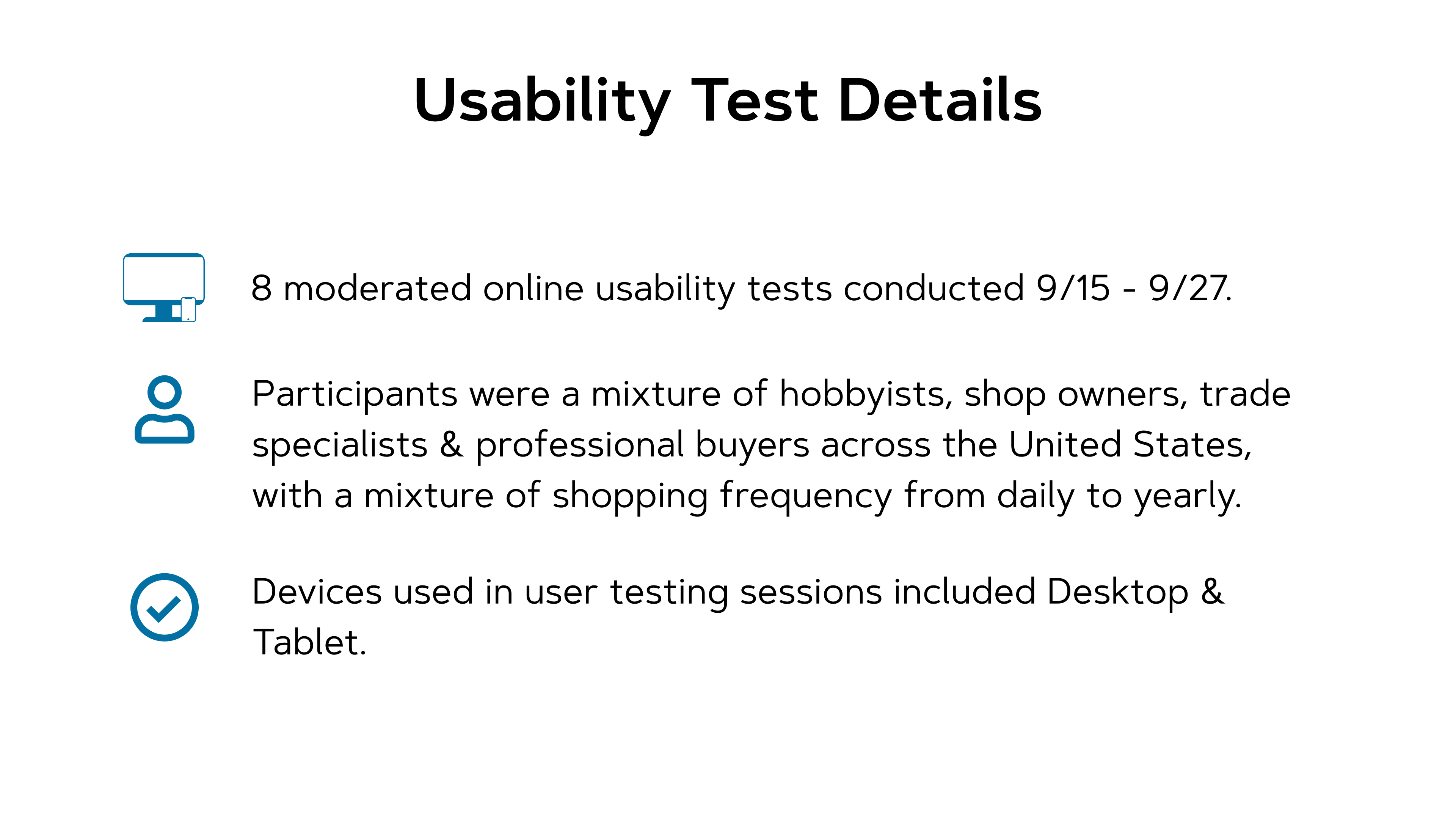
Informed by the technical possibilities & limitations, I prepared an interactive prototype & testing plan for the first round of user testing.'
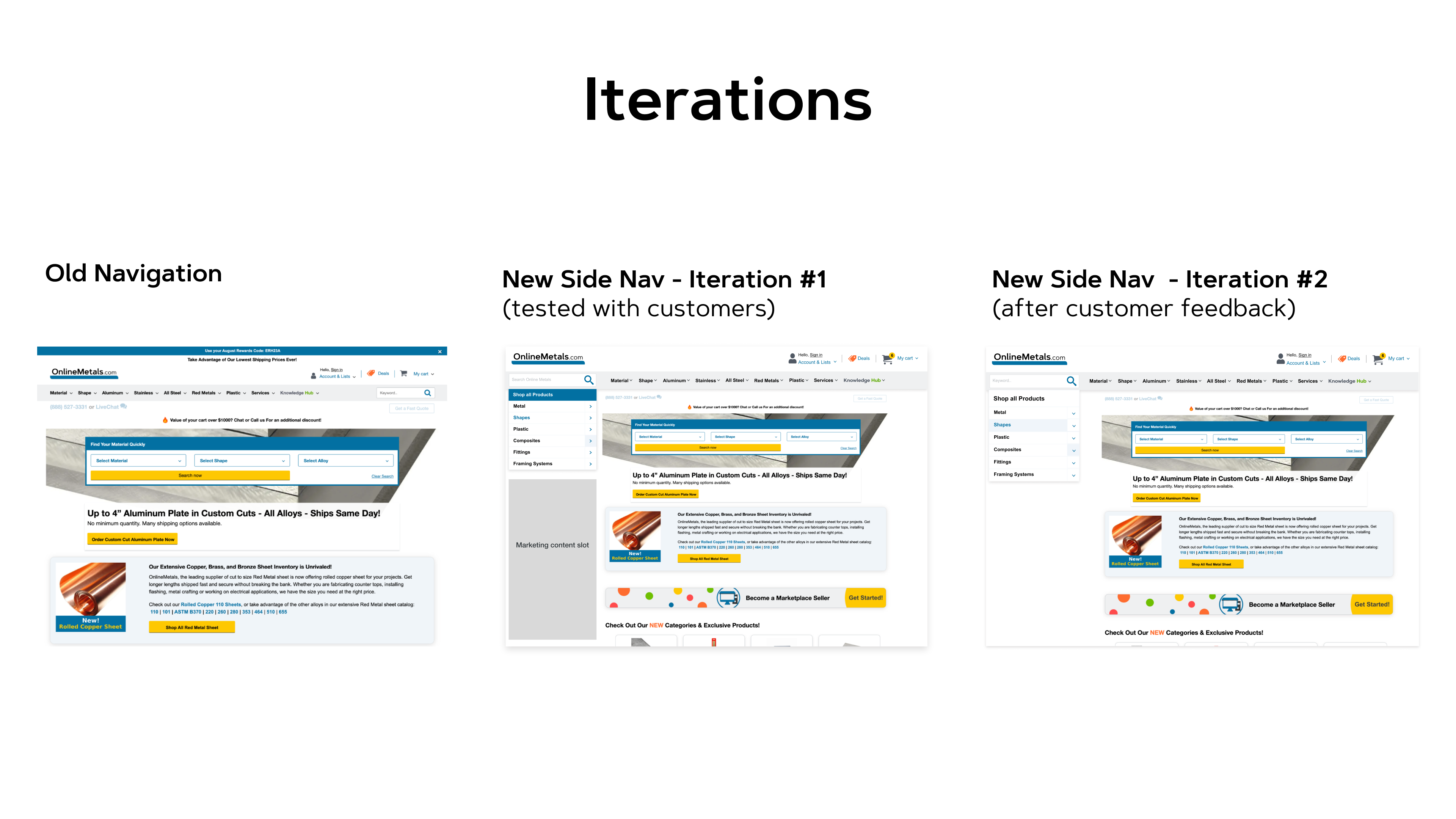
Prototype for User Testing Round 1:
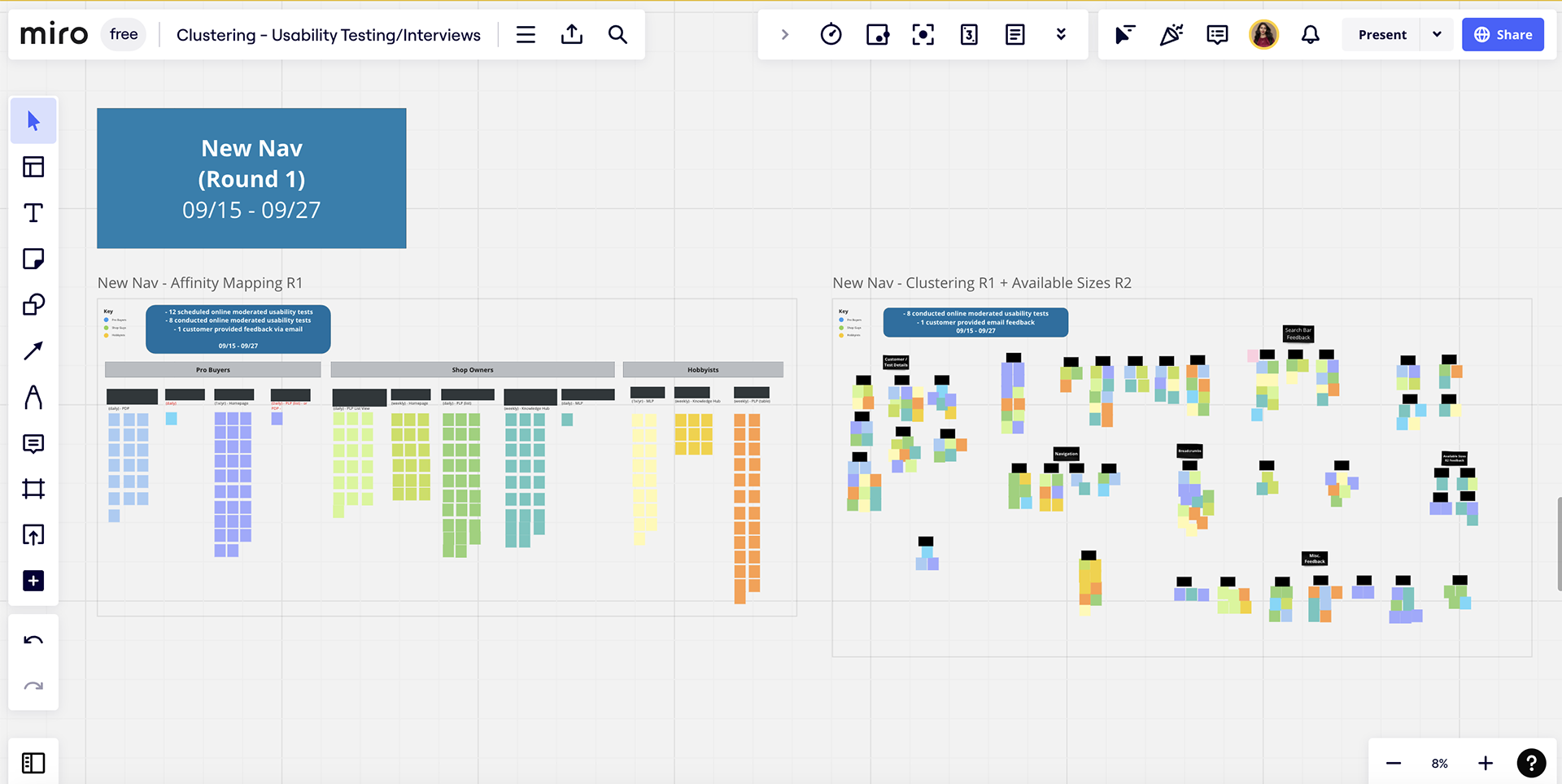
Affinity Mapping/Clustering
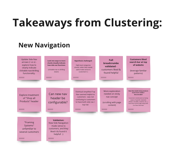
Validation:
- Customers were excited about this new side navigation and how it would help simplify their shopping experience.
- New navigation helped make many products & services more discoverable right away!
- Customers found Breadcrumbs in the side navigation a very helpful way for them to navigate dynamically throughout their shopping experience.
Challenged business hypothesis:
"Customers might be confused with where to find materials in a closed side navigation - an 'open' Metal category as a default state might be more helpful."
Customers actually found the closed side navigation quite intuitive, and demonstrated how they would use it to narrow their search, starting with "Metal", and narrowing down by shape, alloy, etc...
Feedback requiring action:
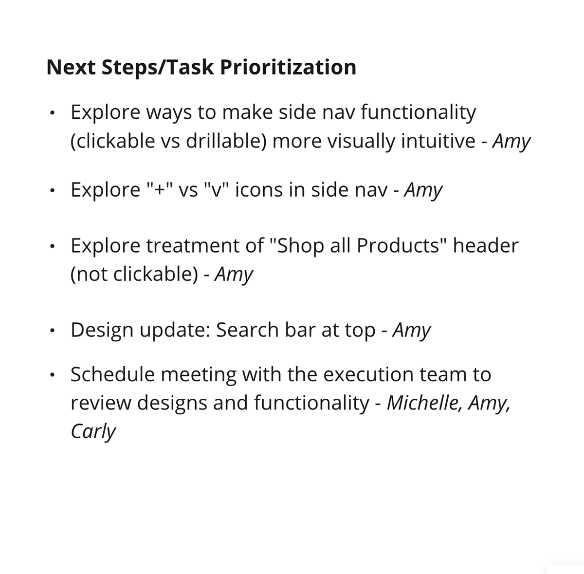
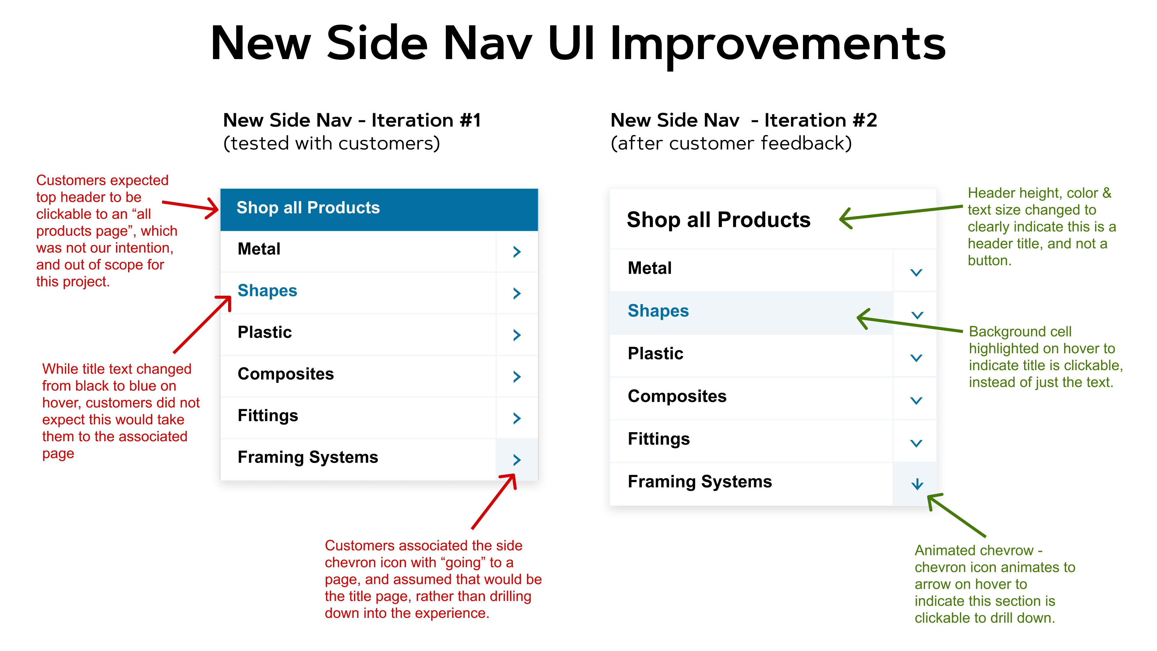
1. Functionality of the clickable nav vs. drillable nav was not always intuitive and clear to customers. (I wanted to iterate on this and explore new UI treatments and interactions to clearly visually communicate this functionality to customers)
2. Customers expected new nav header to be clickable (not the intention or scope of this project), and expected it might take them to an "all products" page. (not a page we currently have)
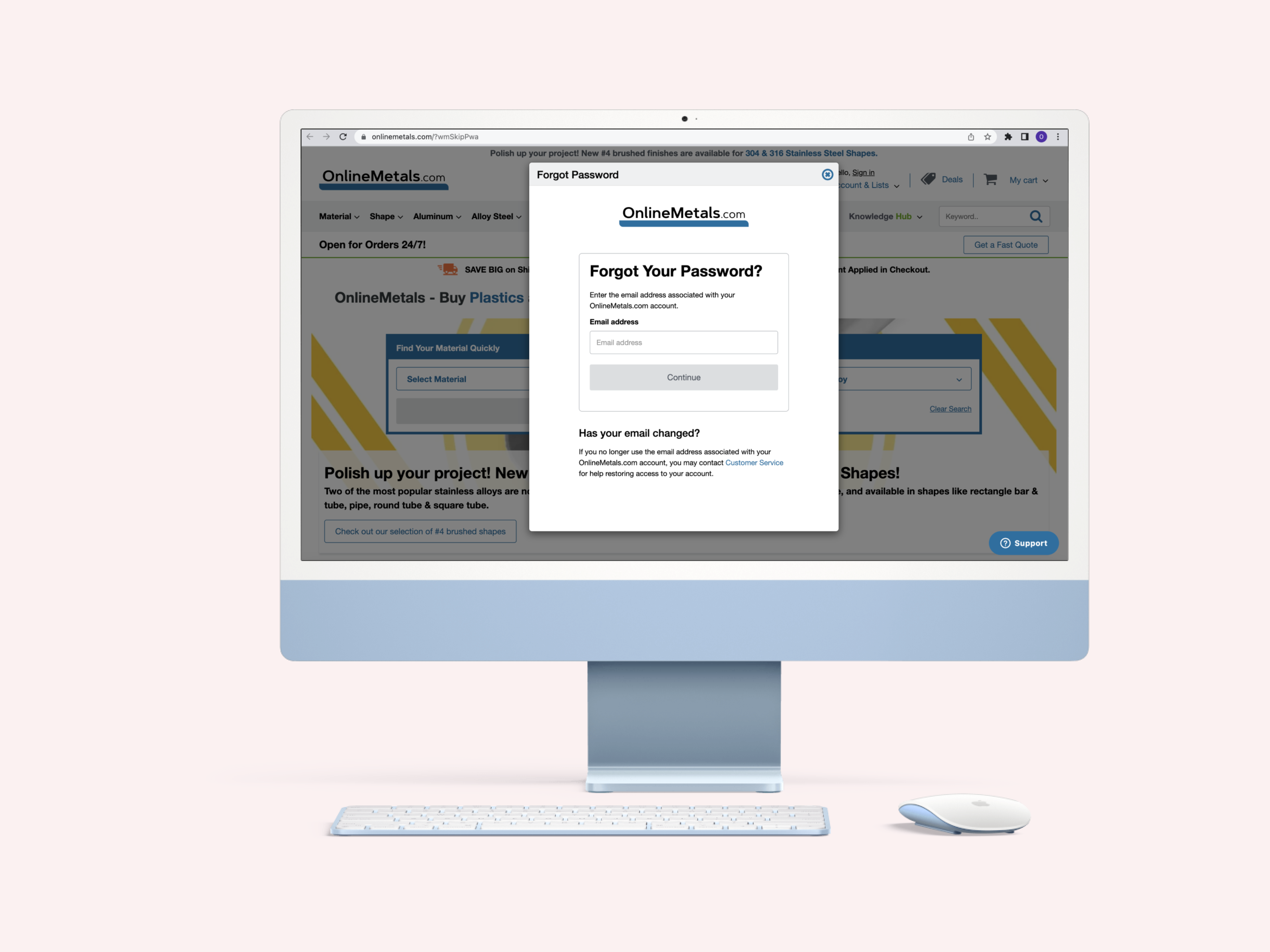
3. Customers preferred Search bar at the top of page, with second preference being on the left above the new side nav. (Because of the project scope and business timeline, we would need to separate this into 2 phases, with first moving the search bar to the left so the top nav on hover would not obscure the new side nav, and then move the search bar and develop the marketing content slots in phase 2)
I presented our research findings & design prototypes to the business at our Sprint Review and communicated our phase roll-out plan that was based on development capacity and business timeline priorities.
With the "green light" from the business on the final designs & rollout plan, I prepared a Figma dev file for handoff with responsive designs (Desktop, Tablet & Mobile Responsive & PWA) and dev annotations for the designs, interactions & phase roll-out strategy, and continued to collaborate with our execution teams throughout the development and UAT process in preparation for our Cyber Monday 2023 big release!
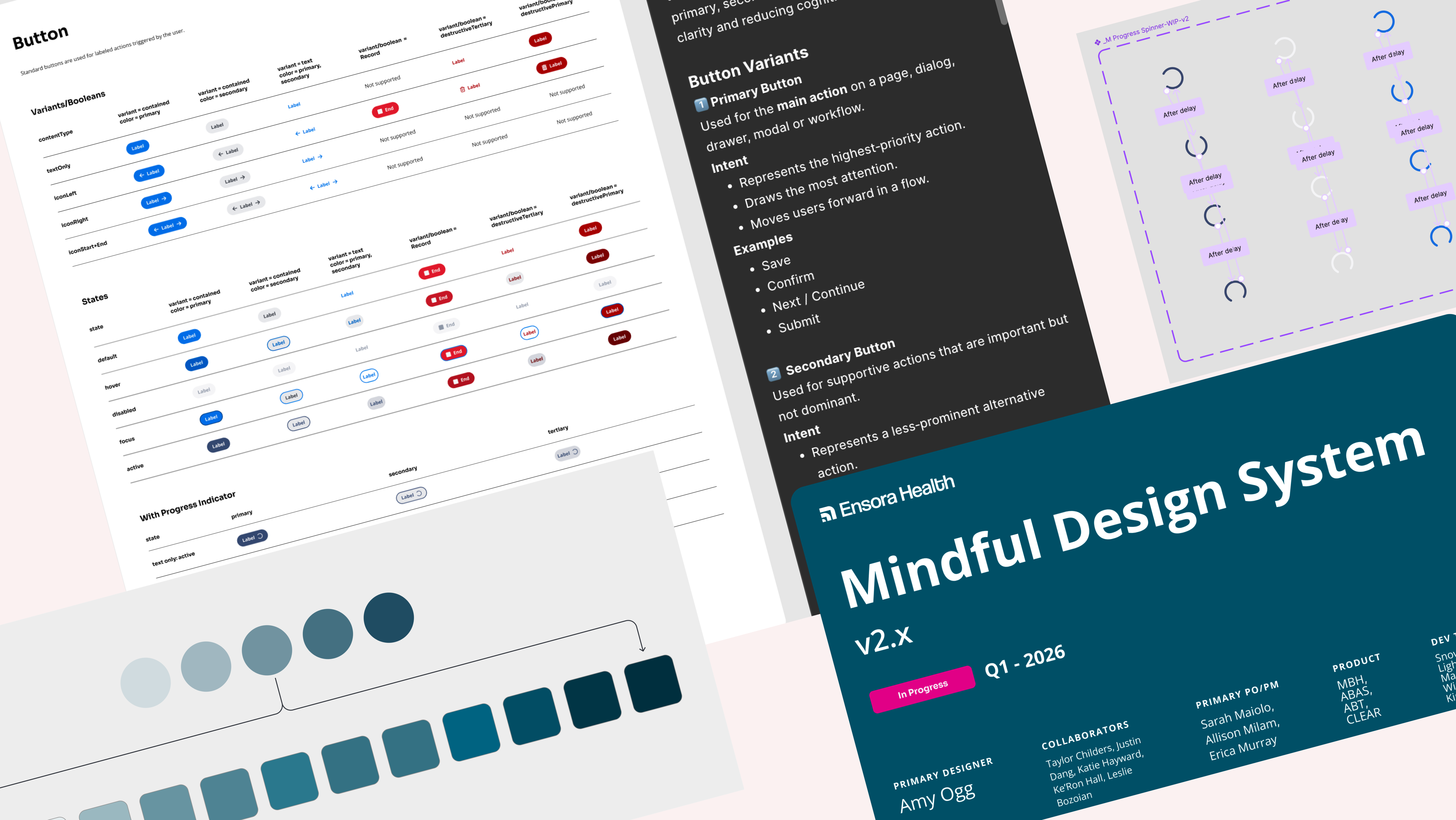
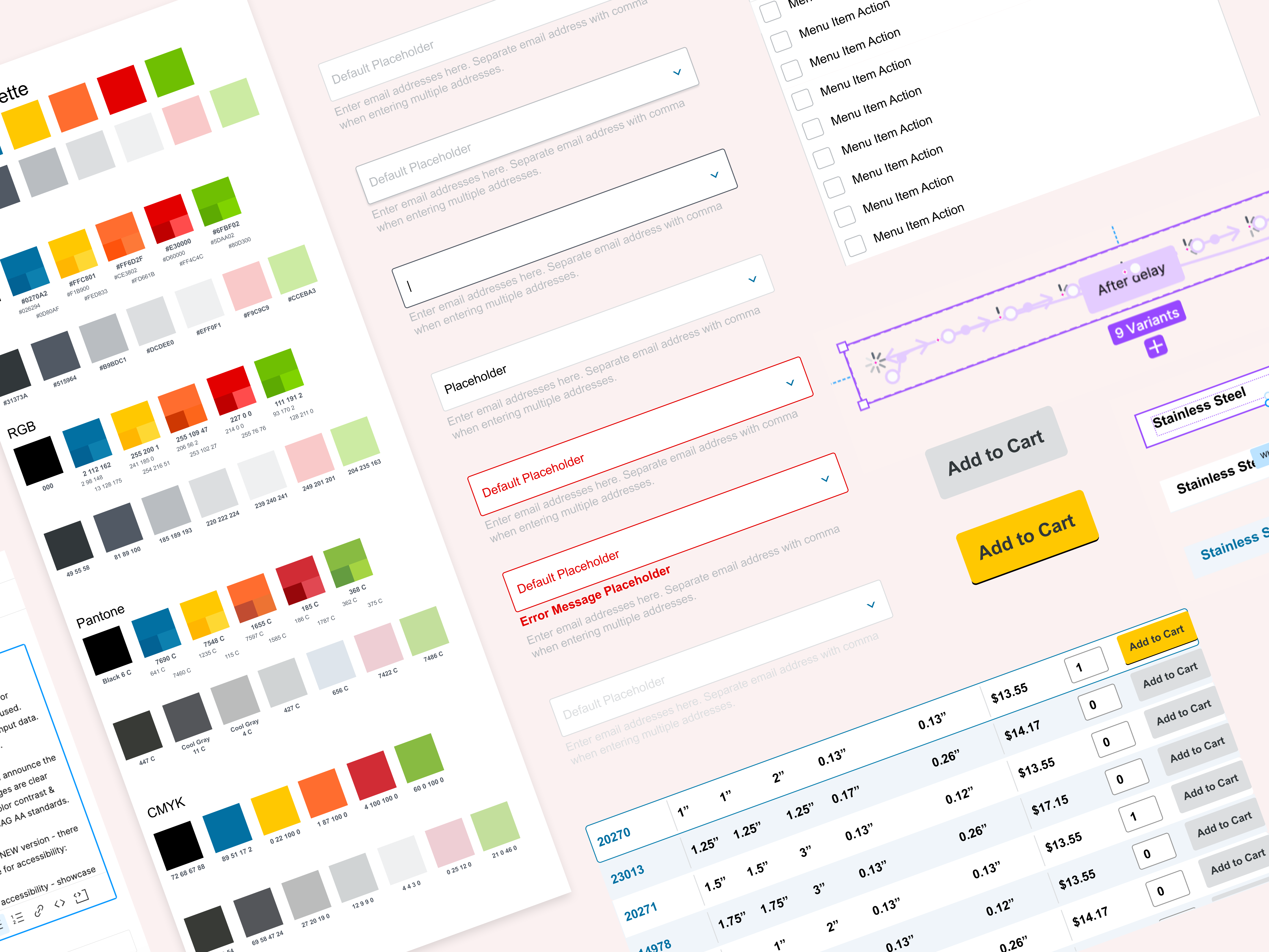
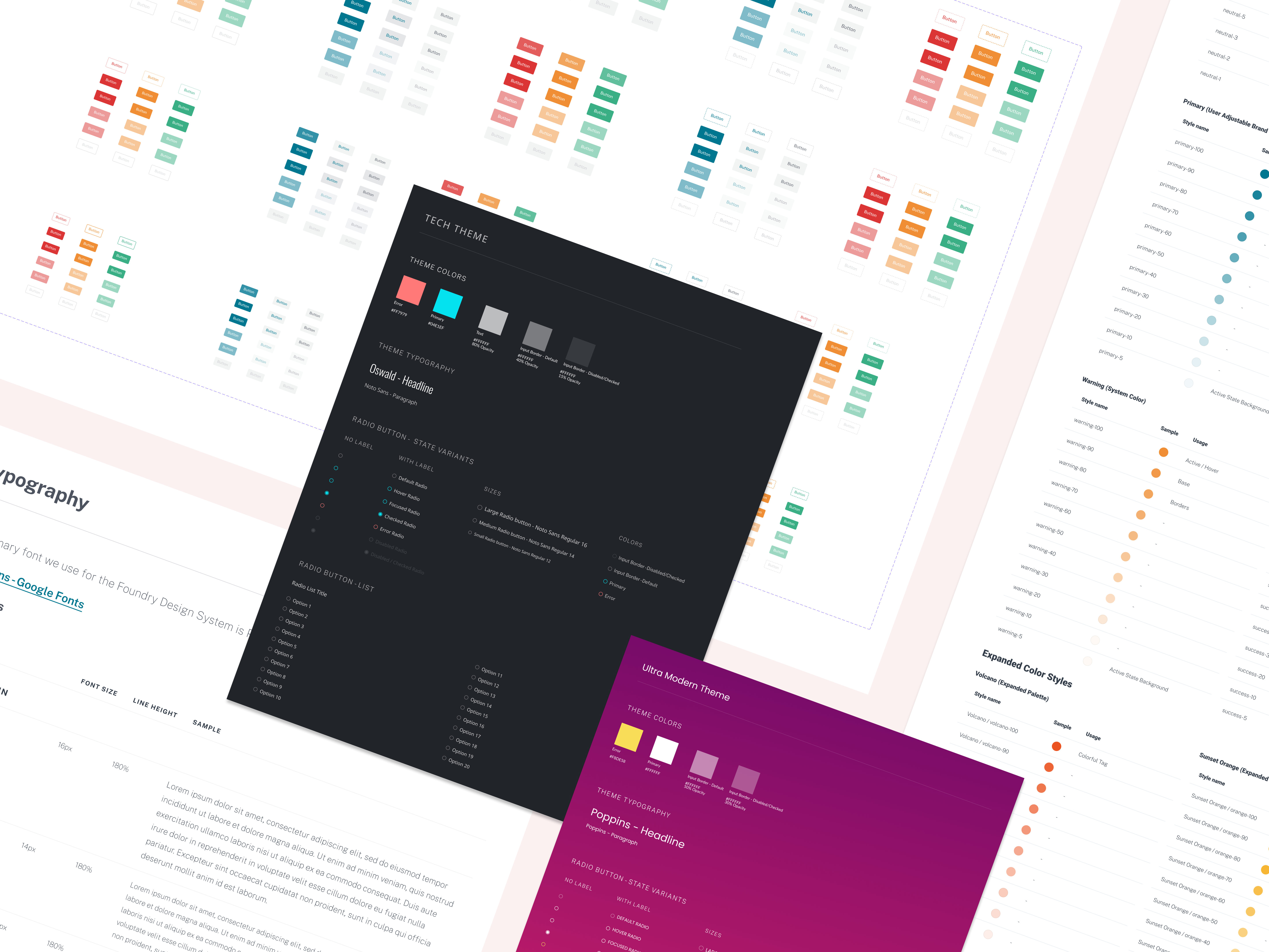
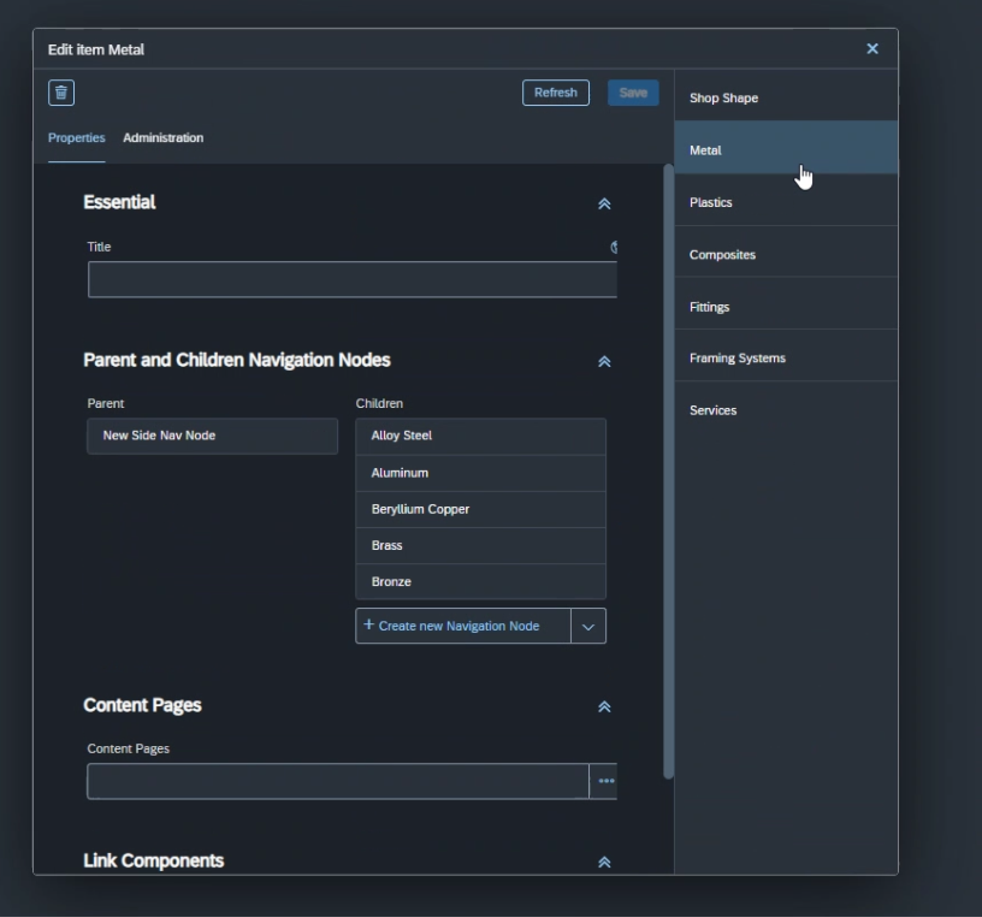
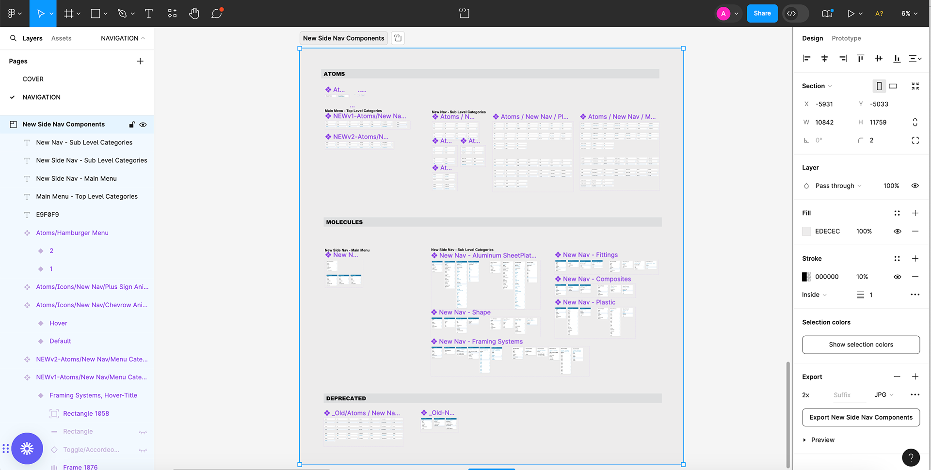
I also spent time updating our Design System & Figma libraries with the new components & page layouts across the product experience.
Design System - New Components
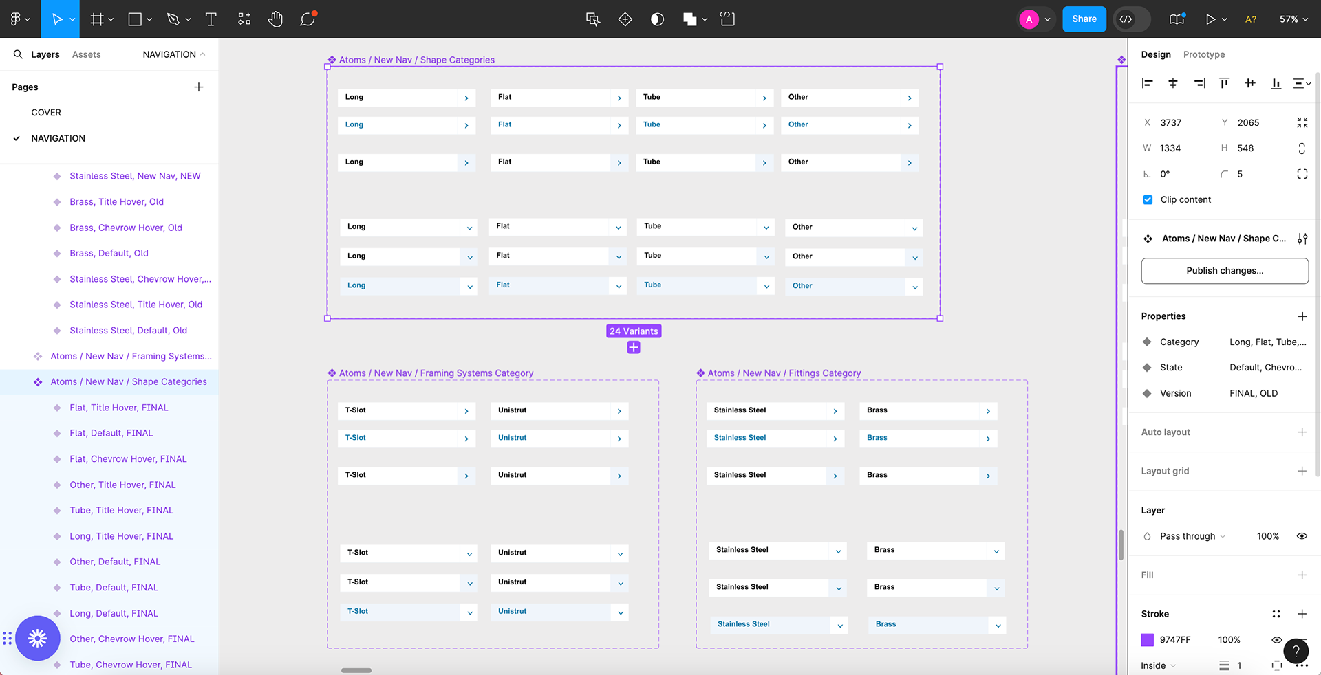
Example of component properties
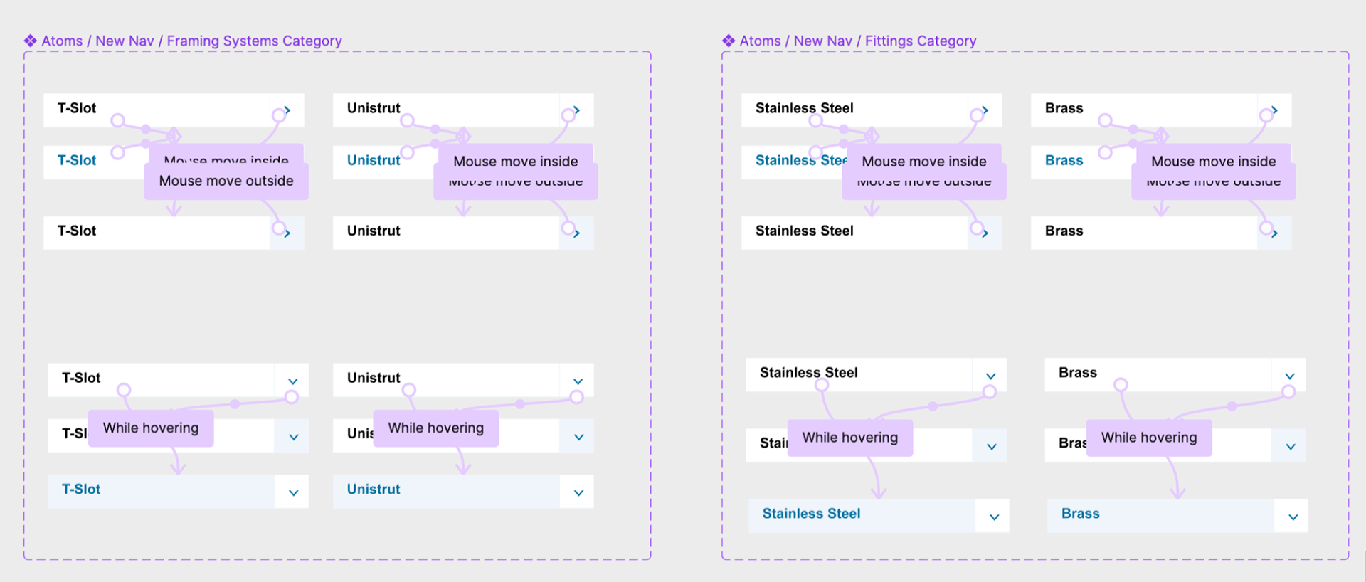
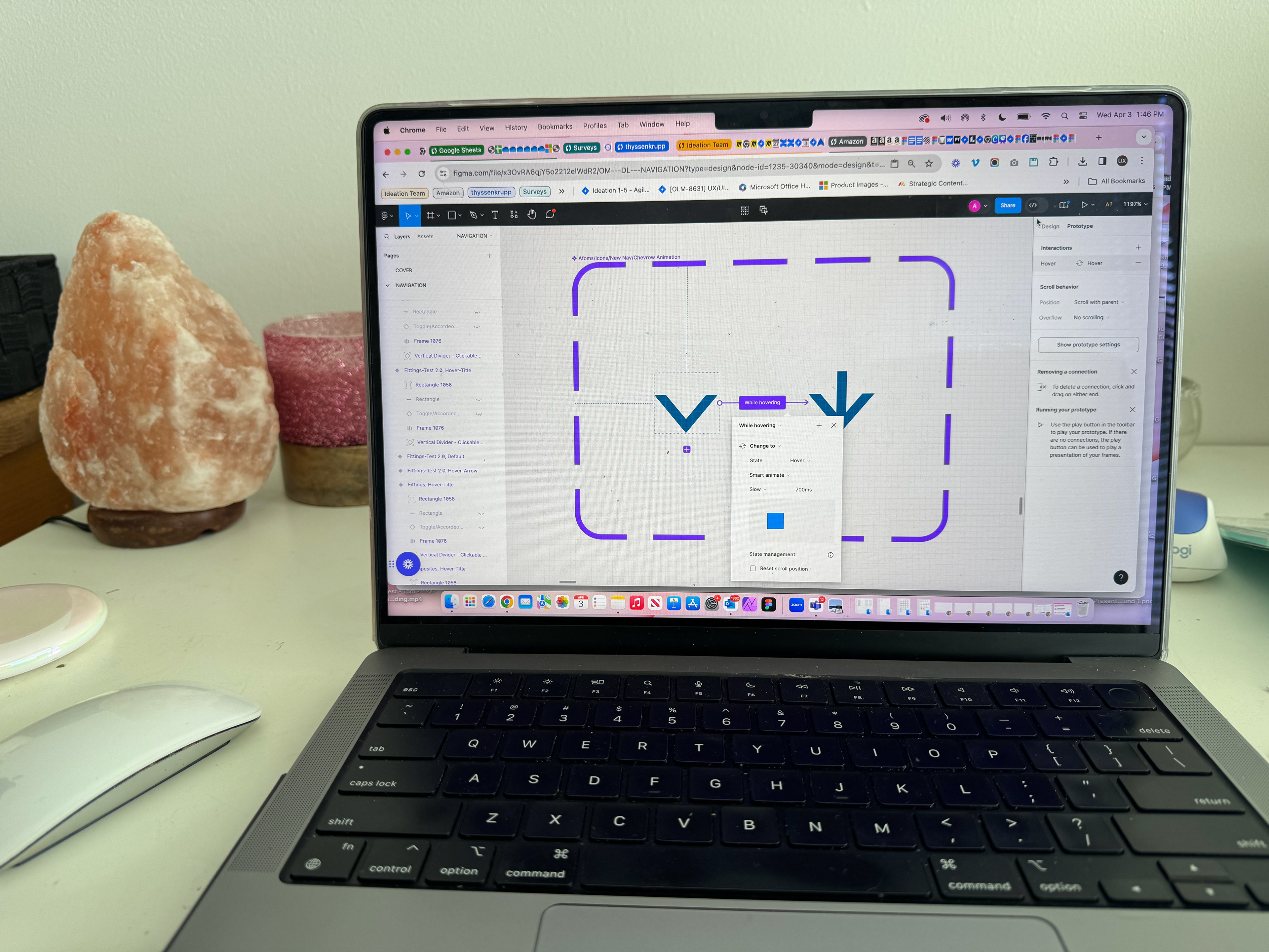
Example of prototyping interactions at component level
New Nav components integrated into Navigation Design Library
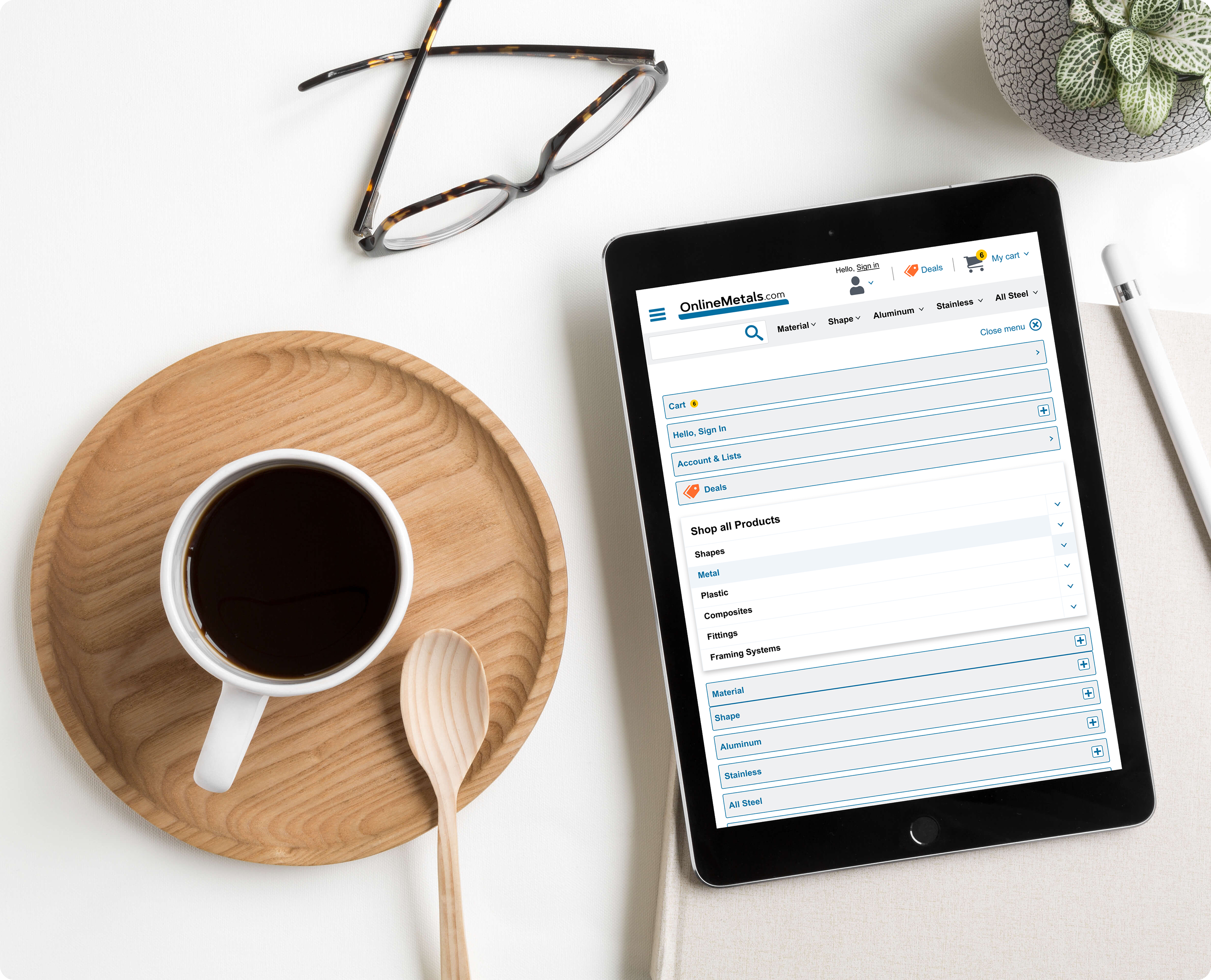
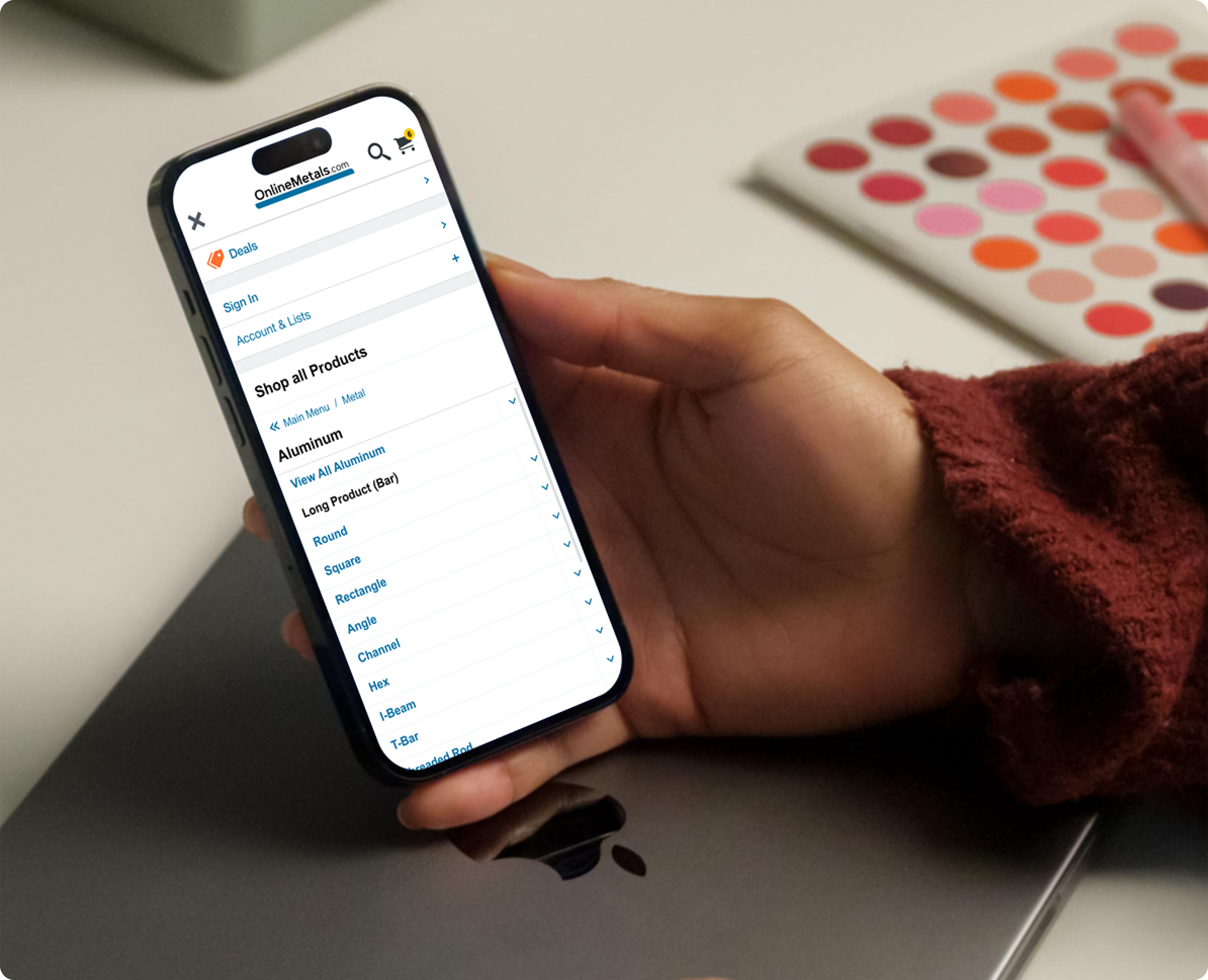
Mockups

Desktop Mockup - Metal category open

Tablet Responsive Mockup - Hamburger Menu open
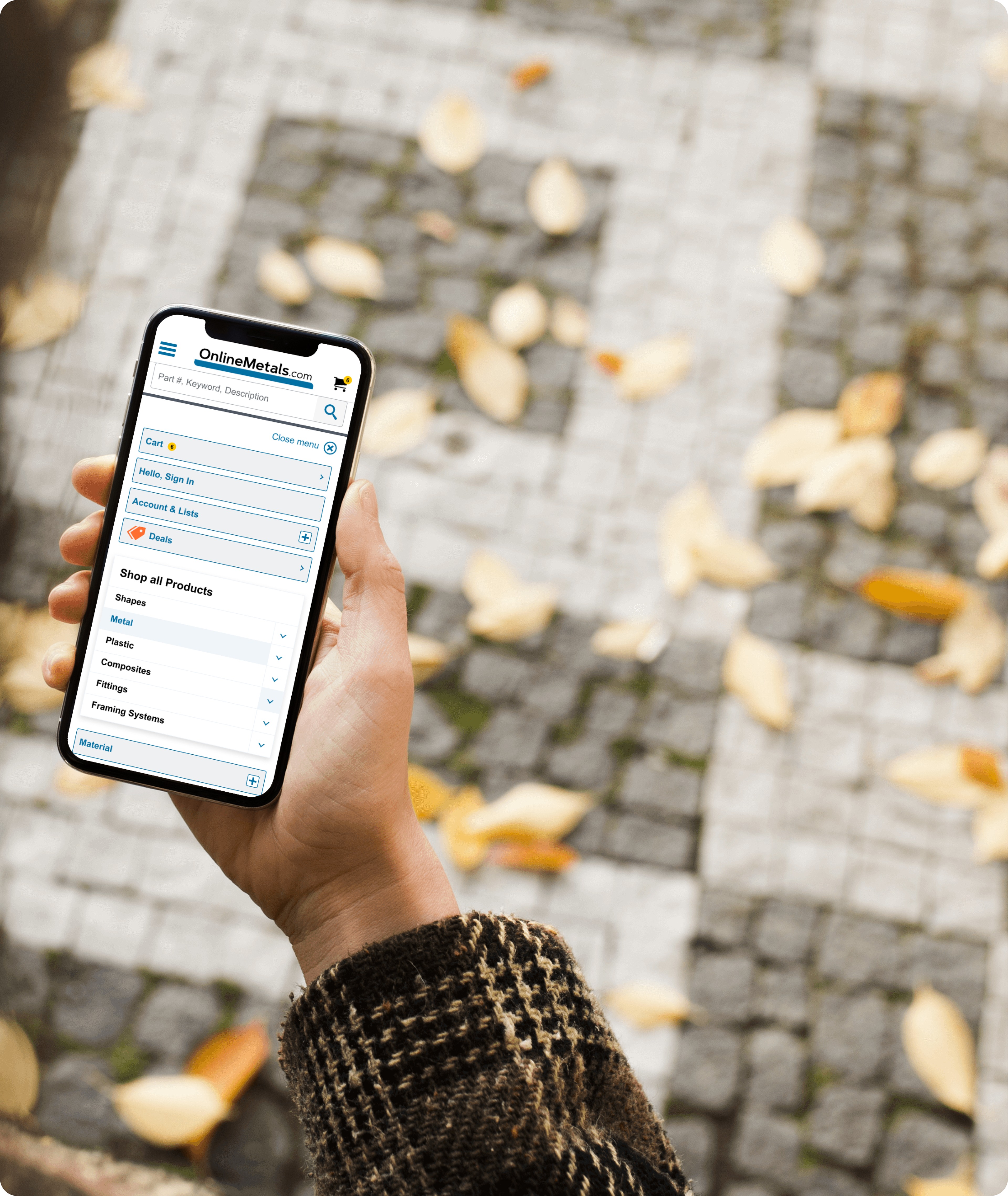
Mobile Responsive Mockup - Hamburger Menu open
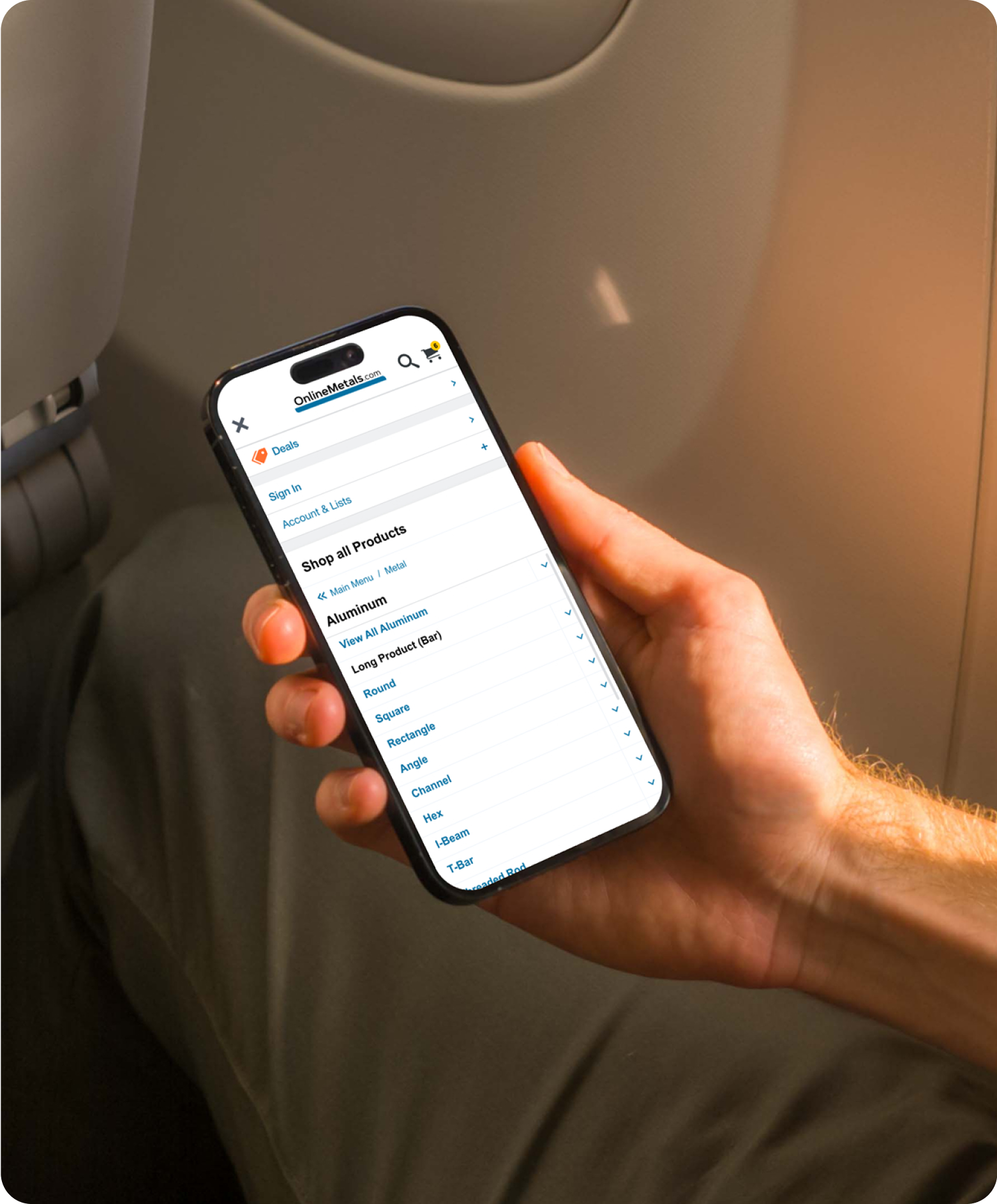
Mobile PWA Mockup - Hamburger Menu open, revealing navigation drilled down to Aluminum category
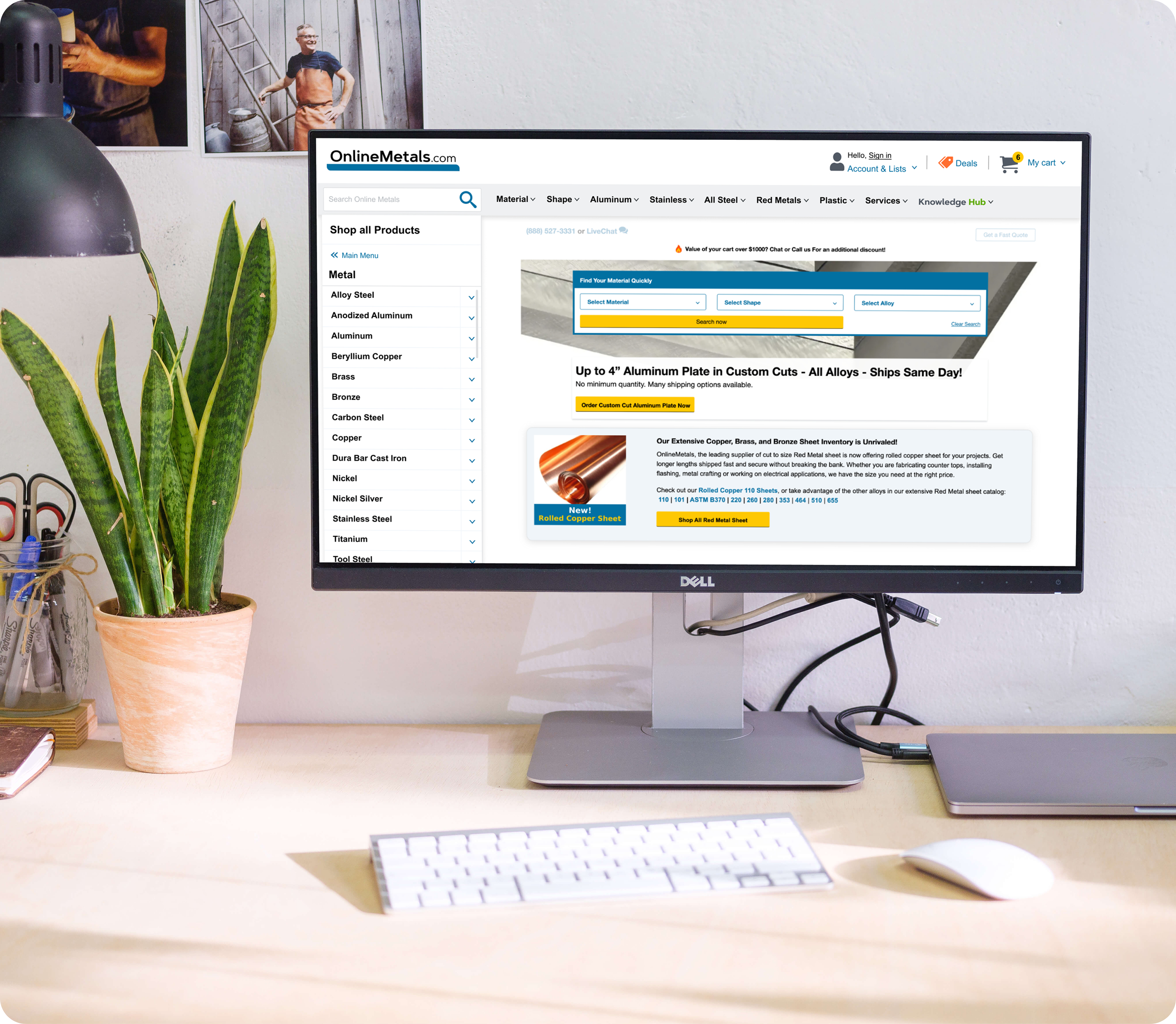
Desktop Mockup - Metal category open
Final Prototype Demo
Measuring Impact
Phase 1 of our new side navigation went live on Cyber Monday 2023! 🥳
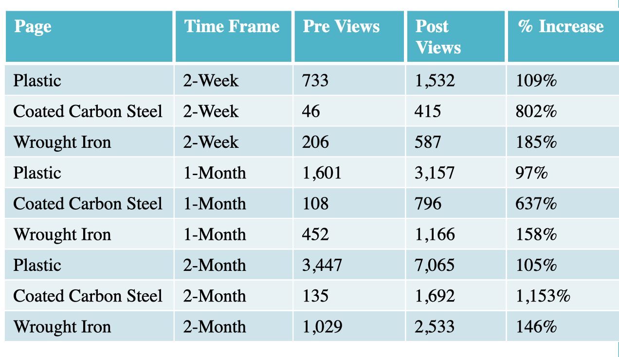
My team decided that a good way to measure impact of this feature would be to identify product pages that previously existed, but had historically very low page views and compare the pre/post deployment page views over time.
We used Mouseflow analytics to determine Plastic, Coated Carbon Steel & Wrought Iron as our pages to focus on, and measured page views and clicks over time periods of 2 weeks, 1 month & 2 months pre and post deployment.
We discovered that the new side navigation significantly increased the customer discoverability of these pages:
Takeaways & Reflections
One big takeaway from this complex information architecture project was validation on the helpfulness and impact of our process improvements to involve the development team early and often in the design process (instead of after user testing) to flush out technical feasibility & level of effort. These process improvements continue to pay off with streamlining our design, testing and handoff process, saving valuable time and resources!
Additionally, I identified several A/B testing opportunities for this new side navigation, which will allow us to test different ways of organizing our navigation nodes and ways to present categories & products in a more discoverable way to our customers. With the sunset of Google Optimize, we are excited to break in our new A/B testing tool from VWO!