The Challenge
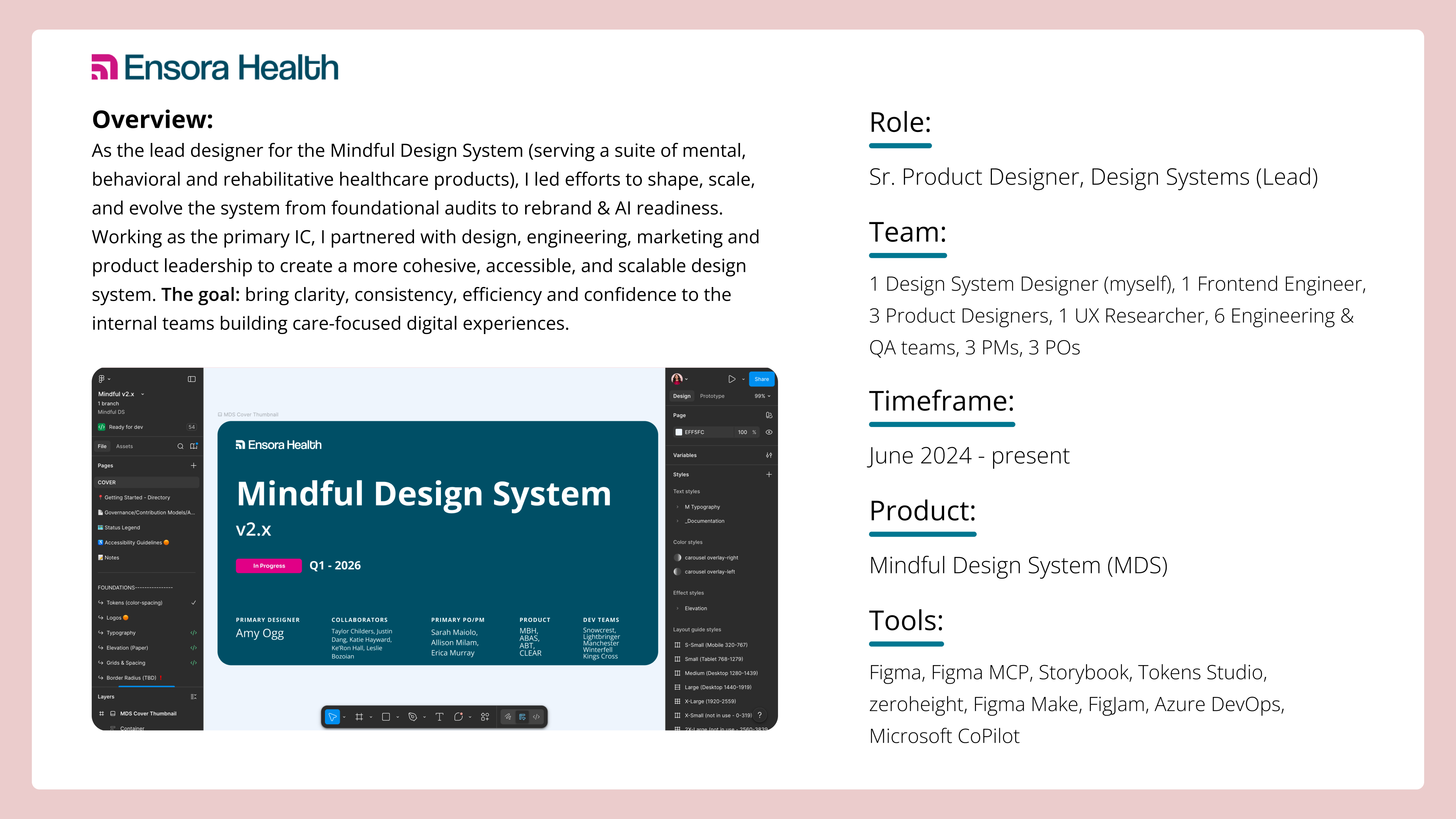
❖ When I joined Ensora Health (previously Therapy Brands), the new Mindful Design System (MDS) existed in name, but not in structure. This emergent multi-brand design system was the second attempt at a design system at the org and it needed some TLC to get off the ground and scale.
🛑 Figma libraries were fragmented and lacked management, documentation was lacking and scattered across Confluence, Storybook & Figma, and parity between design & code was inconsistent.
🛑 Designers, engineers & POs weren't sure which components to trust or where to find the most current guidance.
🛑 Accessibility and QA were handled as an afterthought, resulting in design debt and frustration between product and engineering teams.
🛑 The new design system components & updates was not staying ahead of the feature needs, and this hurt adoption. Teams saw the new design system as a hindrance rather than an enabler.
🛑 Foundations & tokens were incomplete or nonexistent, and there was no clear strategy for scaling across products or future rebrand initiatives.
🛑 Teams were unfamiliar with how to work with a dedicated design system team.
🛑 No clear process for design system workflow, component creation, QA & integration fostered constant cross-functional confusion & frustration.
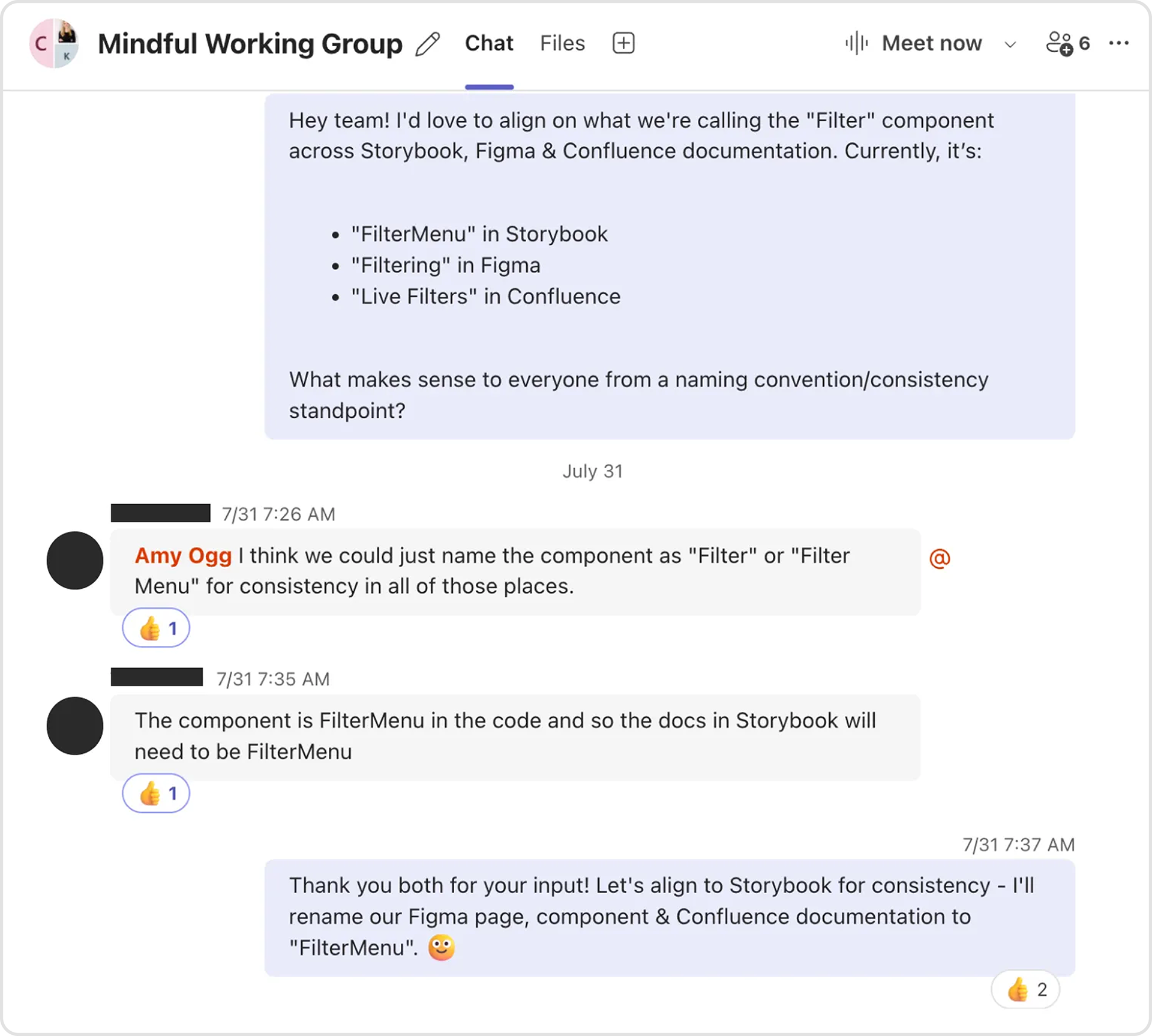
🛑 Information architecture and component naming was inconsistent across Figma & Storybook.
It was clear that before the new design system could scale & support, it needed to build trust.
Discovery & Research
I began by observing how teams worked - embedding myself in Scrum teams, participating in design critiques & retrospectives, shadowing handoffs, reviewing Confluence pages, and auditing Figma file structures. I interviewed designers, engineers, and product owners to understand where friction lived in their day-to-day workflows.
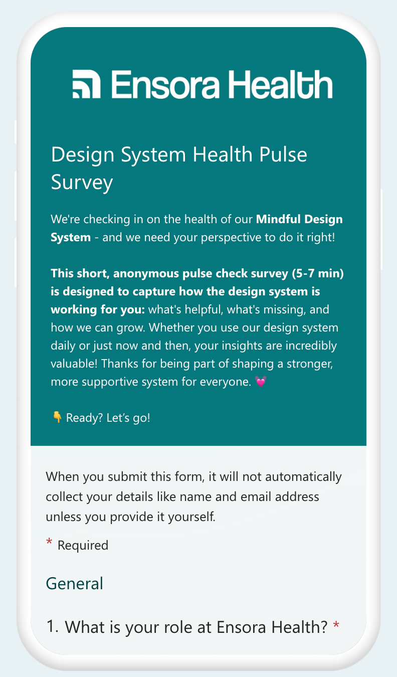
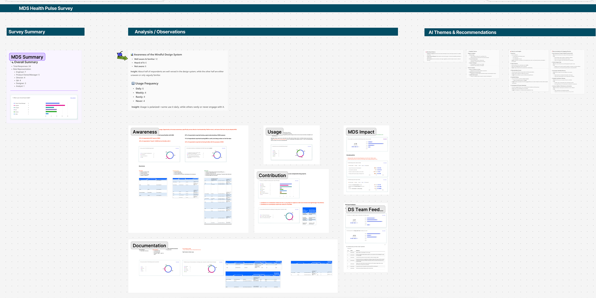
Beyond the insights I documented as part of observations & interviews, I also launched an internal survey in 2025 with over 30 respondents across design, engineering, and product. The results revealed three key themes:
1️⃣ A need for a single, streamlined source of truth for documentation and guidance.
2️⃣ Opportunity to improve alignment between design & code and better help consumers find what they needed.
3️⃣ A lack of leadership visibility into the design system’s purpose, value, impact & maturity.
💡 As a DS team, we received a lot of good feedback & kudos, but we didn't let it go to our heads - there was still a lot of work to be done! These research findings shaped my roadmap around documentation consolidation, adoption enablement, and increasing executive awareness, because a design system’s success is as much about alignment as it is about components.
Strategy & Approach
As the only design system designer, I worked iteratively to build structure while supporting active feature delivery. My approach balanced foundational cleanup with immediate team value, ensuring every change reduced friction for product designers & engineers.
Key strategies included:
❖ Filling in gaps in our foundations and establishing better alignment and consistency between design & code.
❖ Partnering with engineering and design leads to define governance and contribution models, and then socializing the models cross-functionally.
❖ Collaborating with QA & product to bring design accountability into testing cycles.
❖ Establishing a centralized documentation model to replace outdated Confluence pages.
❖ Designing for scalability: anticipating future theming, rebrand, accessibility & AI needs.
This approach allowed progress to unfold in layers for the design system: first building clarity, then connection, and finally, confidence.
Process Improvements & Governance
I worked very closely with my engineering counterpart, the design team and our product partners to improve our testing & QA process to introduce design QA as part of our design system's development lifecycle process and to also involve design QA at the feature level as well.
This set the groundwork for reducing design/tech debt logged against the design system later on after feature implementation, as well as streamlined our process for keeping the design system efforts ahead of feature needs. I took ownership over the design system backlog and roadmap, and worked closely with my engineering counterpart & product to prioritize design systems efforts that allowed us to make massive strides in keeping the design systems work ahead of feature needs.
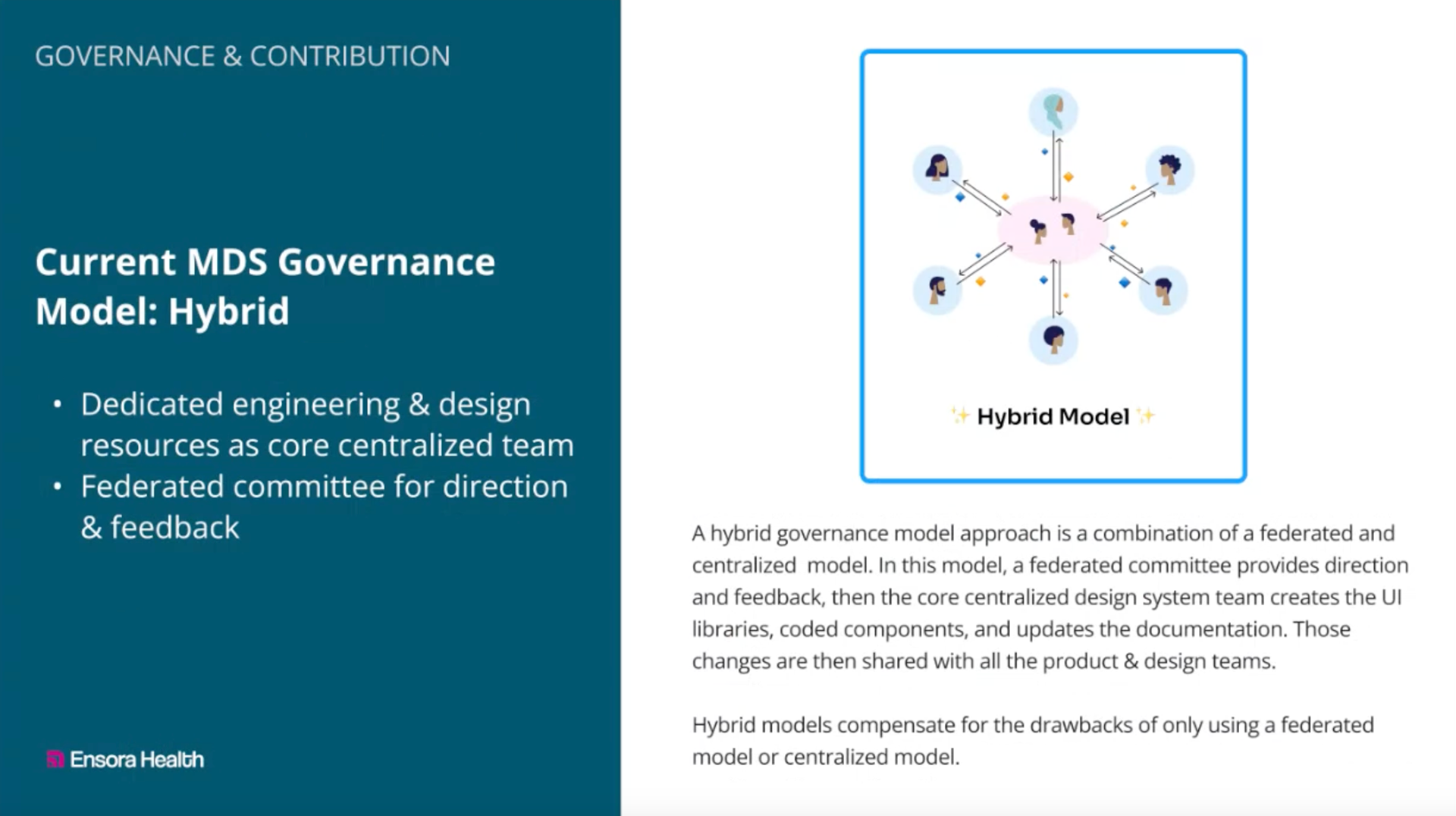
The previous failed design system attempt had been a federated one, and both leveraging a design system as well has having dedicated design system resources & subject matter experts was new for the teams. With my role being brand new (the company had never had a dedicated DS designer before), there was a lot of opportunity to establish strong working relationships, new working agreements and align on ownership & on how we work together.
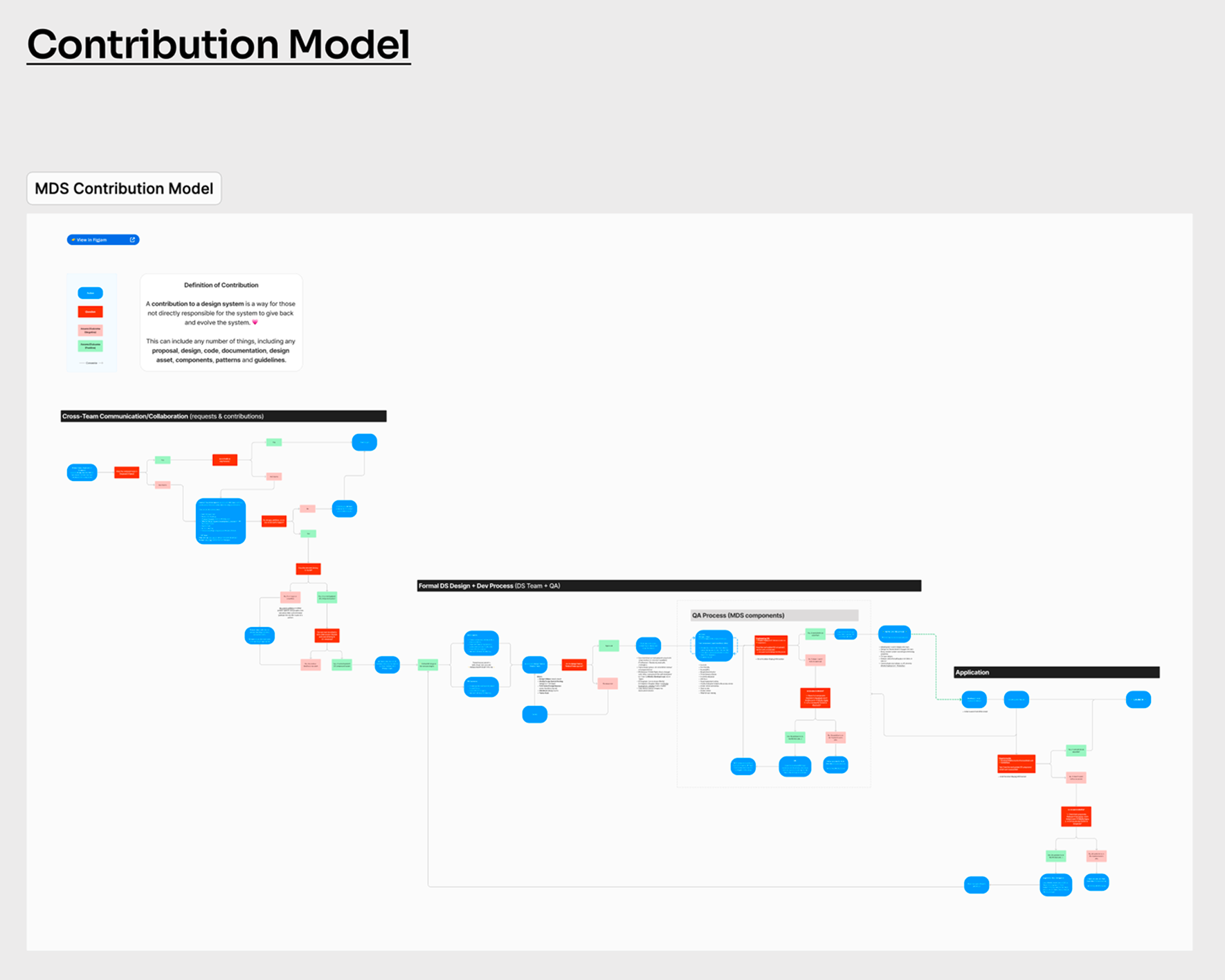
I drafted & proposed governance and contribution models for our design system and socialized cross-functionally for alignment.
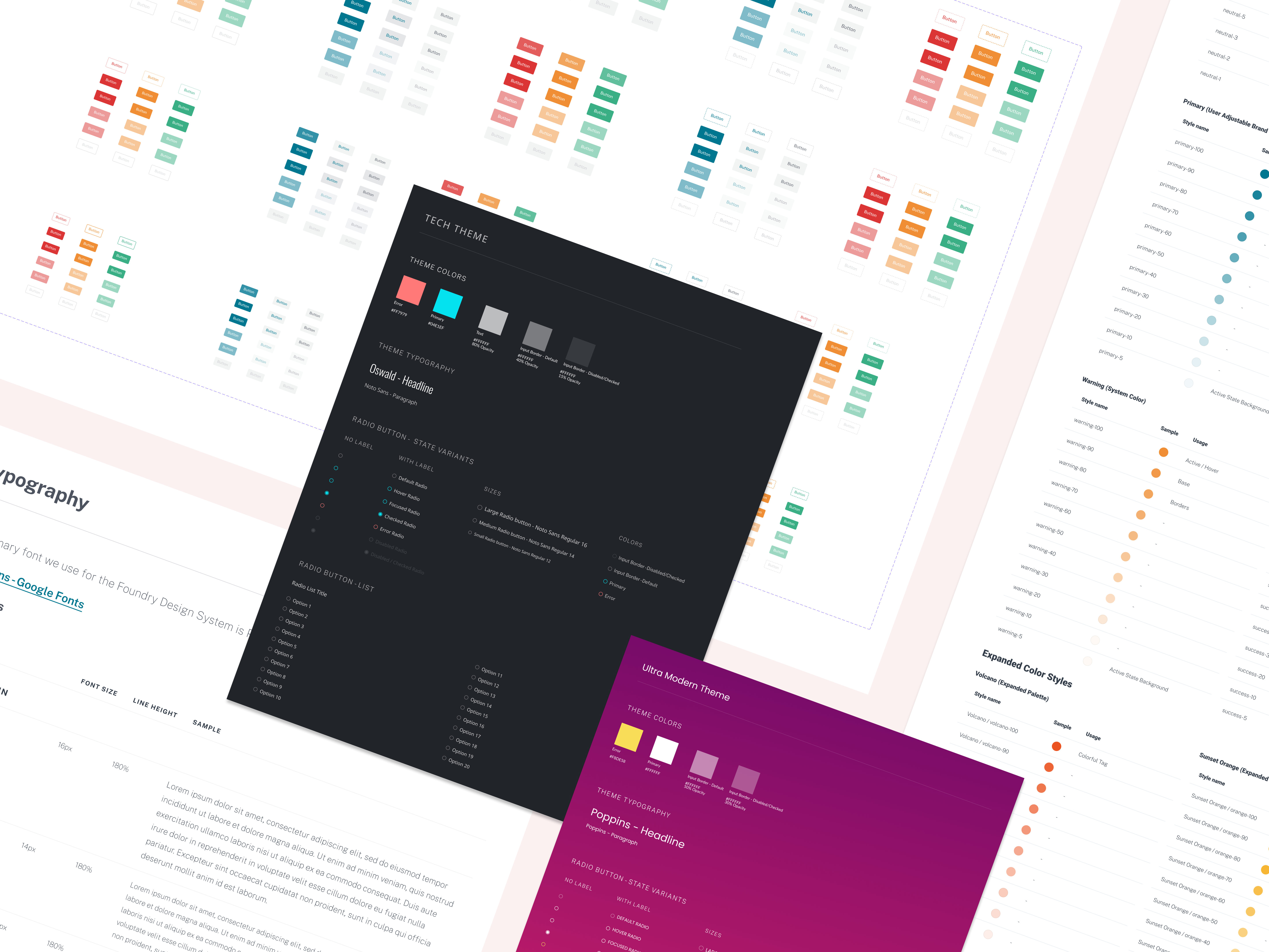
Foundations & Tokens
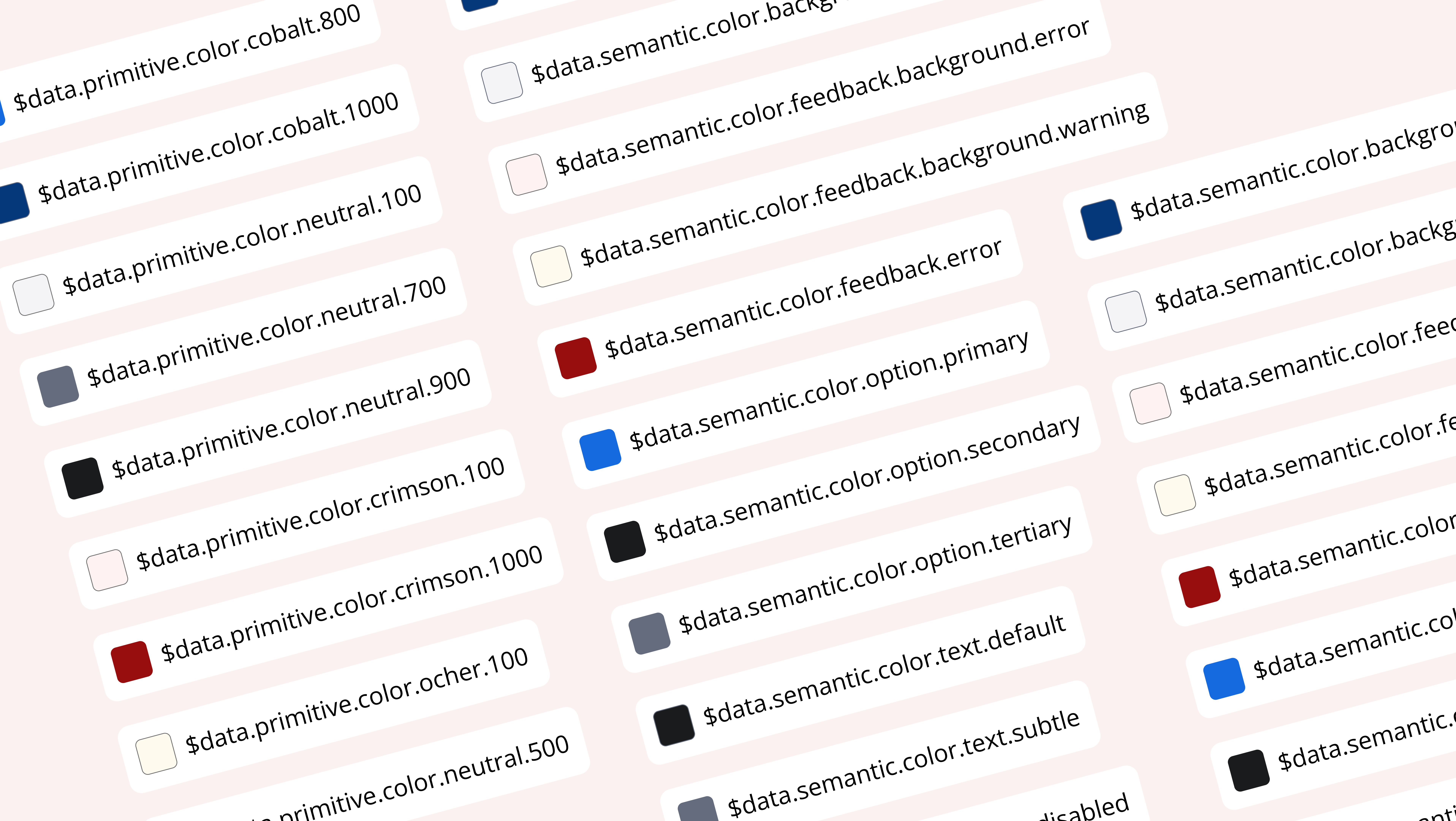
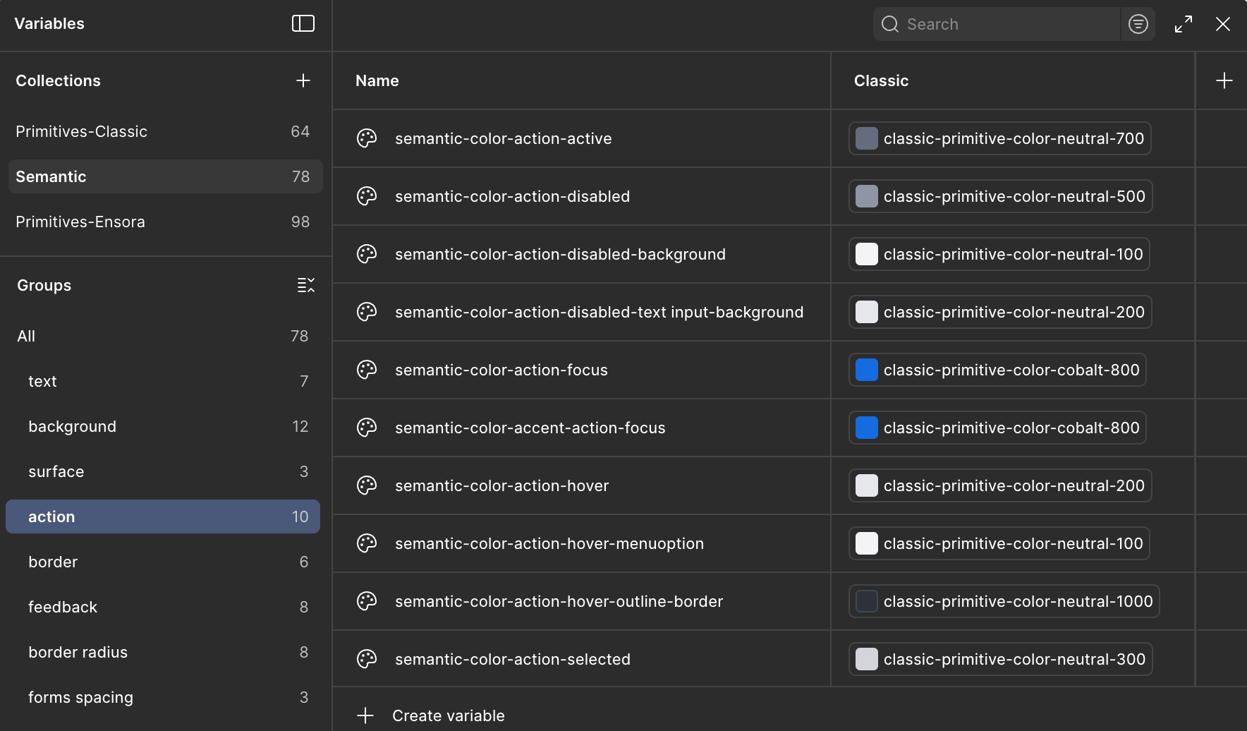
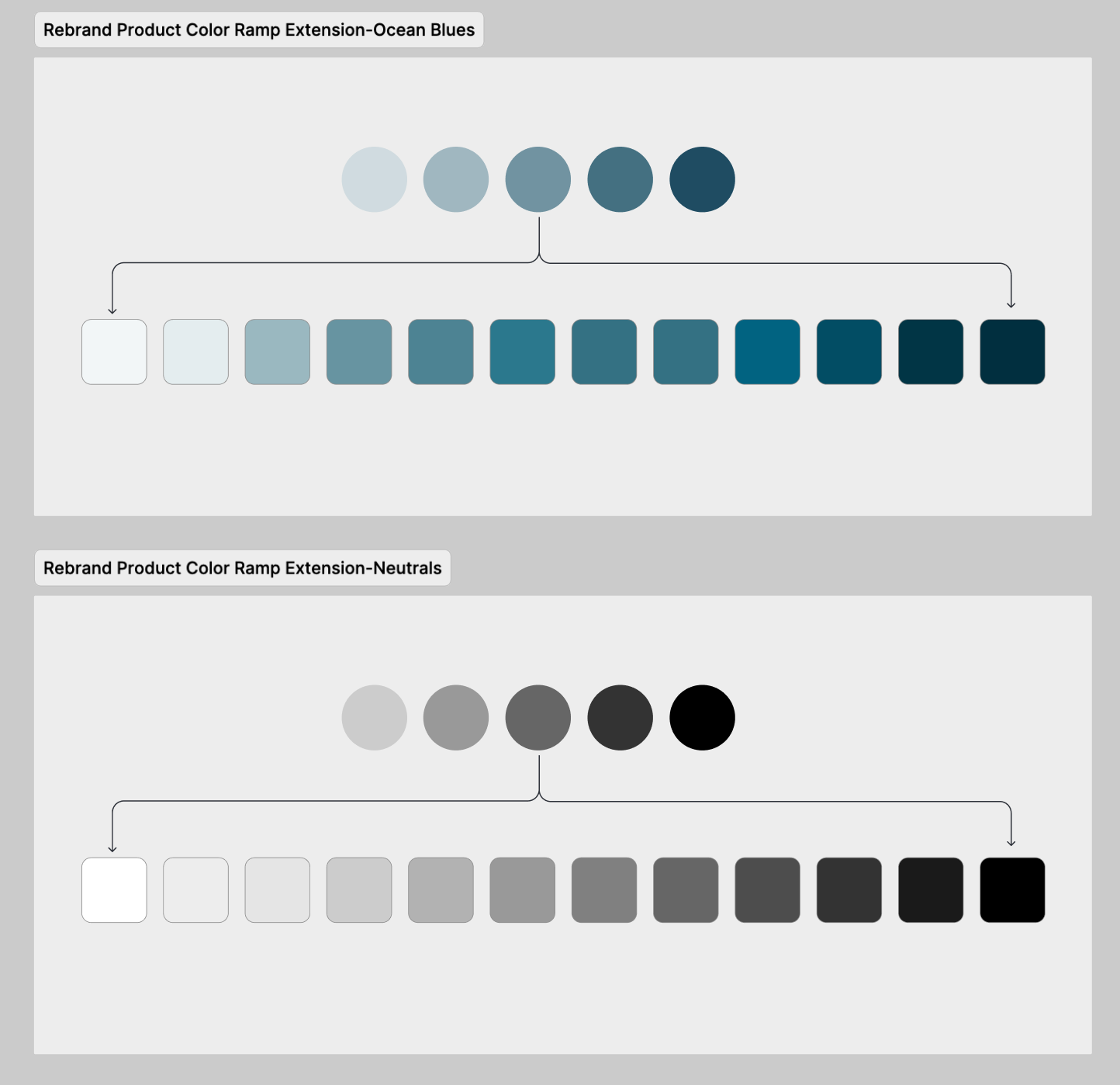
To ensure scalability, I implemented a new token architecture using Tokens Studio and Figma variables. While we had primitive & semantic color variables started in Figma, they were outdated. In code, they only existed as raw hex colors.
The first step was cleaning up existing primitives (unused colors in the Figma library) and getting primitives implemented in Storybook, and then collaborating with the team on semantic naming for our theme-level tokens.
This included defining global collections for color, typography, and spacing - mapped to corresponding code tokens. It not only aligned design and engineering foundations but also prepared the system for future theming and dark mode.
The result was a flexible, future-ready foundation that supports accessibility and brand adaptability without fragmenting the system.
Architecture
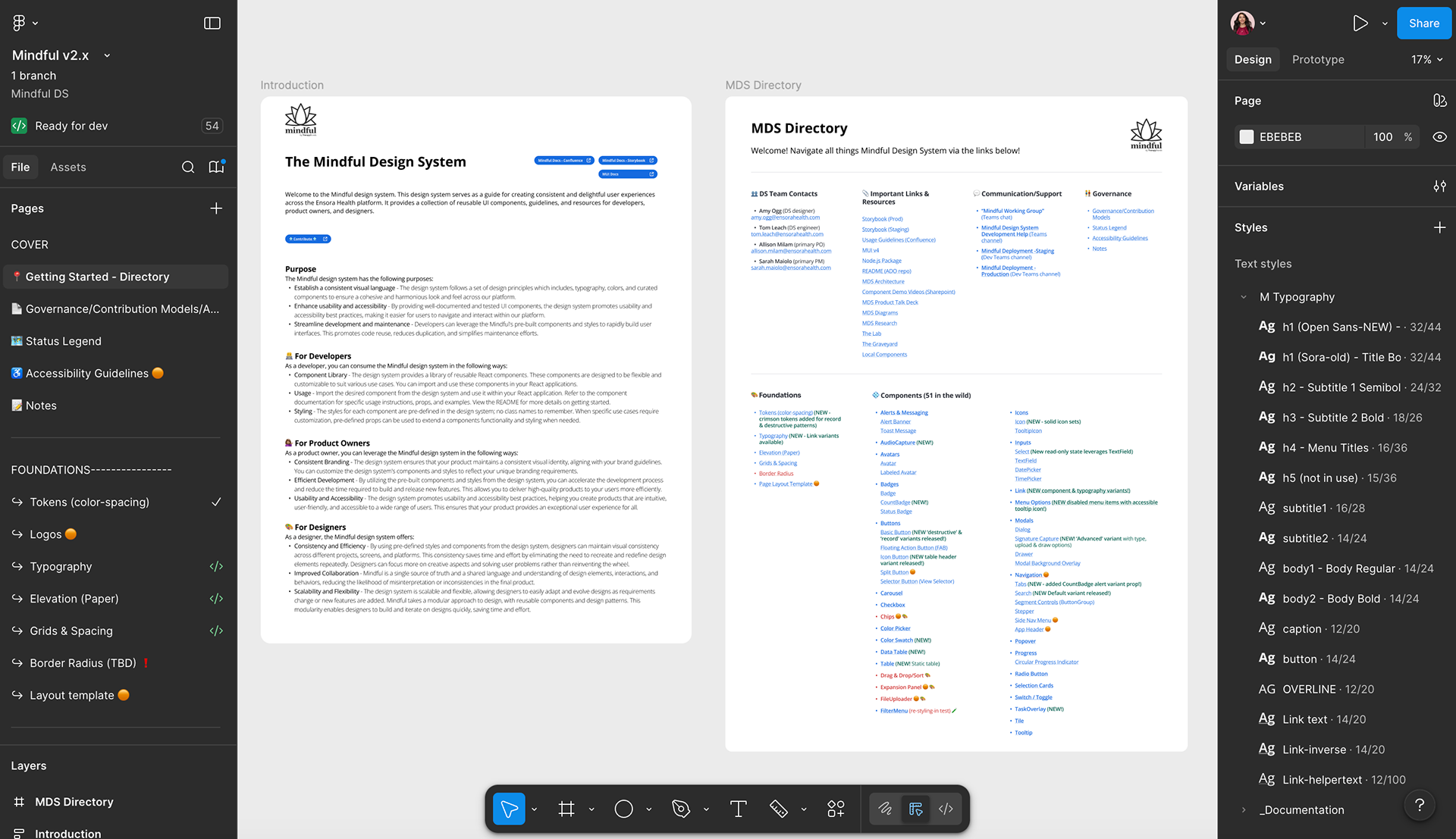
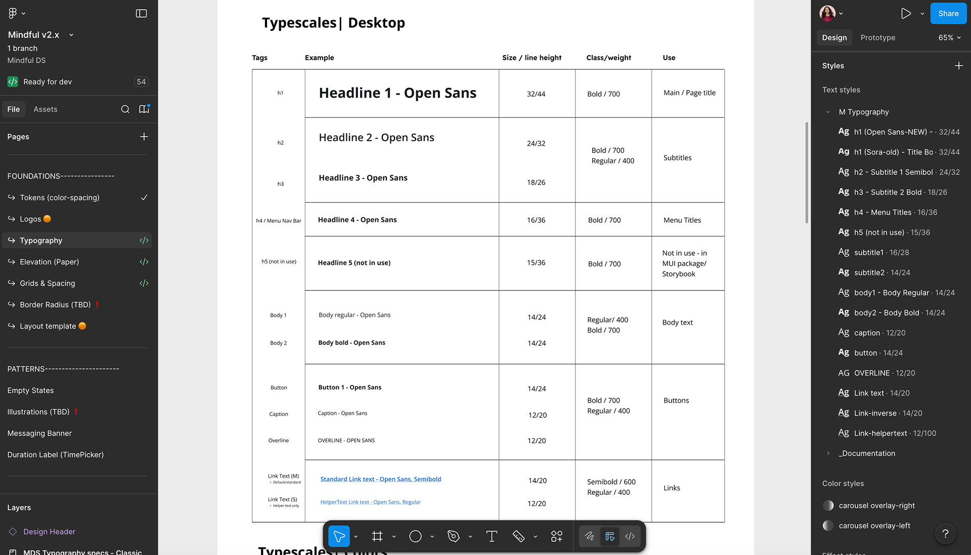
We re-organized the component naming and information architecture of both Storybook & Figma for parity. Designers, engineers & product folks had previously been constantly confused with context-shifting between finding what they needed across Figma & Storybook as many components had inconsistent names in code vs design, and the tools also were organized differently (alphabetical vs MUI section-related).
Aligning Figma & Storybook's architecture and navigation helped simplify discovery & workflows for design system consumers, which saved them time and reduced confusion.
I also created an MDS Directory in Figma, consolidating helpful links & resources for consumers.
Building & Refining Components
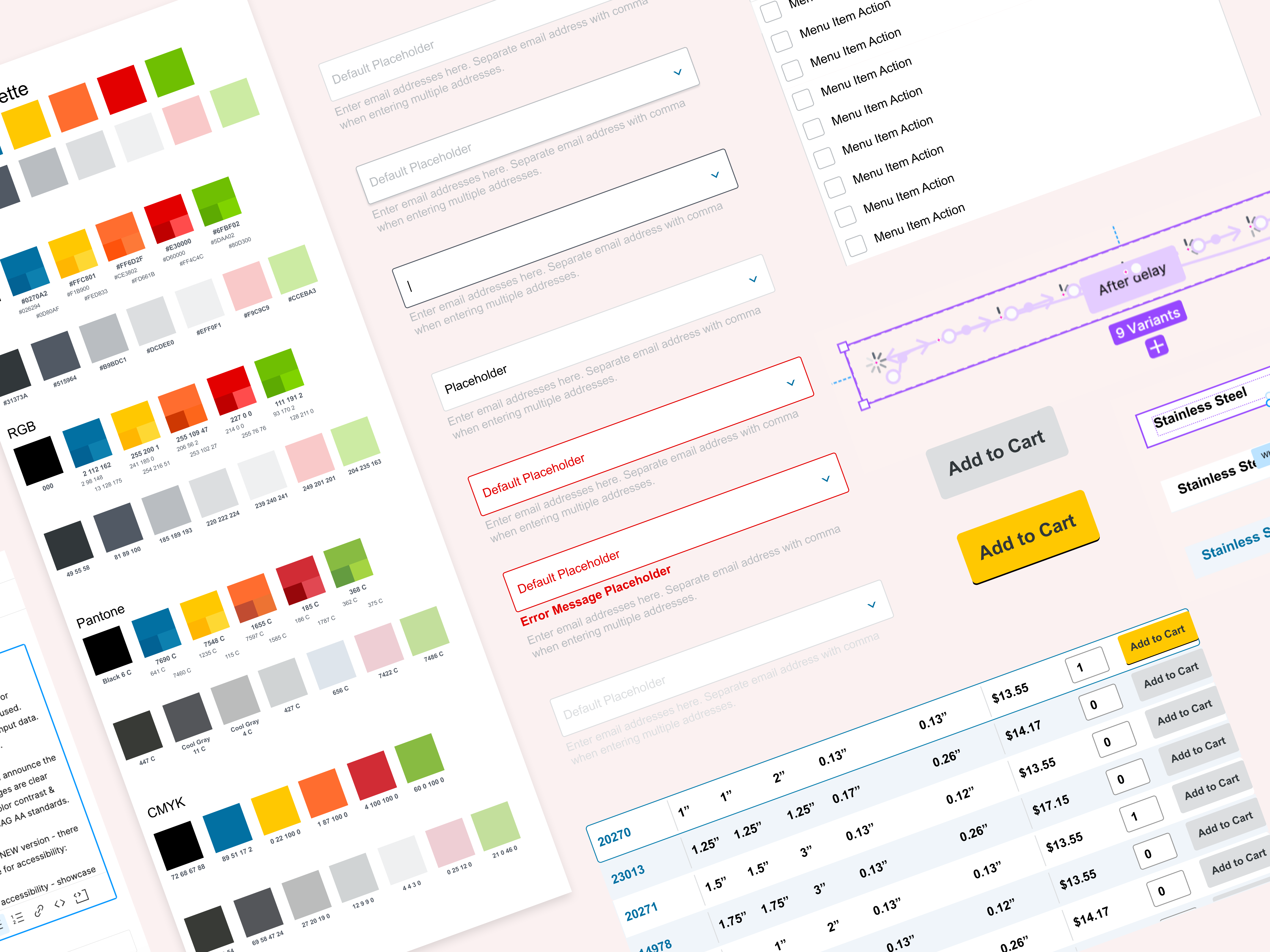
Once the foundational vision was in place, I focused on strengthening the component library.
✅ Addressed foundational gaps in tokens, typography, grid & elevation across our system.
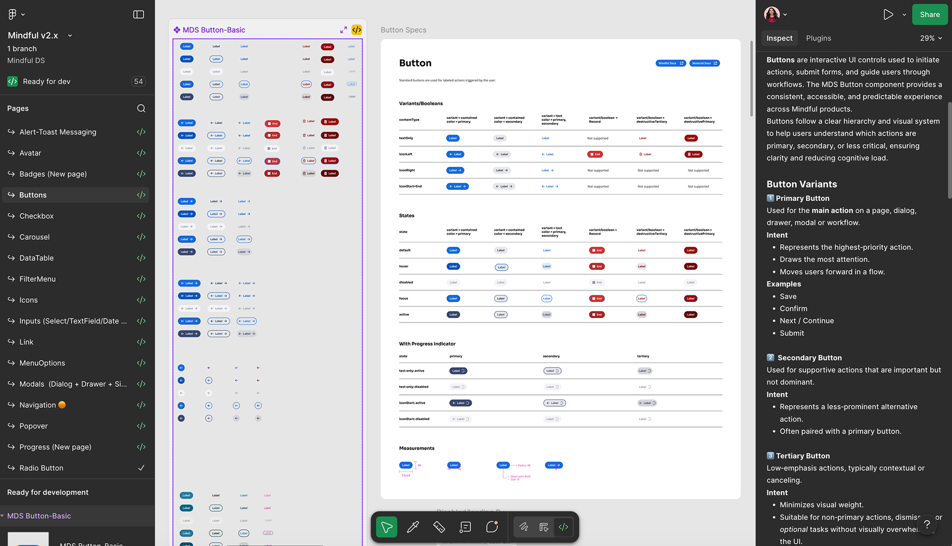
✅ Refactored existing components, logging accessibility and missing state issues across both Storybook & Figma to bring parity between design & code.
✅ Created comprehensive & cross-referenced documentation across Figma, Confluence and Storybook, ensuring designers, product & developers could be met where they were at & receive in-context guidance that made sense for them & their workflows.
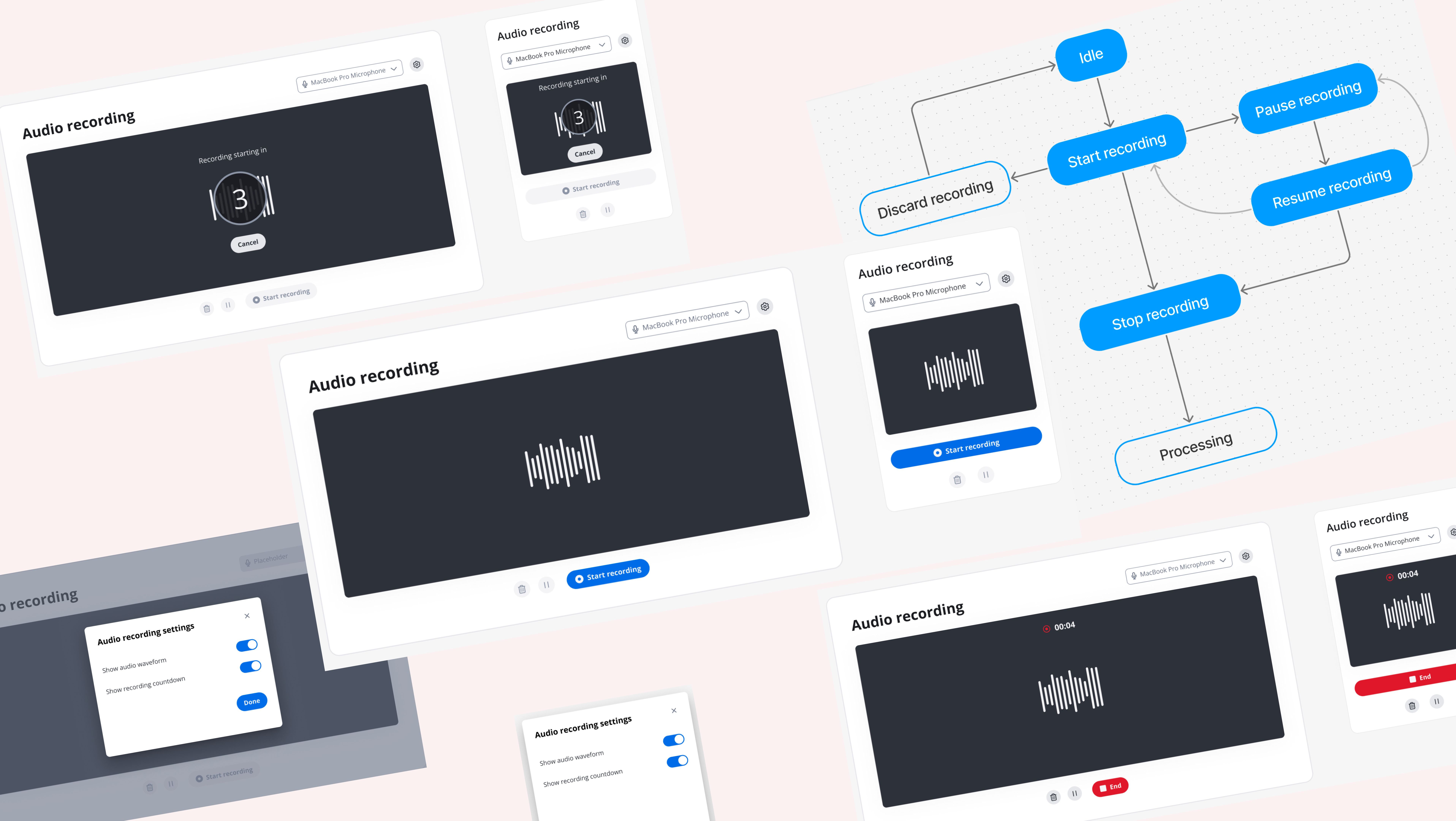
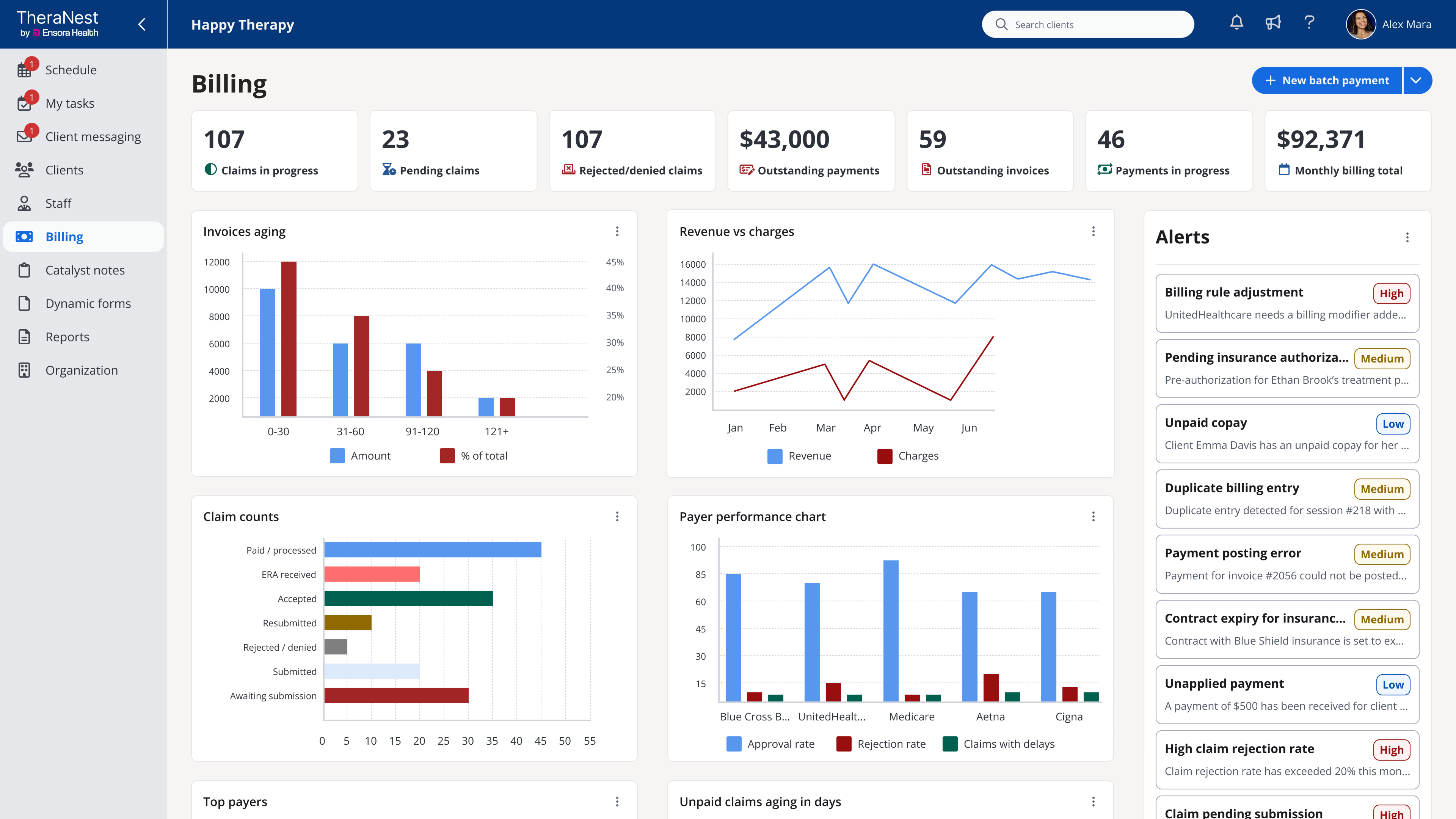
✅ Shipped brand new components, including DatePicker, TimePicker, SignatureCapture, Carousel, DataTable & AudioCapture to directly support in-flight feature work.
This dual focus on cleanup and creation helped the design system deliver immediate value while also setting a higher standard for quality and accessibility.
Outcome: Reduced design-to-dev friction, improved accessibility coverage, and renewed designer, product & engineering confidence in using the system.
Rebrand Readiness
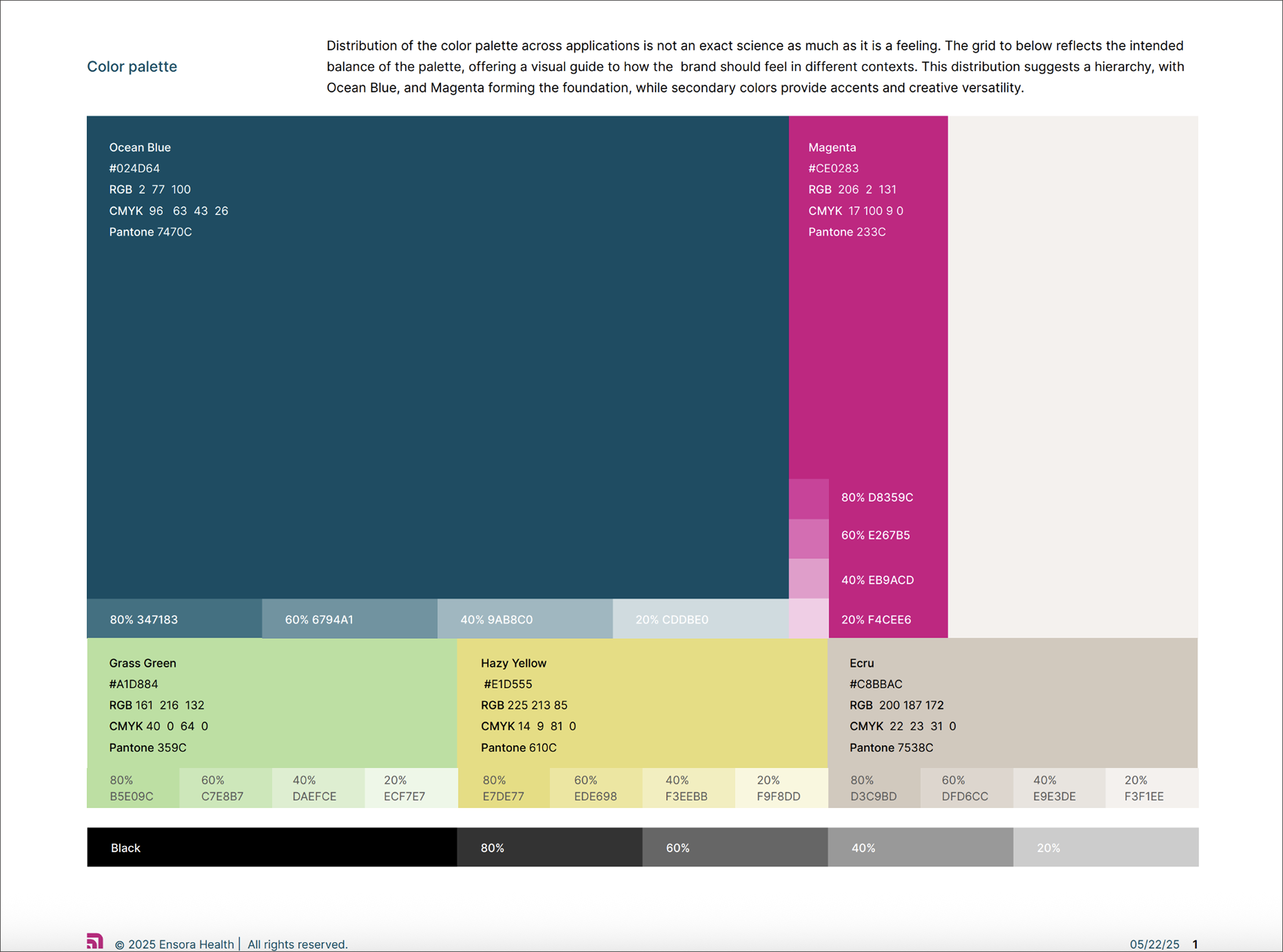
Previously Therapy Brands, the company rebranded as Ensora Health in early 2025. As the organization prepared for the company-wide rebrand within the products, I led the strategy to make the Mindful Design System rebrand-ready without disrupting ongoing work.
Working closely with Marketing, I extended the new palette to meet product accessibility requirements, balancing brand expression with usability. I adapted Marketing's opacity-driven palette to hex codes and tokens. The transition from one primary color to two contrasting brand colors required a holistic view of the product ecosystem, ensuring color application was both functional and expressive.
The design team had vision work designs in-progress with a tight timeline to pitch to leadership, and they were already using our design system components in the designs.
To enable designers to continue moving quickly, I created new variables collections & modes and rebrand component variants within existing component sets rather than duplicating & maintaining separate libraries for this vision work. This mirrored how theming would be handled in code and allowed designers to instantly accept MDS Figma library changes in their working files and toggle components to the new rebrand styles while preserving their design structures.
Outcome: Designers could continue vision work seamlessly to meet their project timeline, which maintained design velocity during a major visual transformation, and set the stage to accelerate rebrand adoption.
The design system variables & component variants powering design team's in-progress vision work with a click:
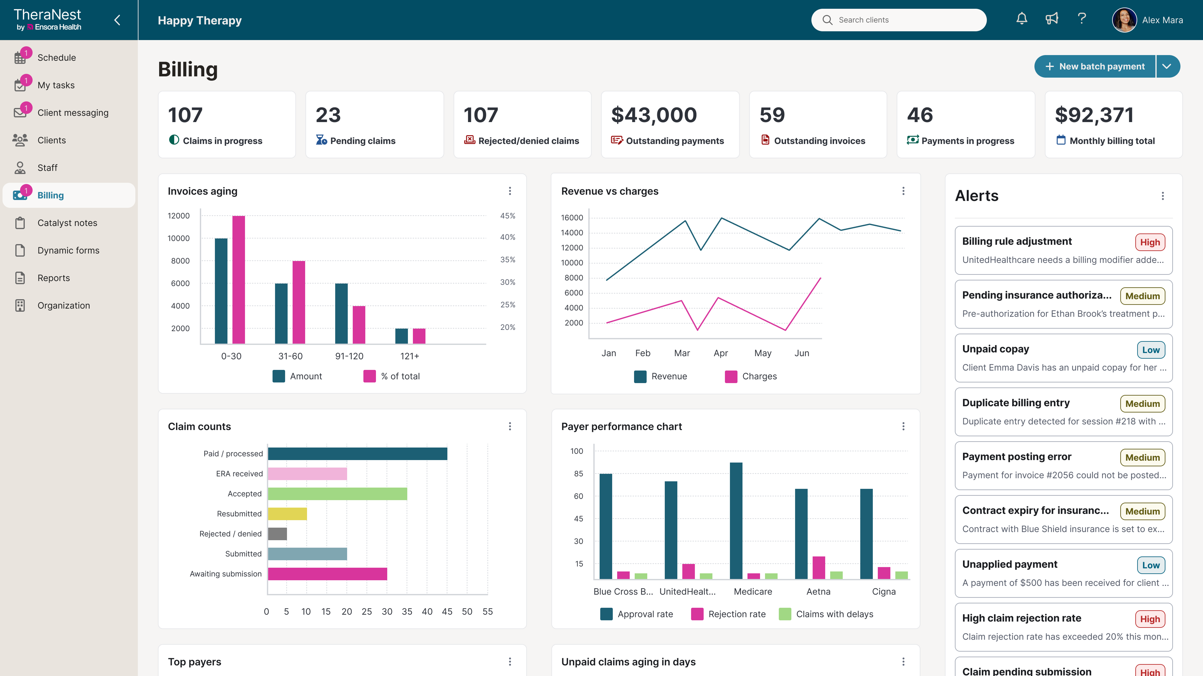
Adoption
🛑 A large initial barrier to widespread adoption of the design system in the product in 2024-2025 was due to tech limitations, as many legacy pages were in Backbone instead of React and could not uptake the design system.
🛑 A secondary barrier to widespread adoption at the team/cross-product level was the design system's level of maturity in the early stages of building it.
2026 tech modernization focus & efforts (converting product pages & modules from Backbone to React) greatly increased adoption at the user level as well as the product level:
🚀 from 2 teams leveraging the design system to 7 teams by Q4 of 2025.
🚀
Mindful Support
❖ We launched weekly MDS Office Hours in early 2025 as more teams & products started leveraging the design system, and began recording, documenting and disseminating educational & training materials for consumers new to leveraging the design system.
❖ Our Microsoft Teams support chat became very active in early 2026 as adoption had massively expanded, and we were now supporting 7 teams across TheraNest web, mobile apps & AI.
❖ Beyond ad-hoc support, we began joining different teams' standups and refinement calls to our best ability as well.
Outcomes & Impact
Through iterative improvement and cross-functional collaboration, the Mindful Design System evolved into a trusted, centralized foundation.
Key results:
✅ Streamlined Figma/Storybook architecture and improved discoverability
✅ Design-code parity improved & maintained across core components, reducing confusion & strengthening alignment and trust
✅ Accessibility and documentation gaps closed
✅ Successful rebrand-ready component & tokens strategy
✅ Increased adoption by teams, products & experiences
✅ Increased visibility & awareness with leadership (from only about 10% of leadership being aware of our design system & its purpose in 2025 - to over 90% in 2026!)
✅ Design system powering TheraNest's major tech conversion from Backbone to React Q4 2025 - Q2 2026.
✅ Design system served as our visual language 'North Star' across new AI services & mobile apps teams
Selling Design System to Leadership After Re-org
Beyond metrics, the most meaningful outcome was established trust - between designers, engineers, product and the system itself. This led to positioning both resourcing and the design system itself well when the company underwent a massive re-org in 2025.
Between the gaps closed, foundation built & the trust built internally, Tom (DS engineer) and I were able to successfully pitch the value & purpose of and need for the design system, its resources & team to new leadership in the org when the company's product direction drastically shifted.
Video of MDS Pitch Deck for Leadership
Looking Ahead
With the foundation more stable, the next phase for us focuses on metrics, maturity & AI-readiness:
1️⃣ Measuring adoption and accessibility improvements
2️⃣ Continue to prepare the design system to be AI-ready (documentation, MCP server, testing, establishing feedback loops, etc...)
3️⃣ Expanding tokens collections and theming/dark mode support
4️⃣ Strengthening contribution models across product teams
5️⃣ Partnering with Marketing to market our design system both internally & externally as a product & resource.
These initiatives will help sustain the system as a living, evolving product that grows with both the organization and its people. 🫶
What People are Saying
"Amy is an absolute gem of a design systems thinker and leader...she has directly led to unifying various patterns and behaviors across the breadth of the Ensora product portfolio. Over the course of my tenure working alongside her, I have seen her thrive in ambiguous conversations to persuade and drive a unifying vision and direction to internal and cross functional teams of our developing design language. I can't recommend Amy enough to any organization looking for someone to partner/own their design system. She is a bright talent that will leave a positive lasting impact on any team that is fortunate enough to have her."
- TAYLOR CHILDERS, Senior Product Designer @Ensora Health
“Big shoutout to Amy for being an incredible collaborator and a true advocate for quality. Over the past year, she’s poured so much effort into shaping the Mindful Design System into a scalable, high-quality foundation - and it shows. She’s always willing to roll up her sleeves to get the job done and consistently keeps users at the center of every decision. Grateful to have her on the team!”
- MONIQUE SAUVAGEAU, Director, Product Design & Research @Ensora Health