"Our experience with Jennergy has been outstanding. I was thoroughly impressed with the creative energy and keen eye to detail. Their ability to turn around edits on the drop of a dime quickly made them one of our main go-to design resources."
- JAN KLESZYNSKI, COLEHOUR + COHEN
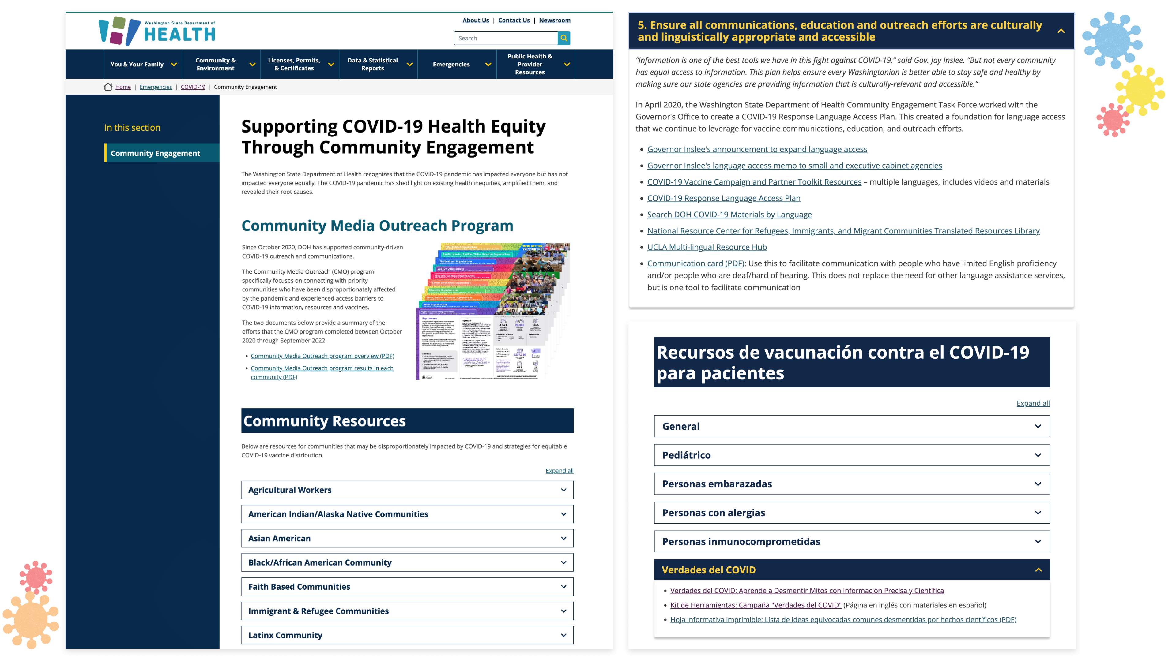

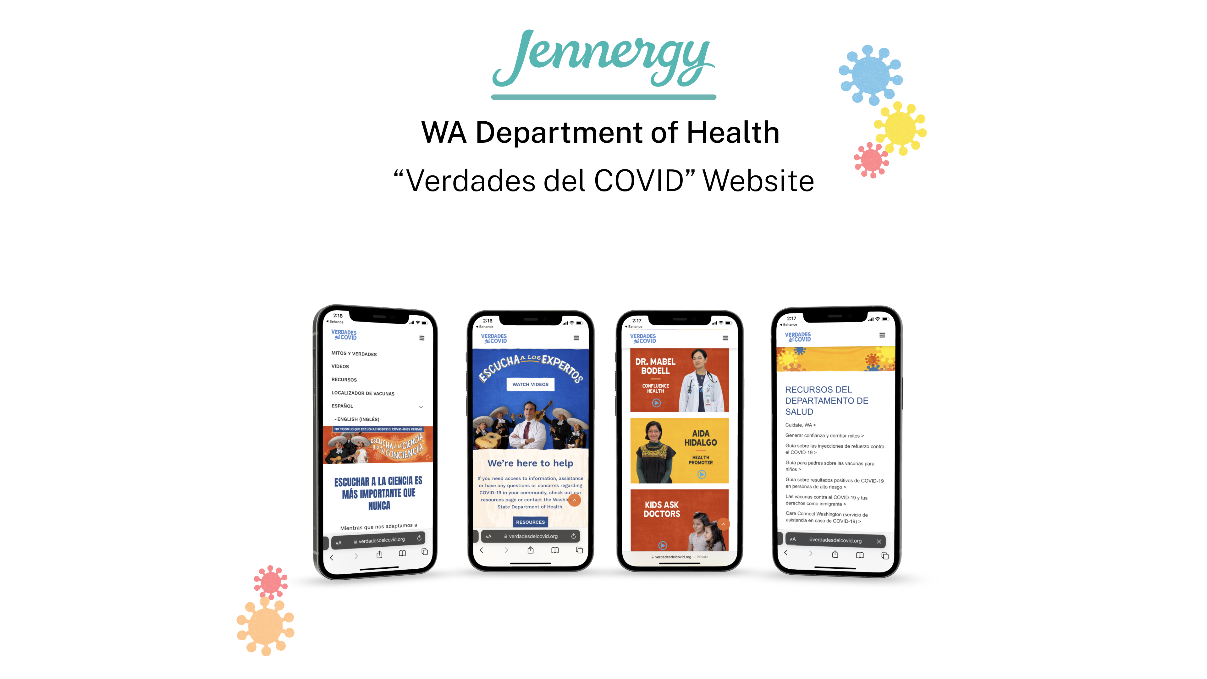
During our initial stakeholder interview, our client (Washington Department of Health - WA DOH) provided us with a project brief and initial desired content for this website, and we discussed WA DOH's goals for this website as part of their Community Media Outreach Program, the project requirements & content that we would be designing to better understand the problem space.
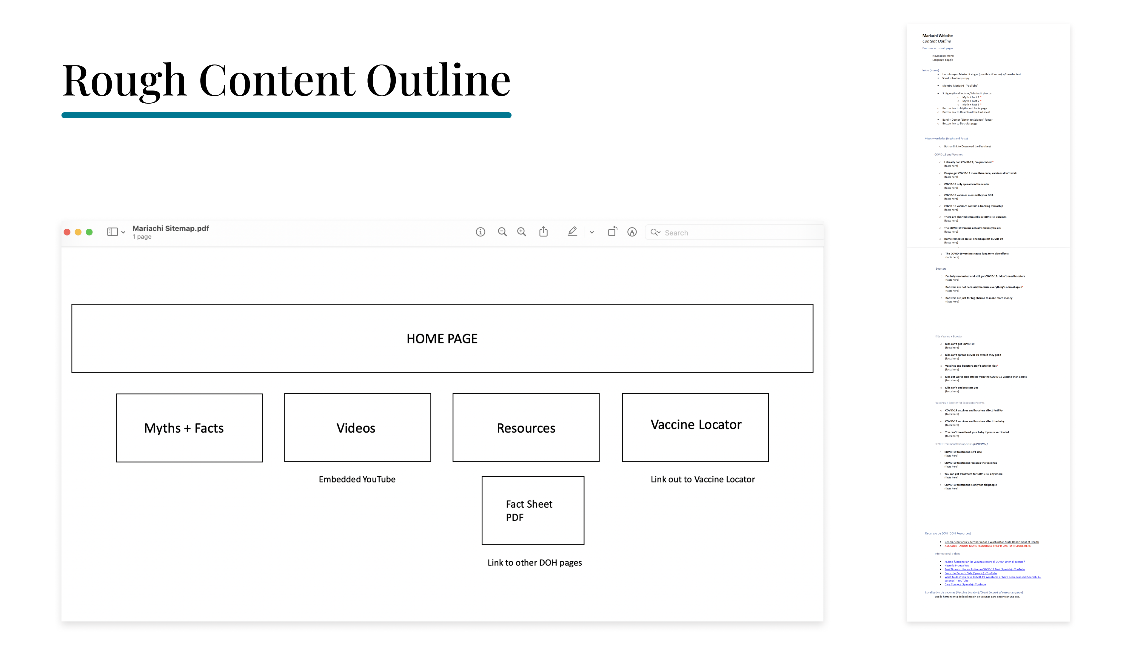
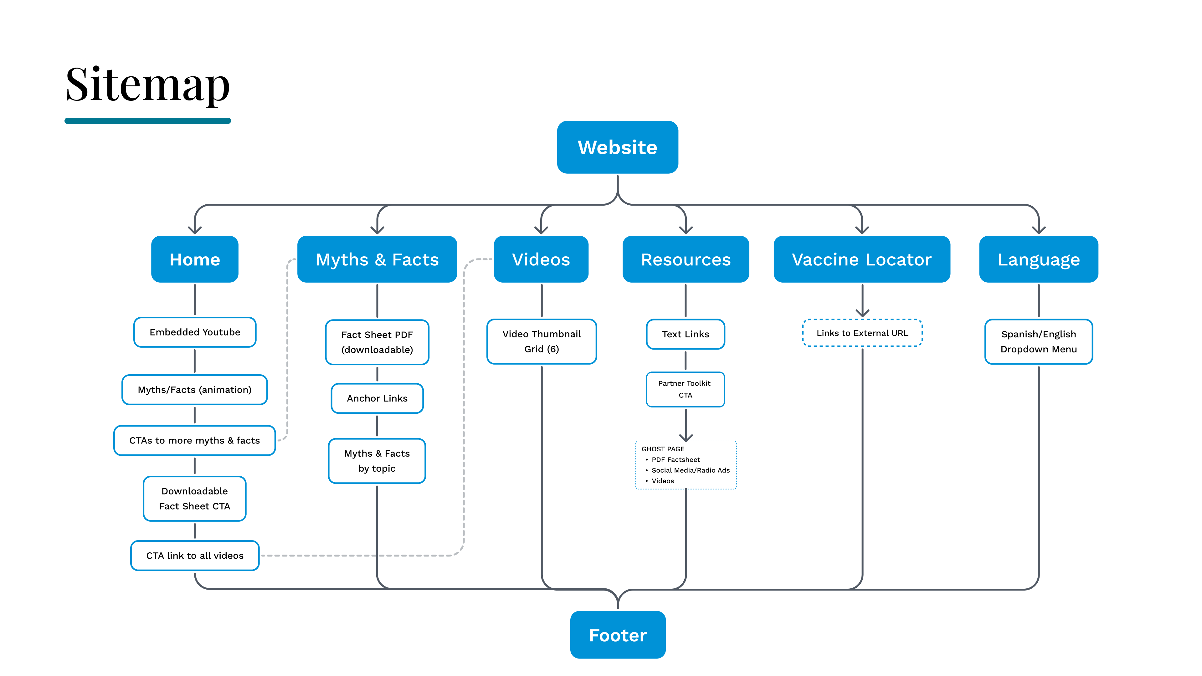
From here, I created a sitemap to visually communicate the website information architecture with the client and provide structure for my upcoming design work for this website.
Next, I collaborated with the Creative Art Director and one of the other senior designers at Jennergy to begin brainstorming & ideating on visual concepts to present to our client, including color palette, typography, animations, and look/feel.
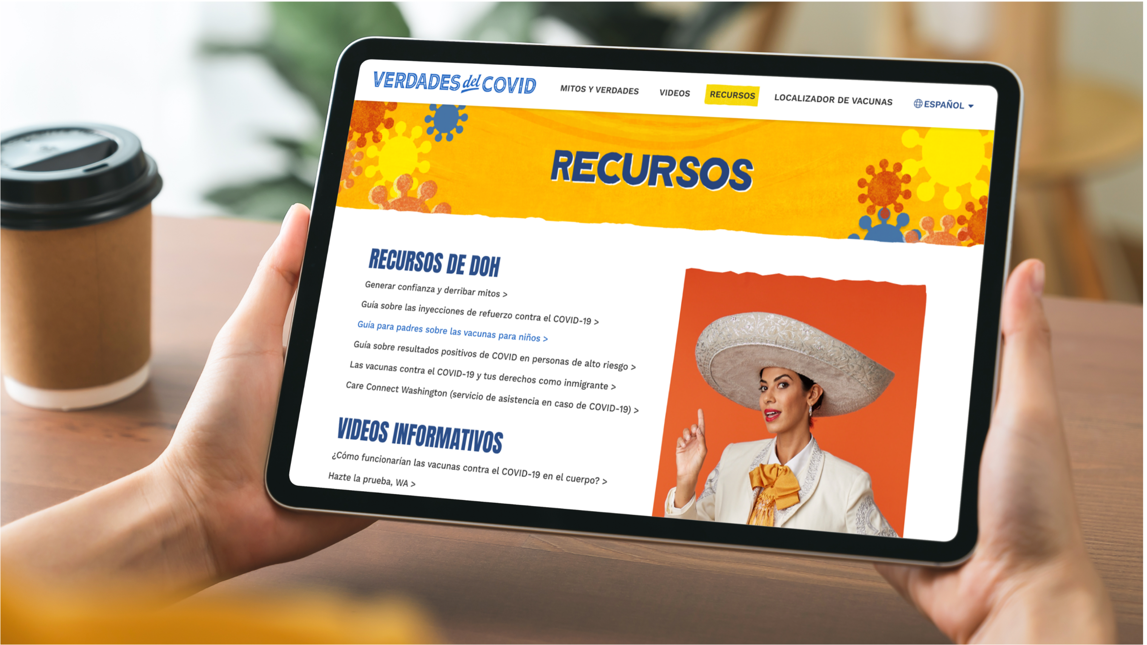
As a website with the purpose of serving the Hispanic community with COVID resources & facts, we drew inspiration from Latin American culture: flag colors, Adobe buildings & poster screenprint textures.

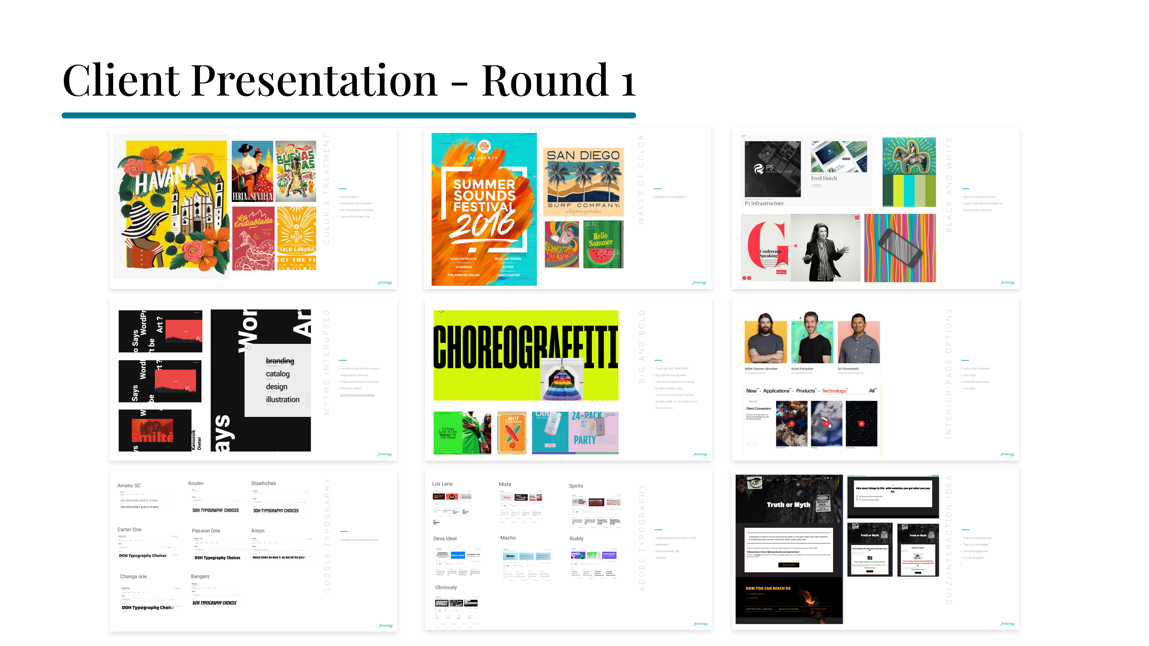
Click through our presentation here:

To follow up on client feedback for the Homepage Myths & Truths (Mentiras y Verdades) interactions, I created a second presentation communicating different animation concepts for the client to choose from:
1) "Myths Interrupted" - Mariachi band coming in to break apart the Myth text, replacing Myths with Truths.
2) "Colorful Truths" - Truths in color, while Myths in black & white
3) "Mariachi Overhaul" - Original mariachi concept, but animated instead of static, with mariachi graphics "Myth!" sliding in over the myth text upon scroll via parallax animation.
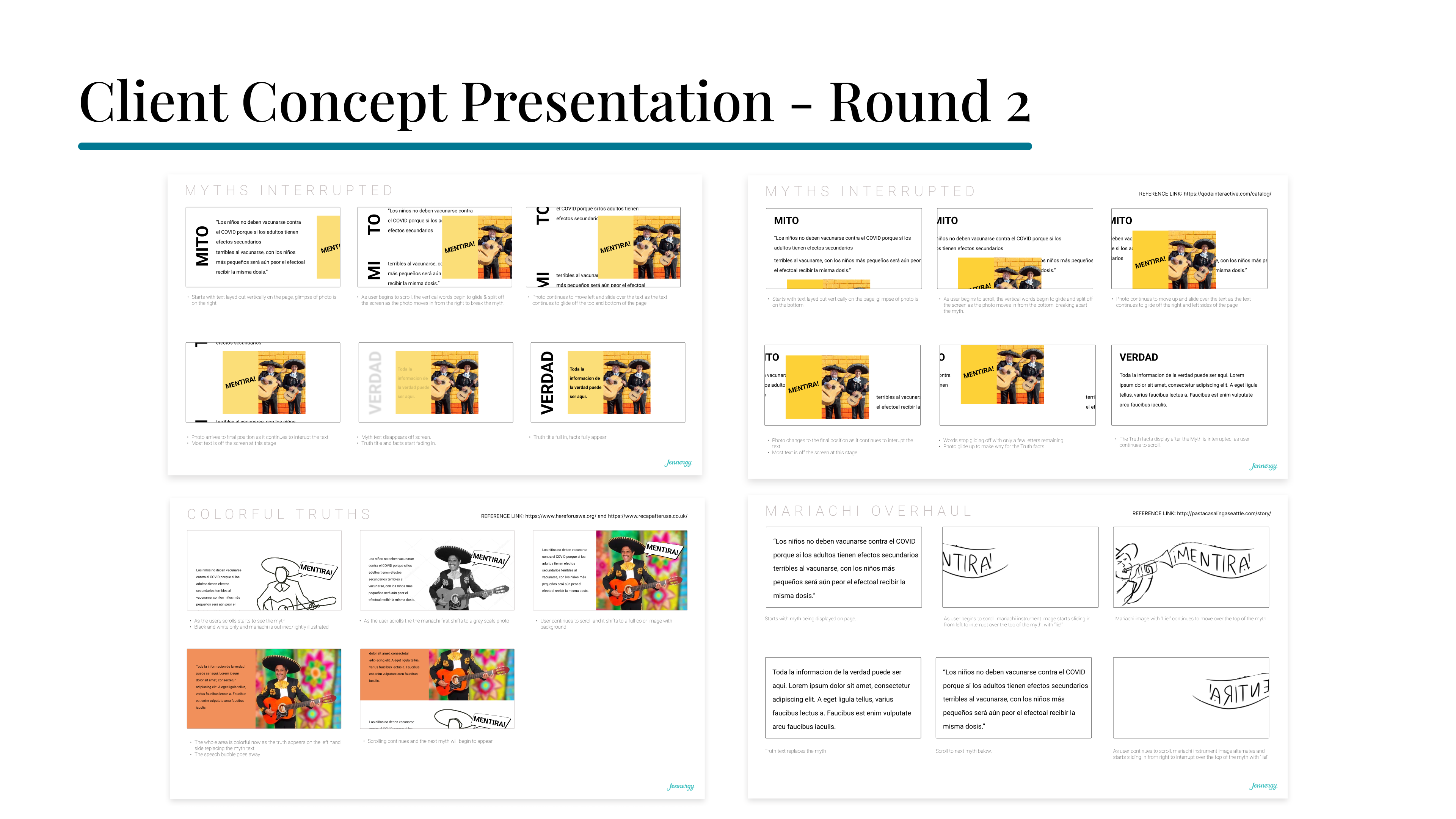
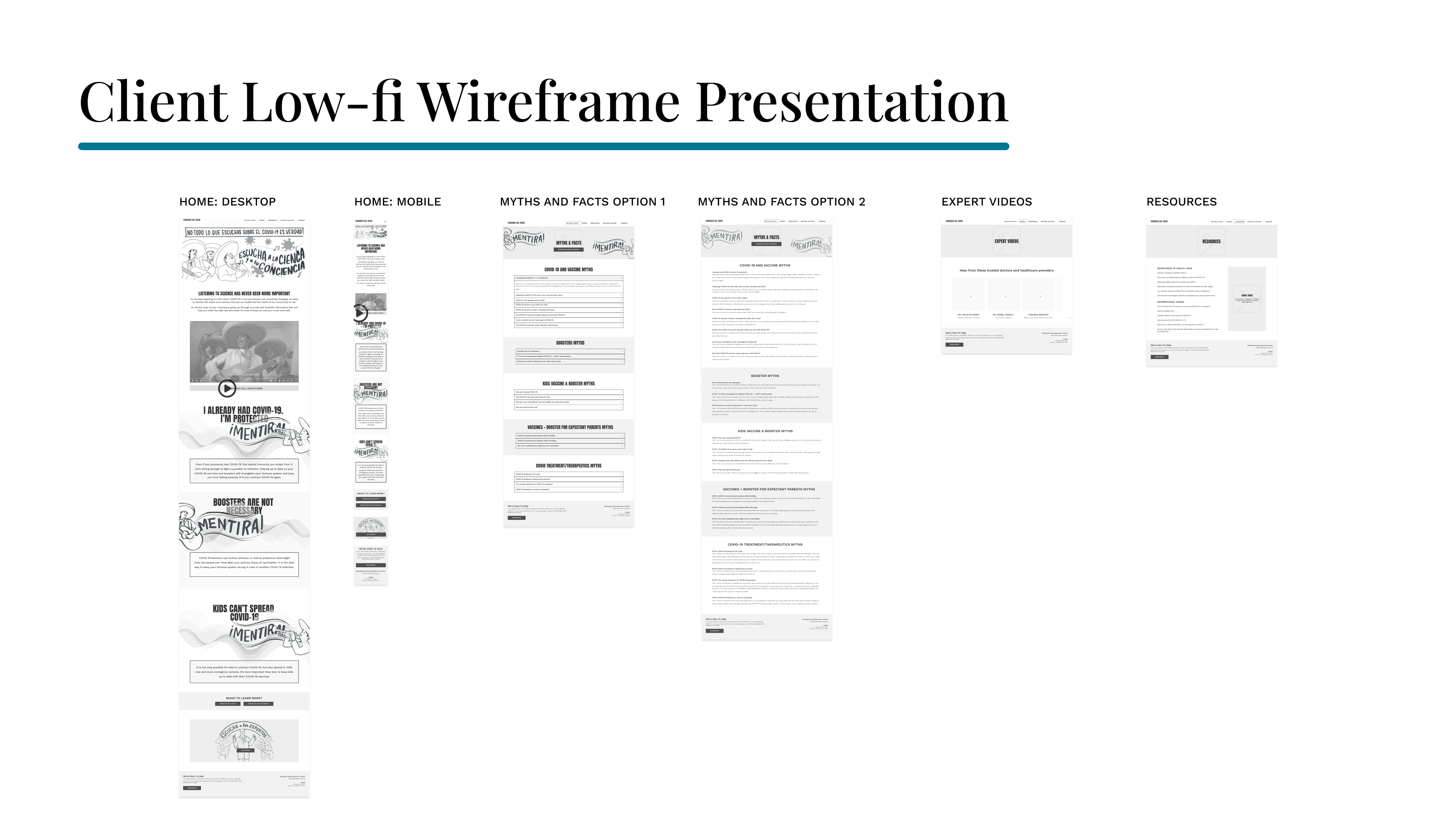
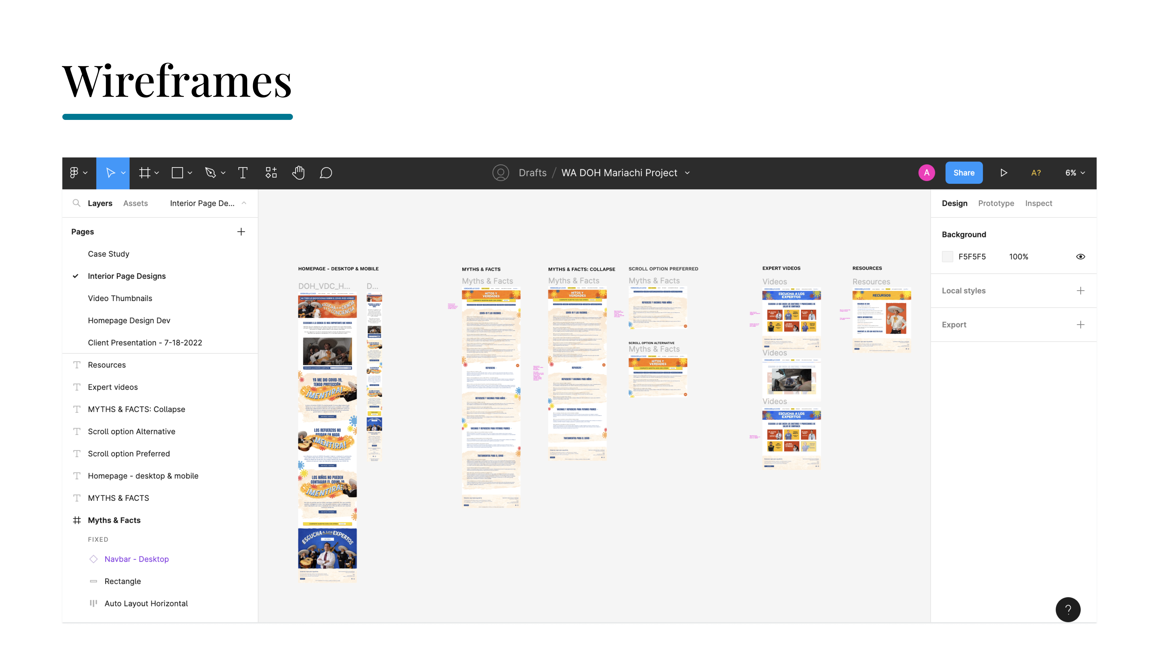
The client liked the direction of Option #3 - "Mariachi Overhaul" for homepage animation, so we proceeded to create low-fidelity page layouts (homepage and internal pages) based on our content outline.
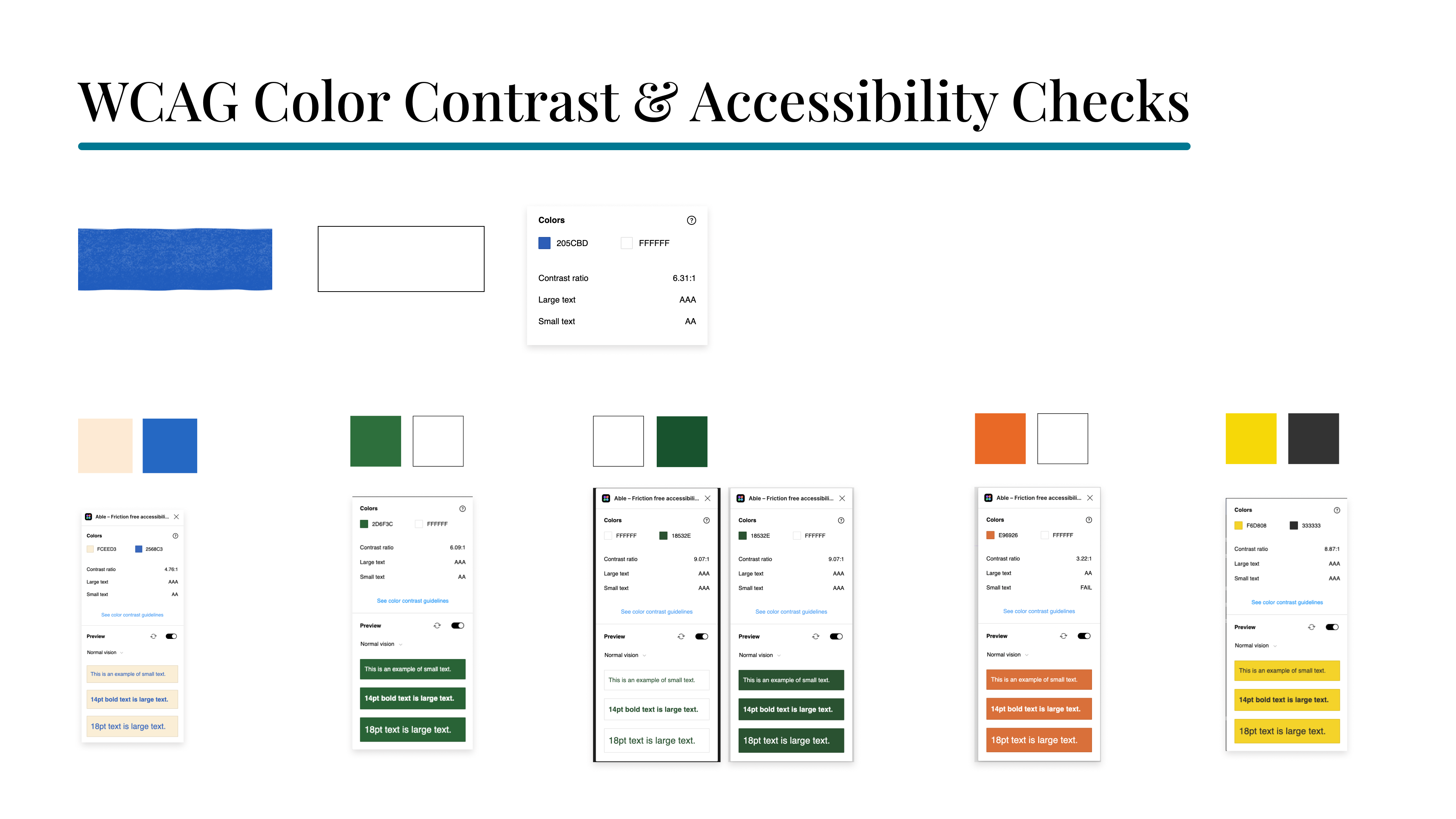
As I developed the color palette & styles, I ran WCAG accessibility checks for color contrast and text size for UI elements and states.
Early-stage exploration of different Homepage color/texture variations:

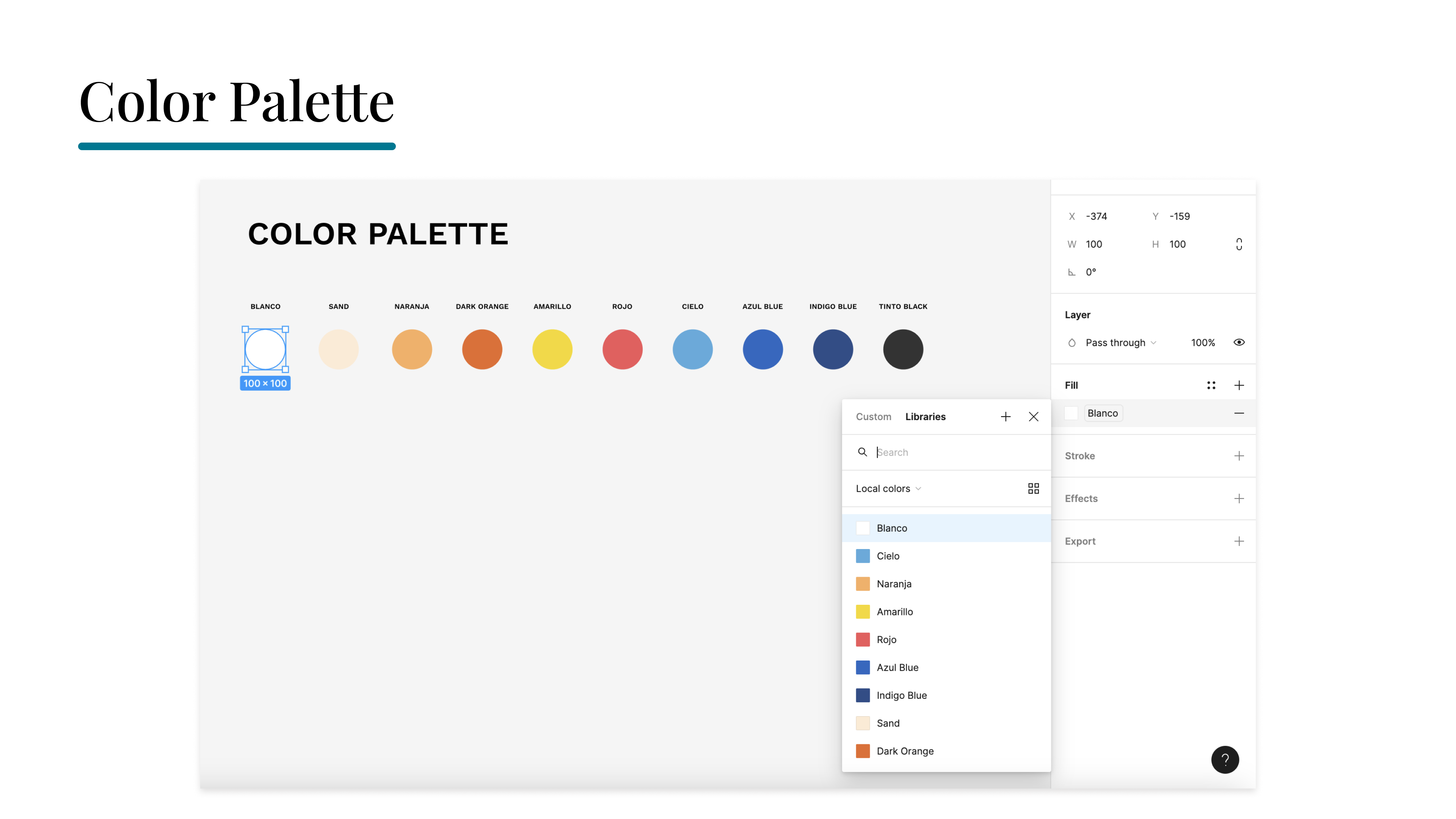
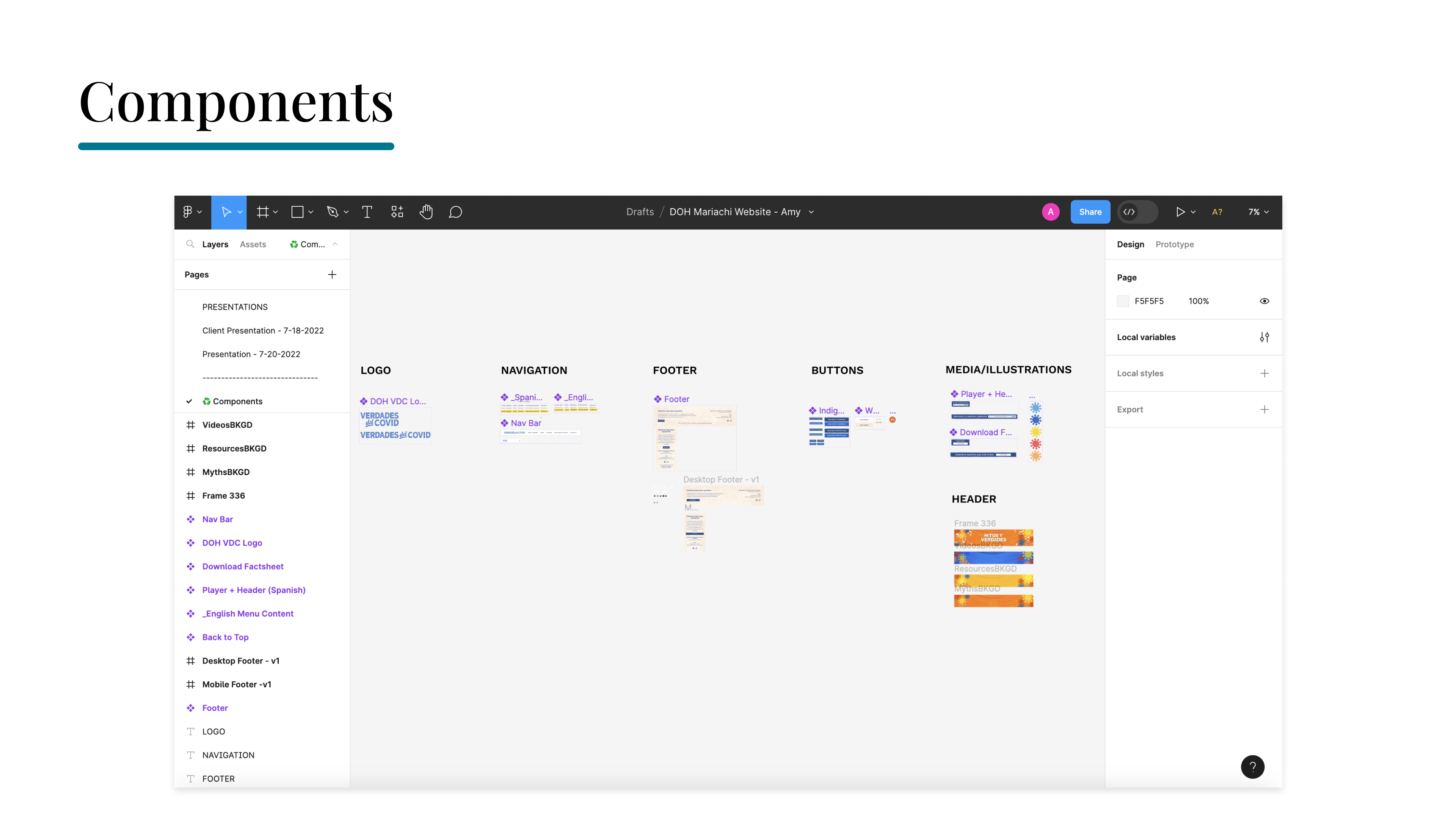
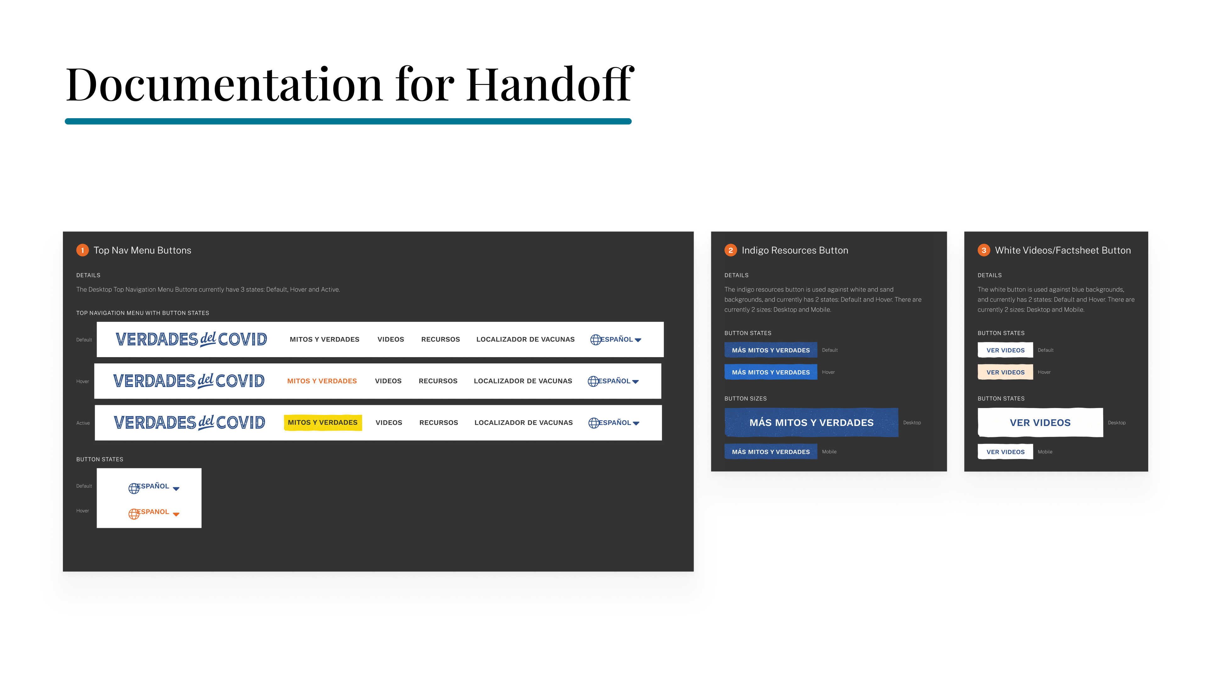
I created a local styles & component library in Figma to streamline the design workflow and insure consistency in my responsive design elements as I continued to build out the UI.
I inserted a little personality & fun into the color styles we'd be using by giving many of them Spanish names such as "Cielo" (heaven/sky) and "Tinto Black" (ink black).
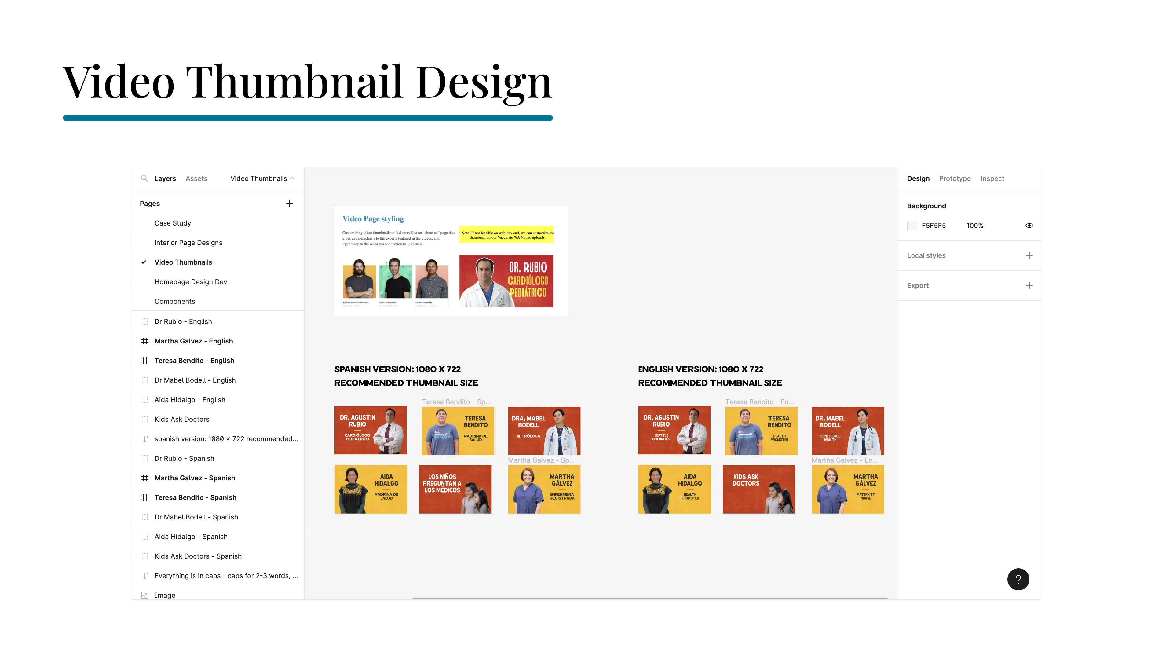
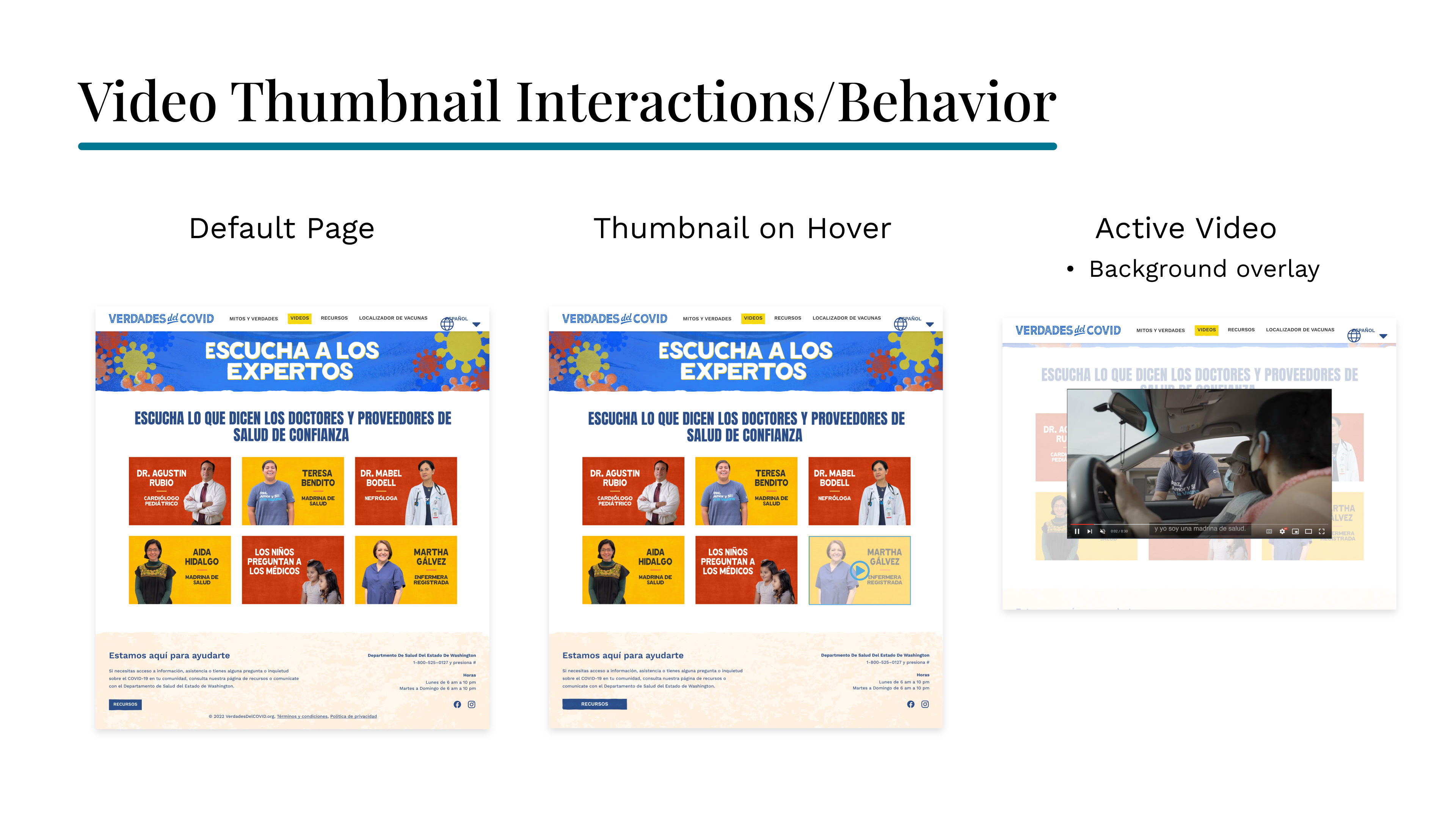
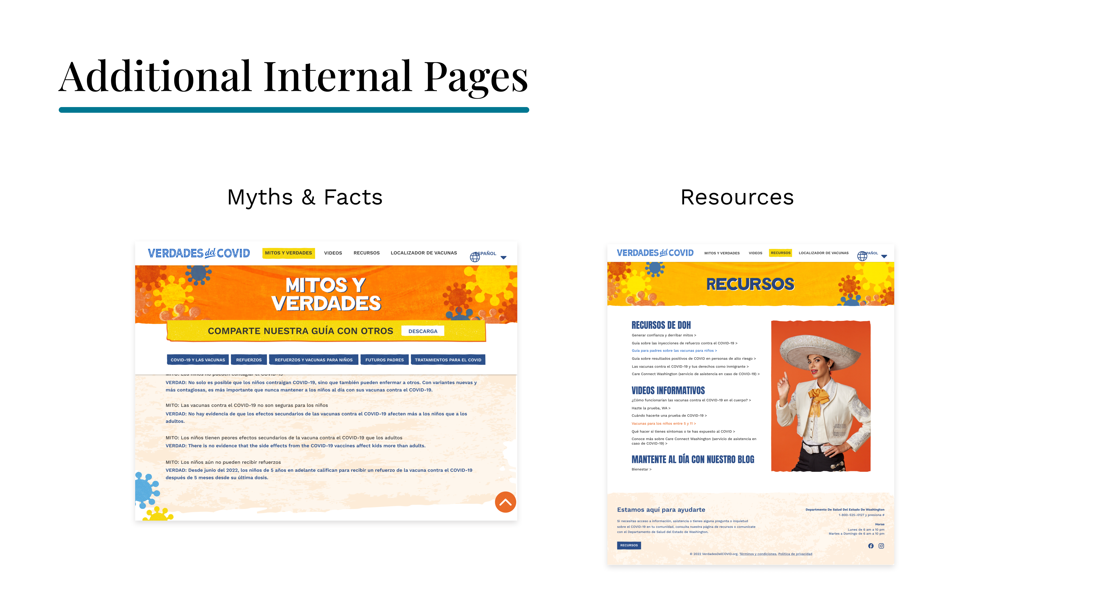
I collaborated with our senior graphic designer who helped with creating background textures in Photoshop for elements such as headers, footers & buttons, while I built out the mobile & desktop high-fi wireframes and other design assets in Figma.


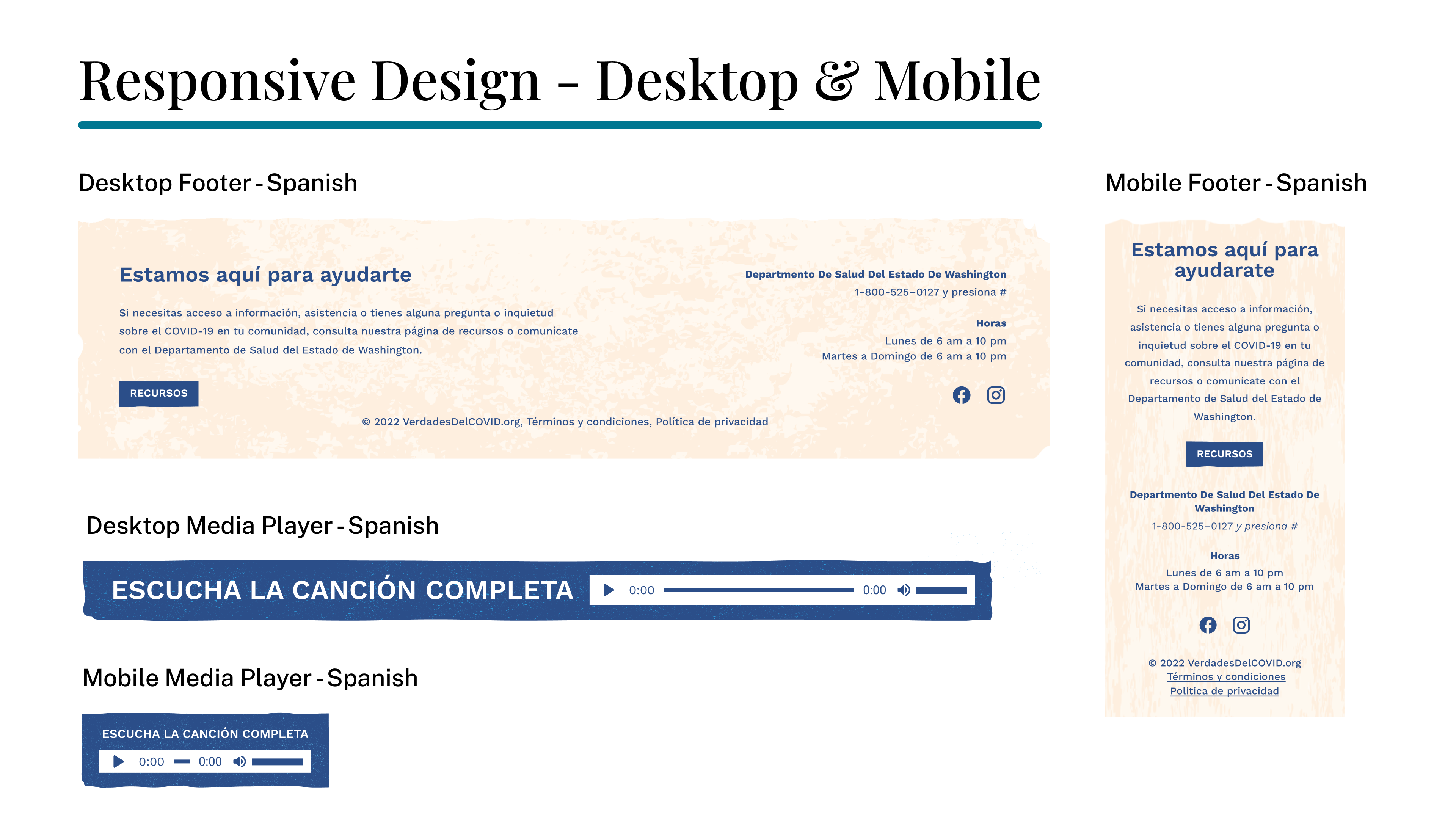
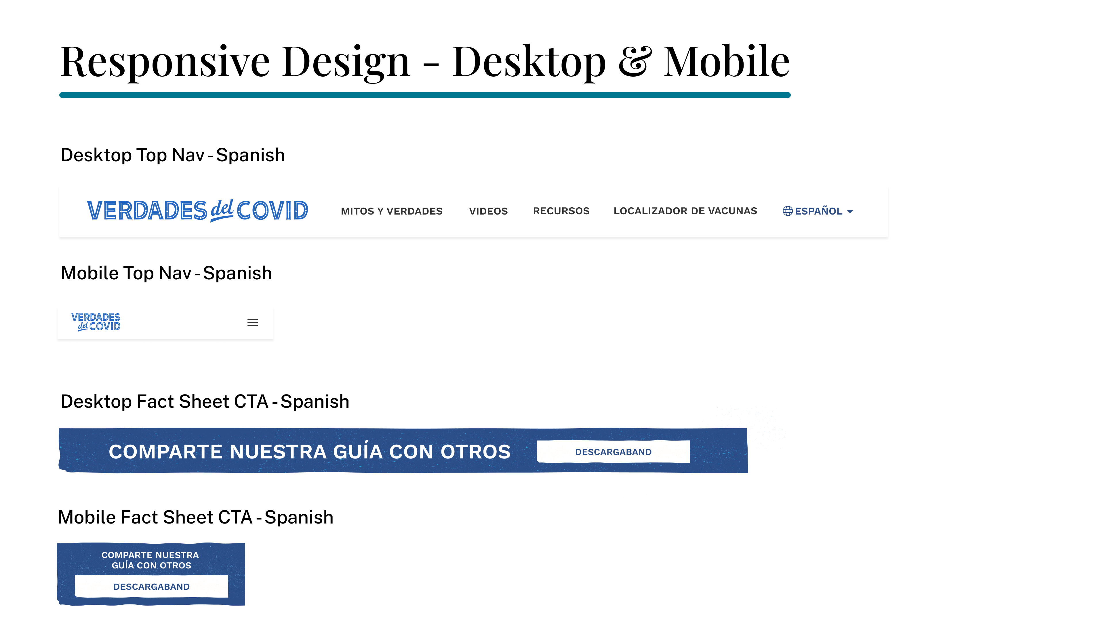
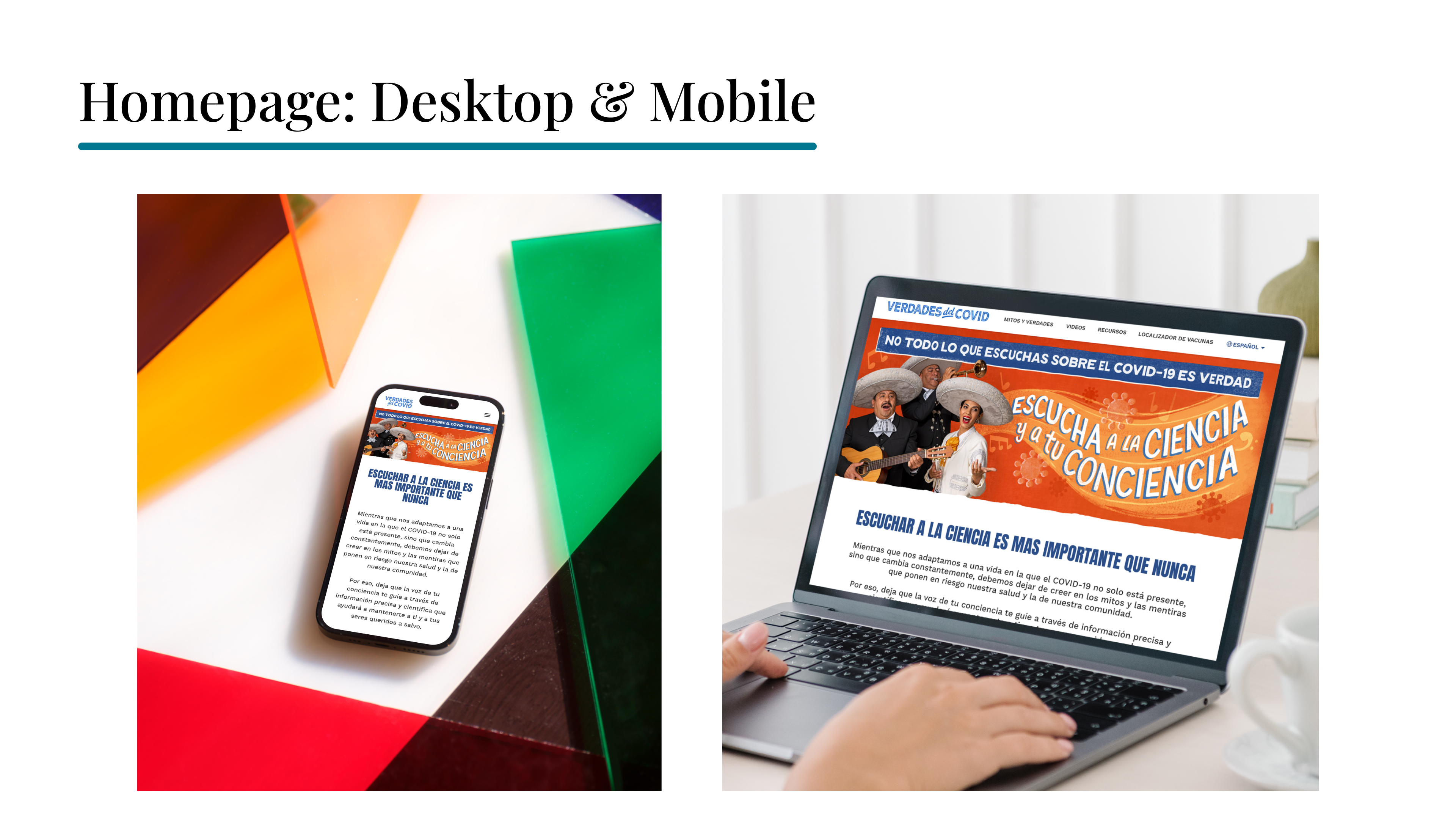
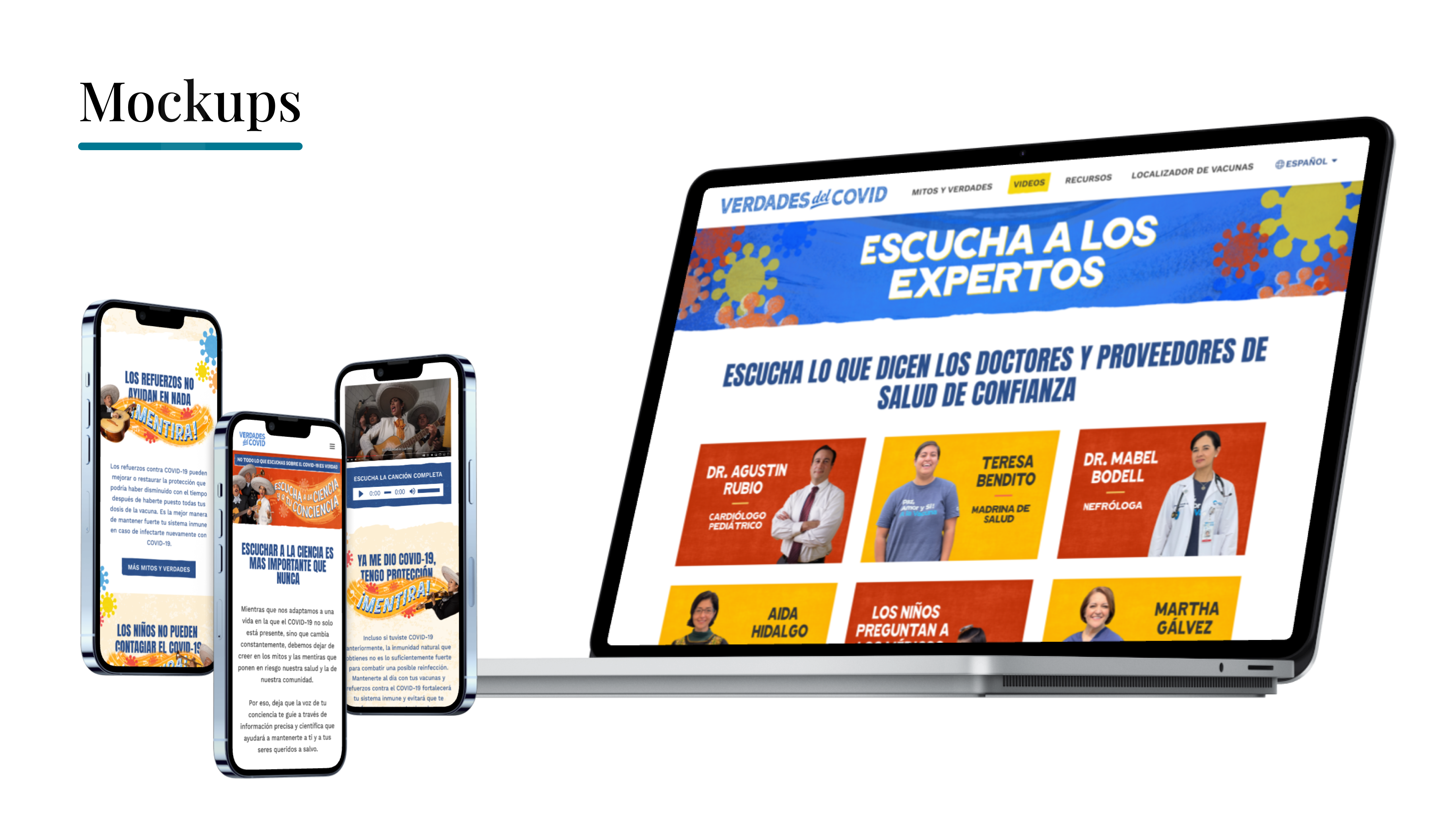
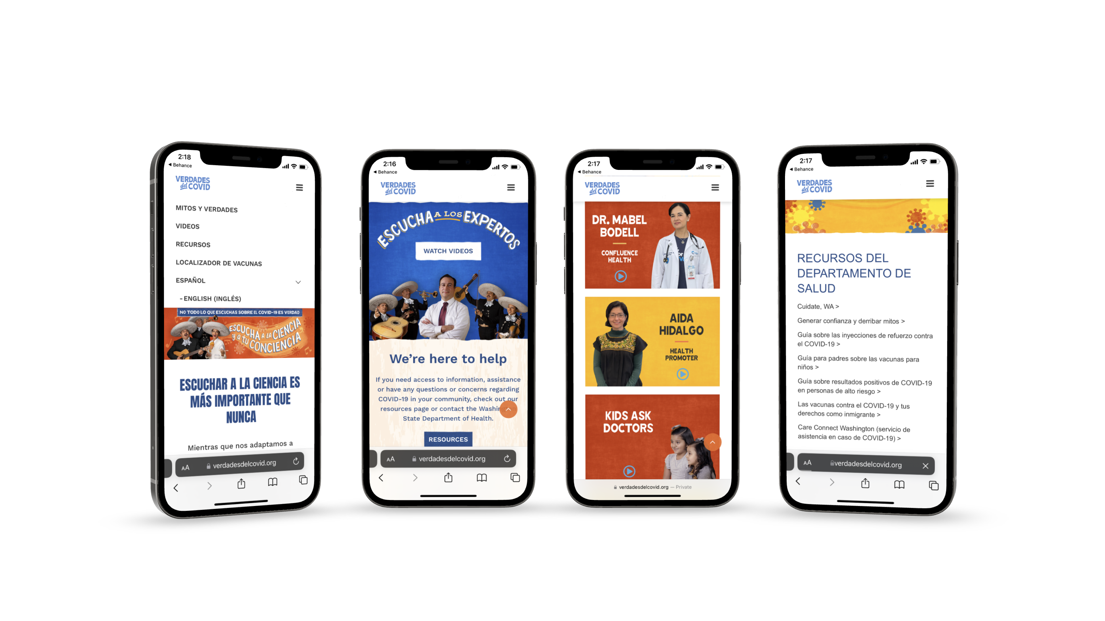
I designed the responsive Mobile & Desktop experiences in conjunction to ensure the experience was optimized for each device size and type.
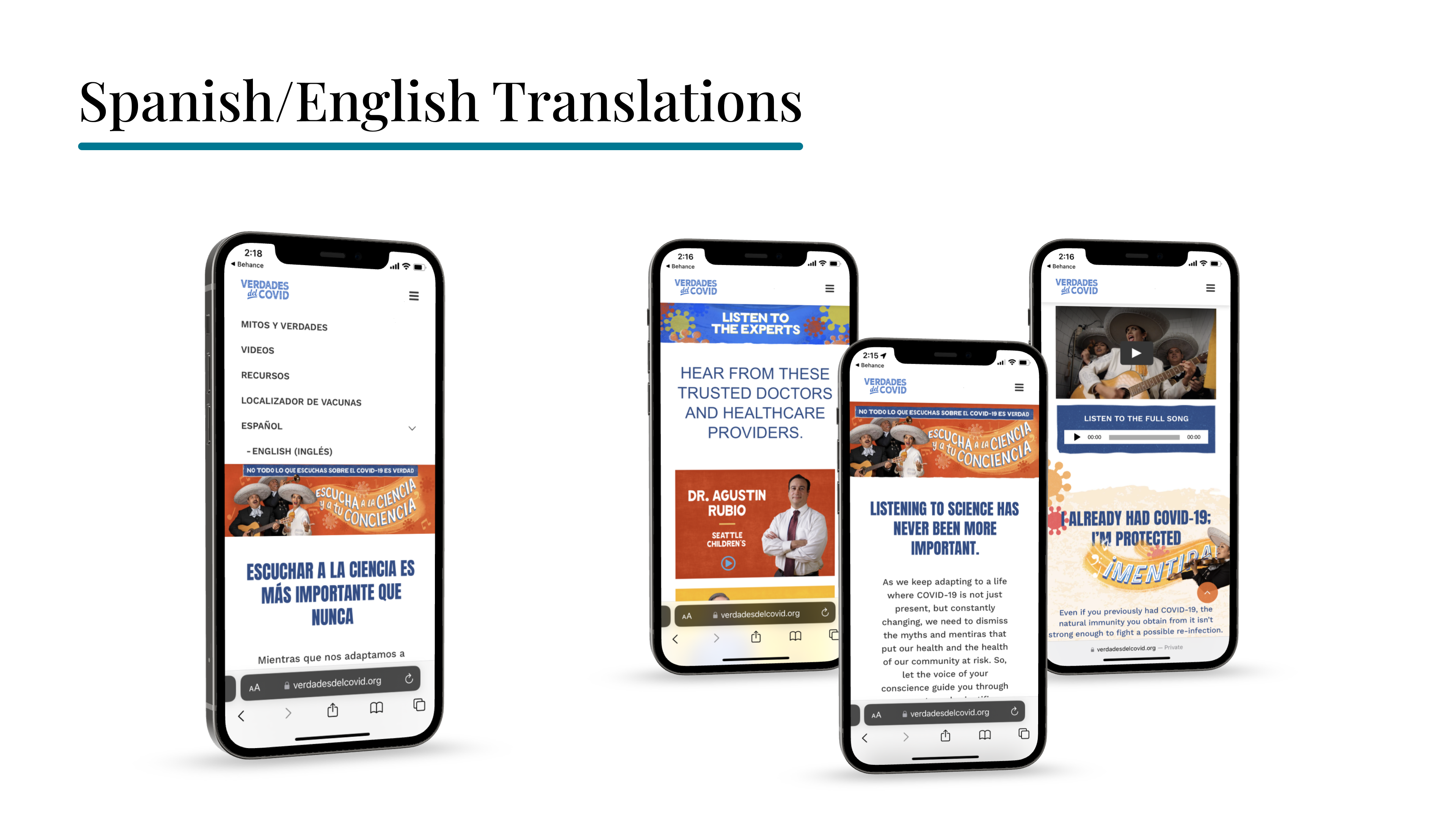
While the intent of this website was to provide resources to the Hispanic/Latinx community, it was also desired to have the site available in English translation as well. My Spanish language fluency allowed me to assist with providing the Spanish/English translations.
"Amy has been a great asset to our UX/UI team - she brings innovative ideas that continues to enhance our projects with her creativity and user-centric approach. Her willingness to help, technical skills and positive outlook greatly facilitate smooth collaboration with our clients and team. Thanks Amy for being so terrific!"
- JENN HILL, JENNERGY