

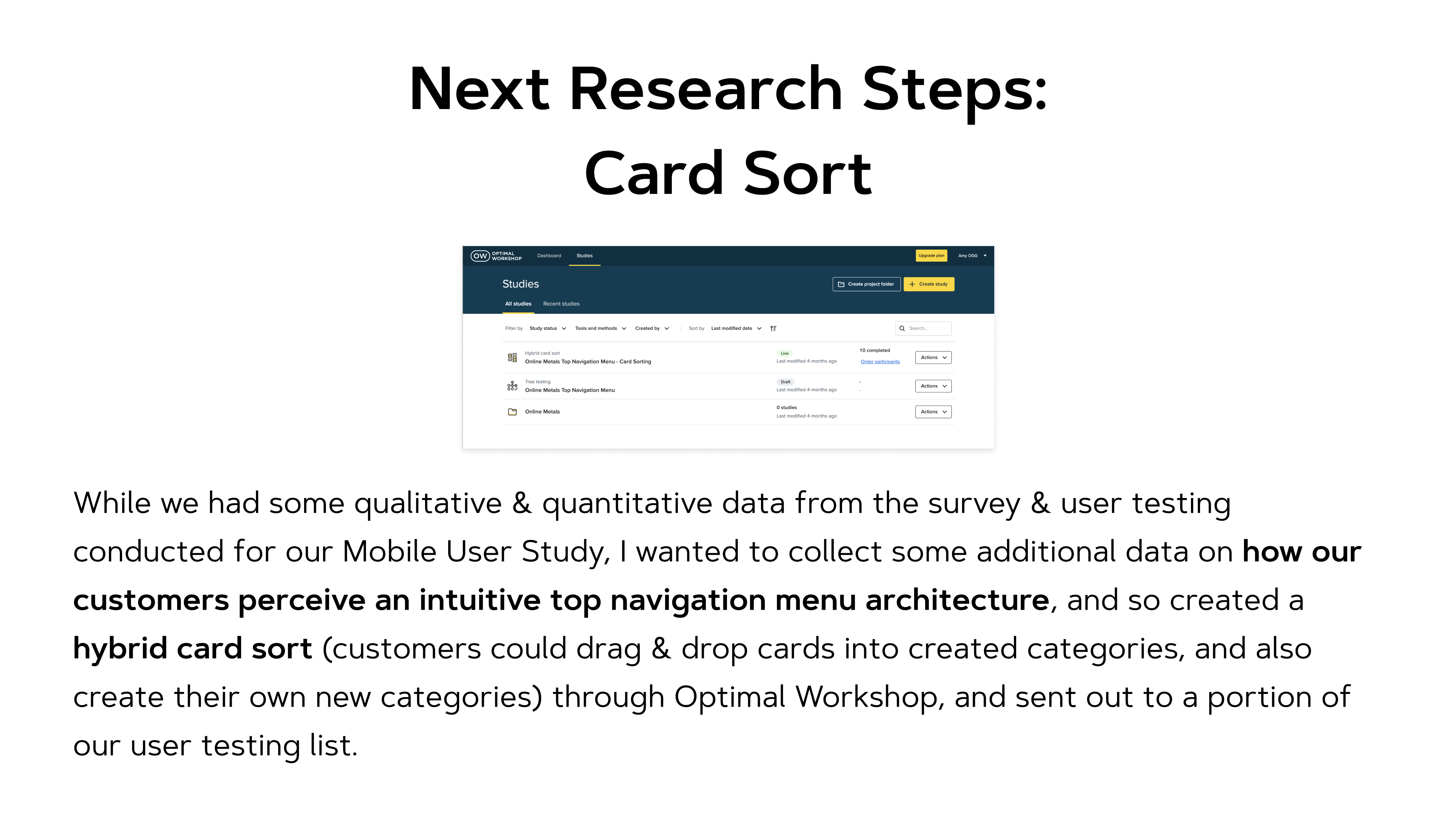
Click through slide deck above to view Card Sort findings & analysis.

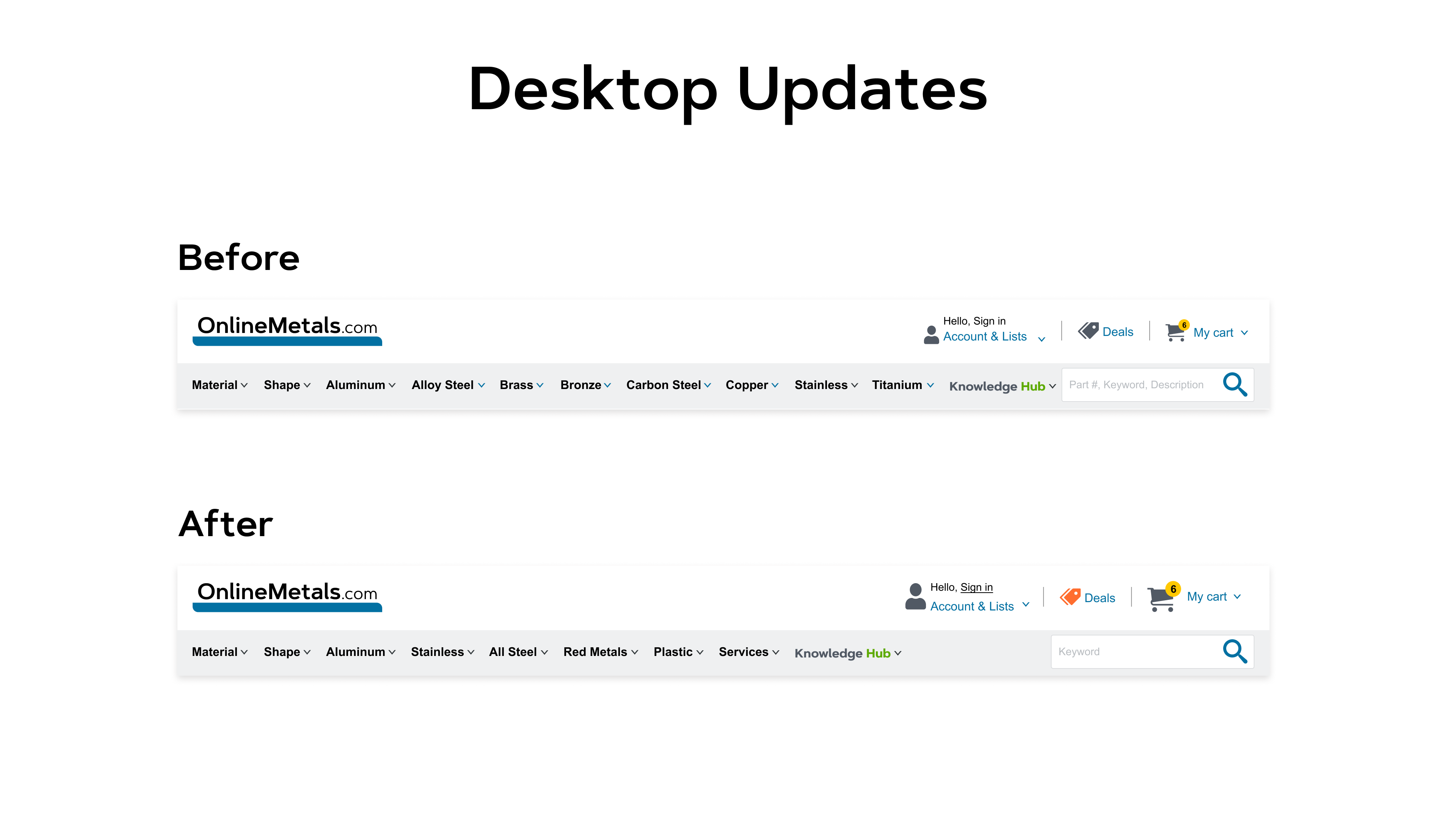
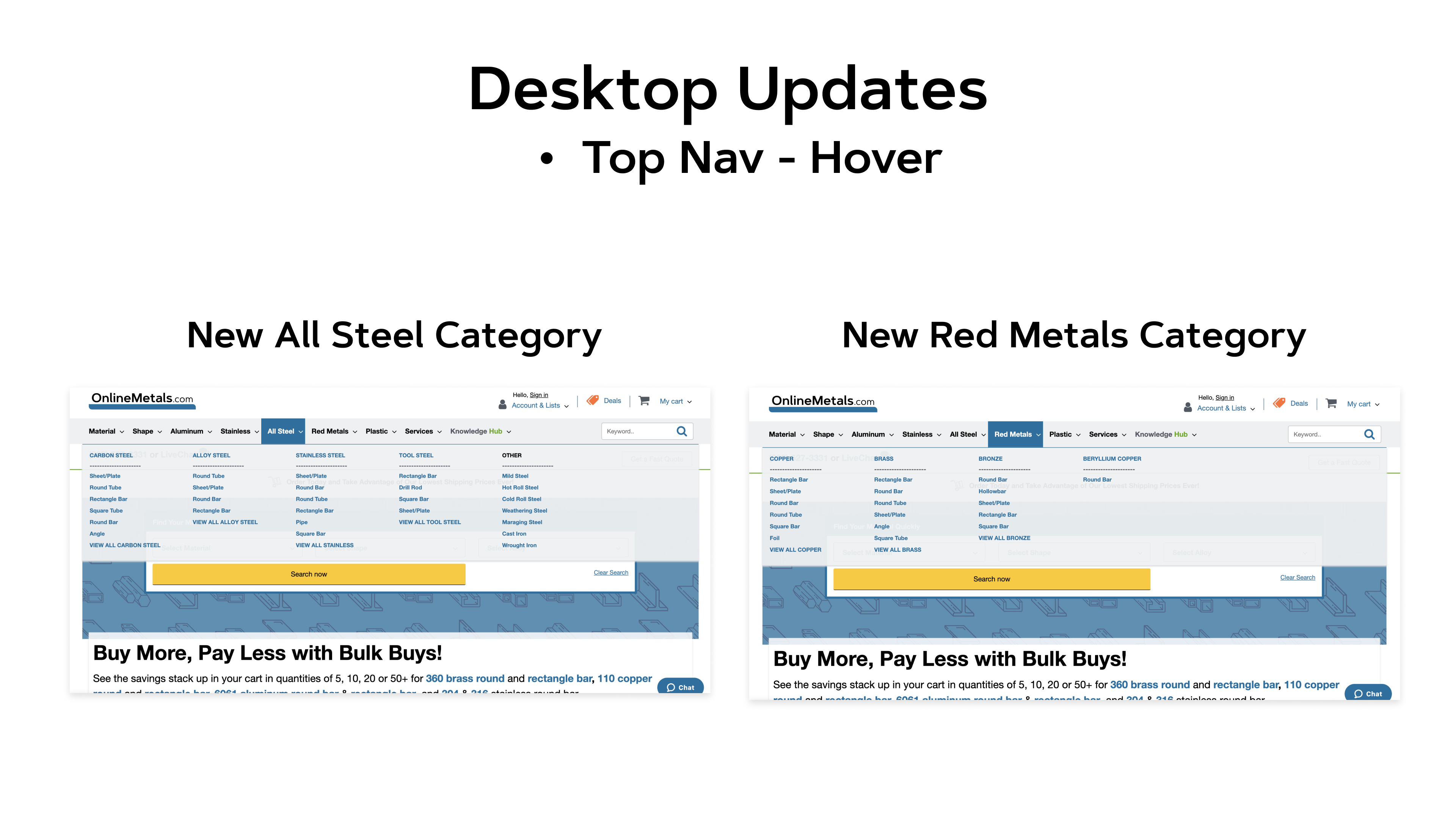
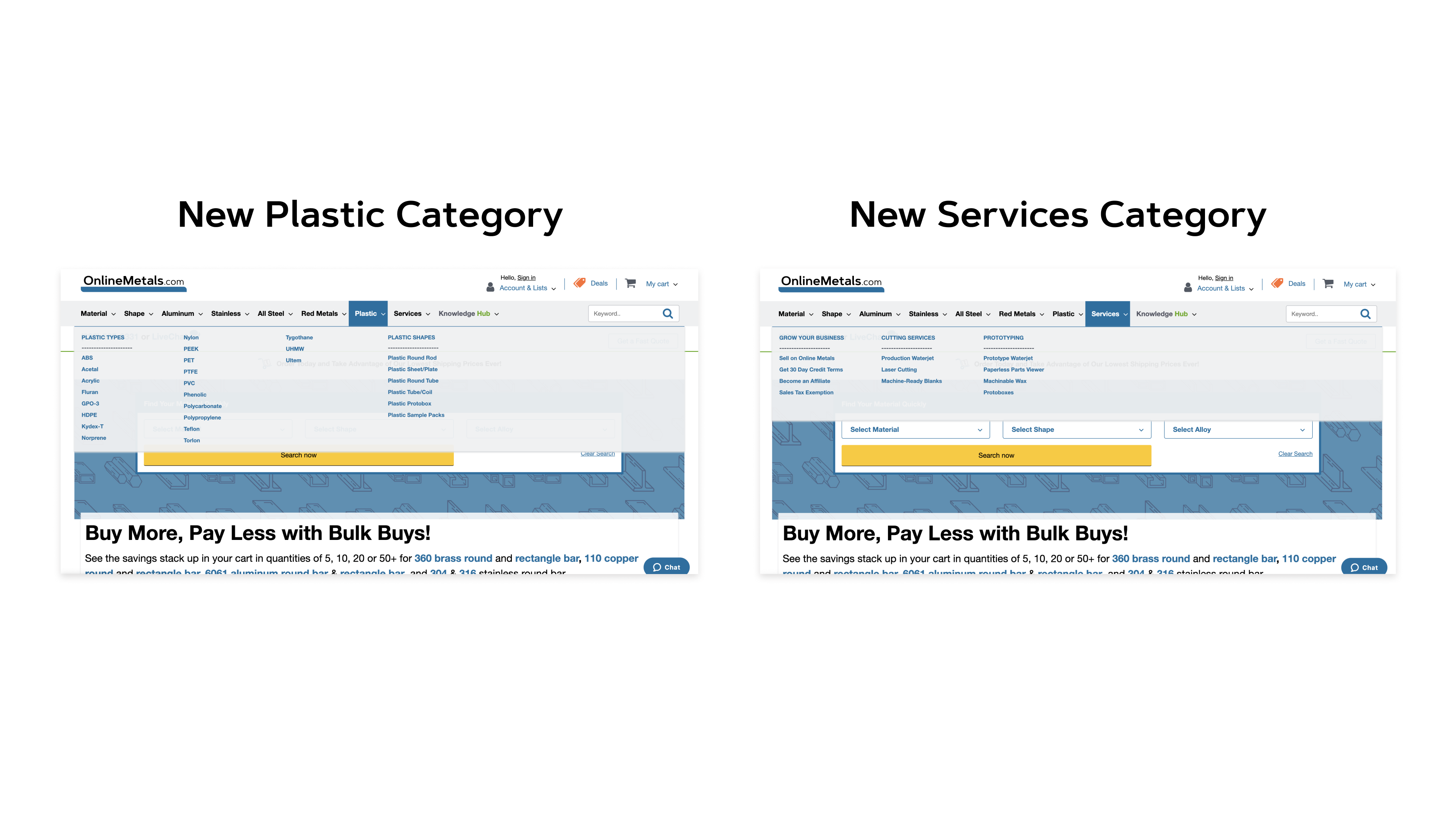
As our Desktop experience now supported a clickable Top Navigation, we wanted to create parity with the Mobile experience. I conducted some competitor benchmarking to gain inspiration on design & functionality and to identify opportunities for us.
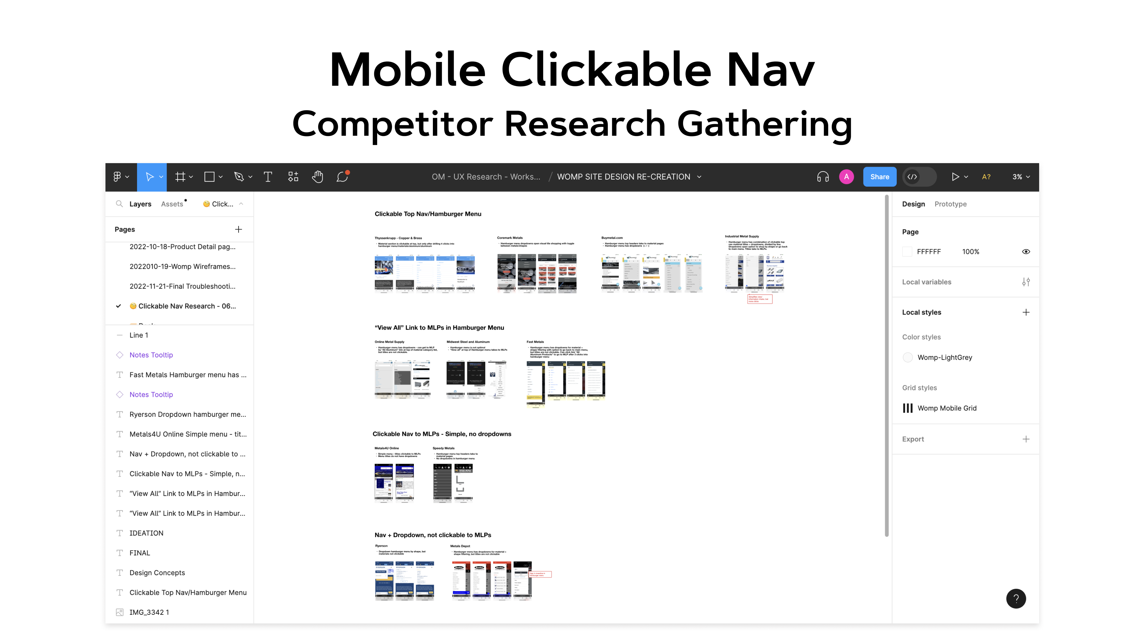
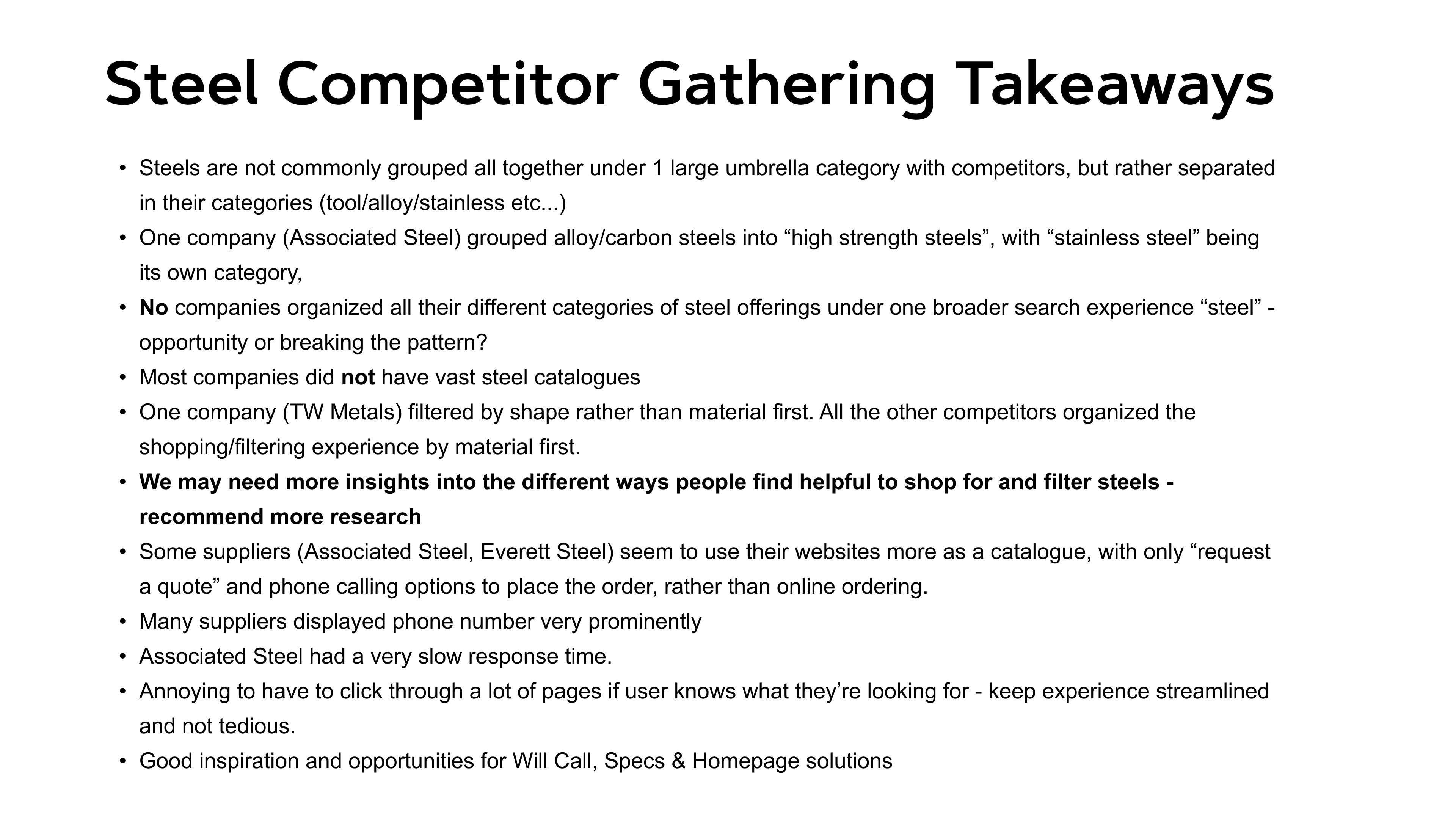
My key takeaways:
1) Many competitors did NOT have clickable menu titles in their navigation.
2) Many competitors who DID have clickable navs only had very simple ones (no menu dropdowns/filtering within navigation), which took to the respective material list pages.
3) Three competitors (Online Metal Supply, Midwest Steel & Aluminum and Fast Metals) included a "View all" link to their material list pages in the hamburger menus. (helpful for very large categories, as well as to provide a clear CTA in case the title clickability is not apparent to all customers)
4) Industrial Metal Supply had a slide-out navigation, and I drew inspiration from their UI to differentiate their clickable menu titles from their dropdown menus.
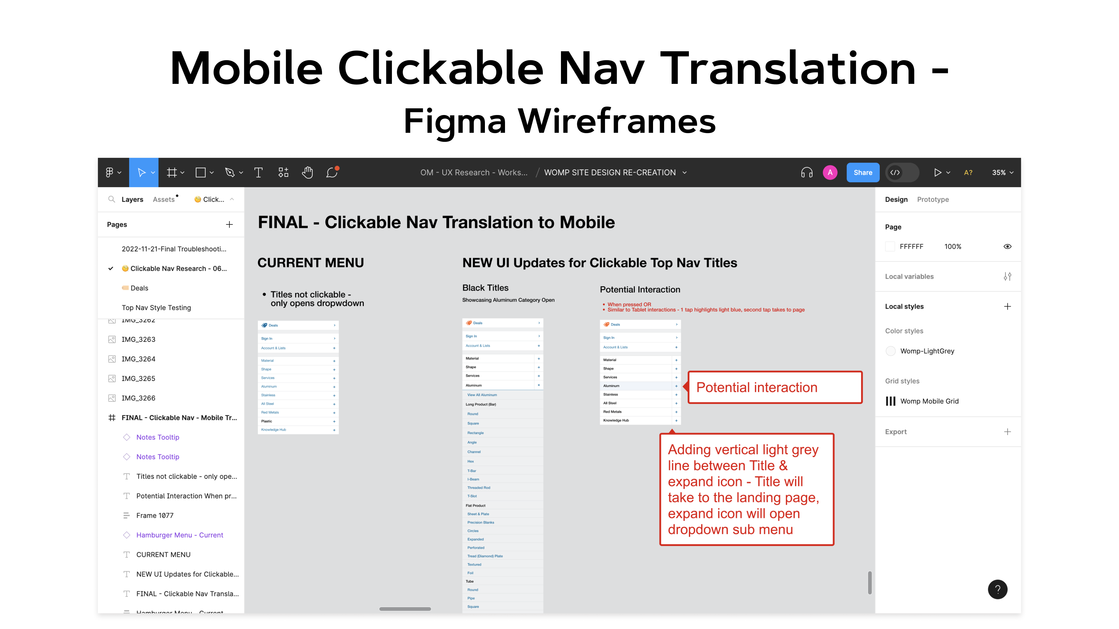
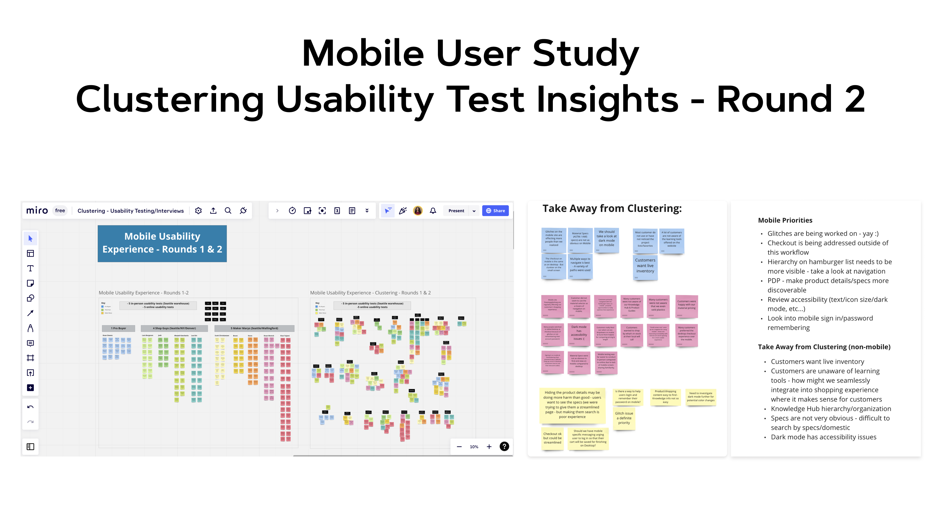
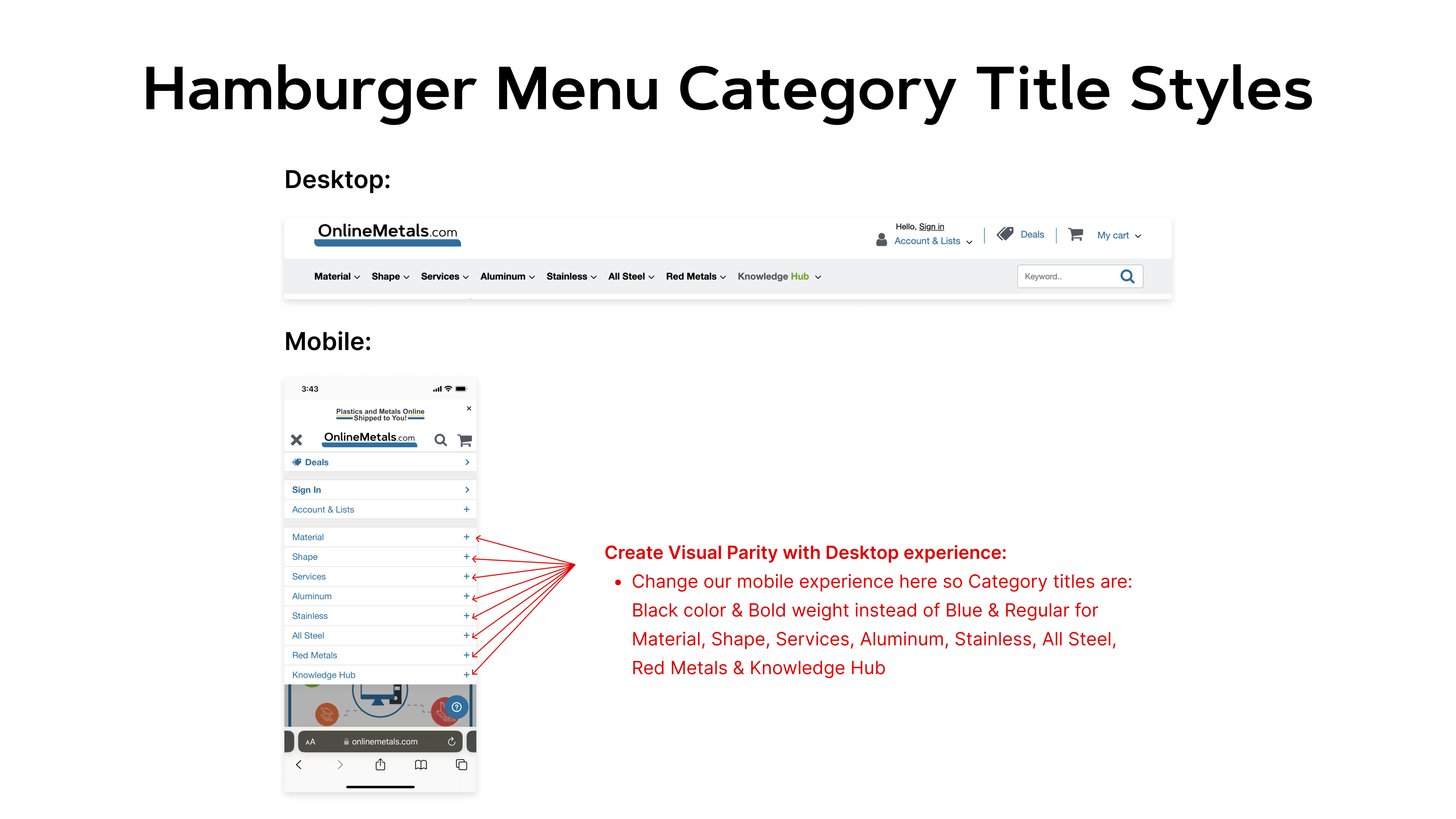
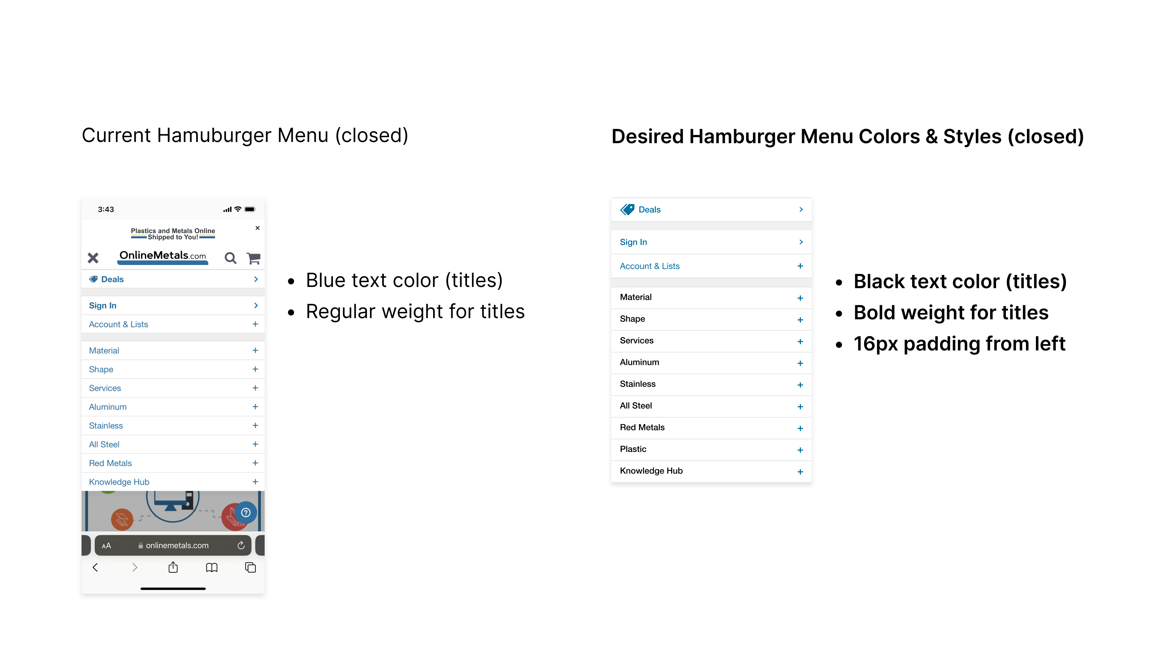
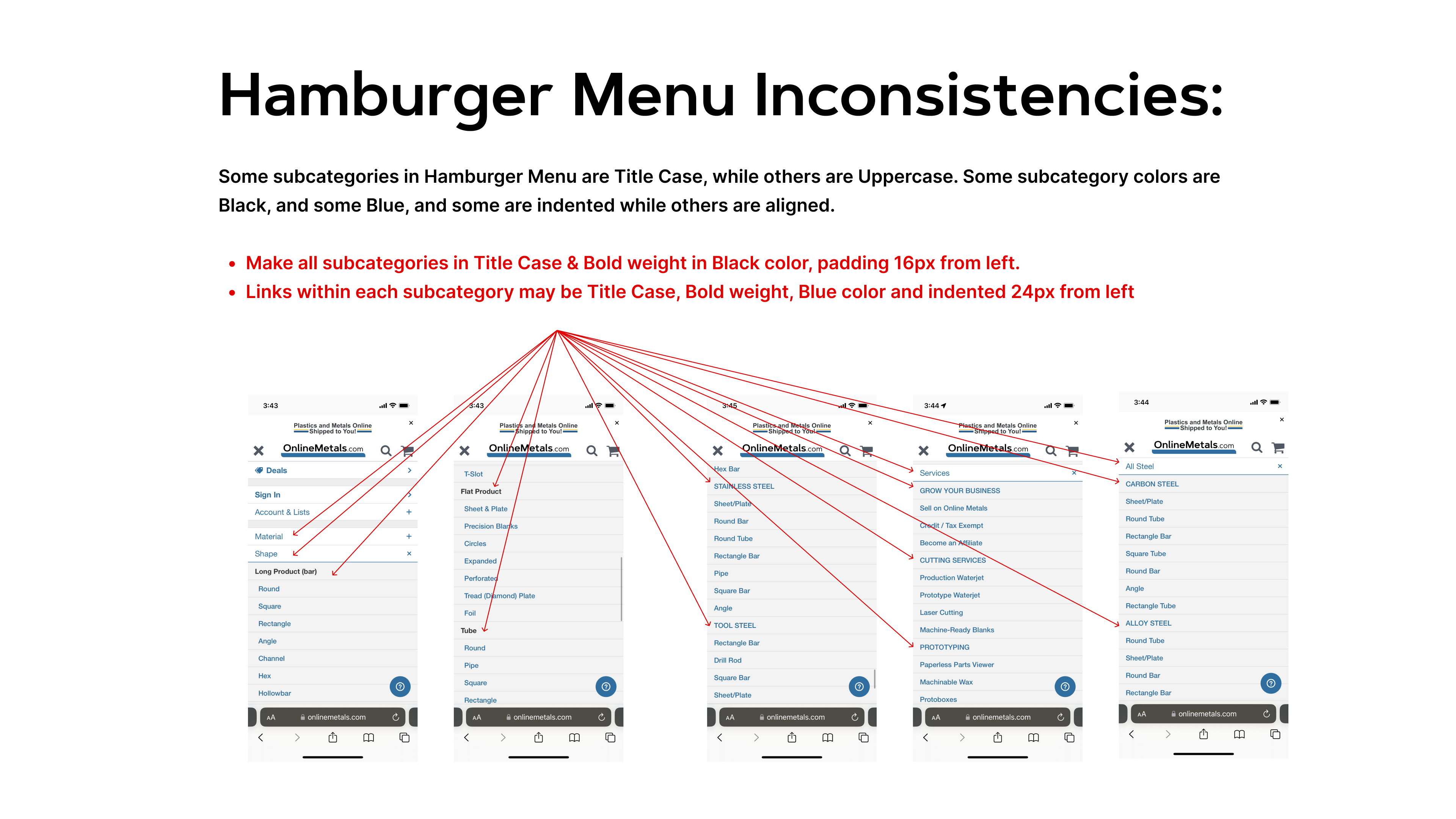
Testing Mobile UI updates/interactions in Staging environment:
